You may create multiple effects with the Text Block module.
The Text block is default module of the Visual Composer plugin and helps in creating various effects when creating pages, posts, and other posts types on your site.
General settings
Text Block has default WYSIWYG editor and you may use its original functions. However, we’ve added some styles to make it suit the theme perfectly.
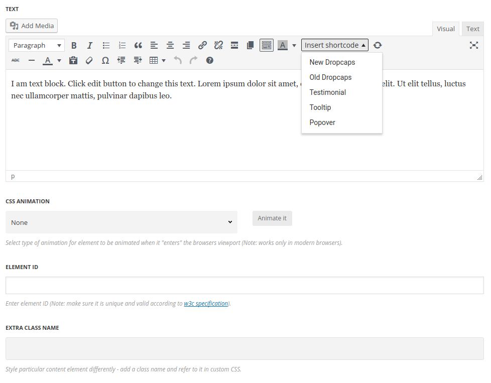
By clicking on Insert shortcode button you may see the drop-down of the available features within Text Block module, as shown on the image below:
Below you’ll see how to work with some of the effects.
Blockquote
Add quotes and excerpts within a Text Block.
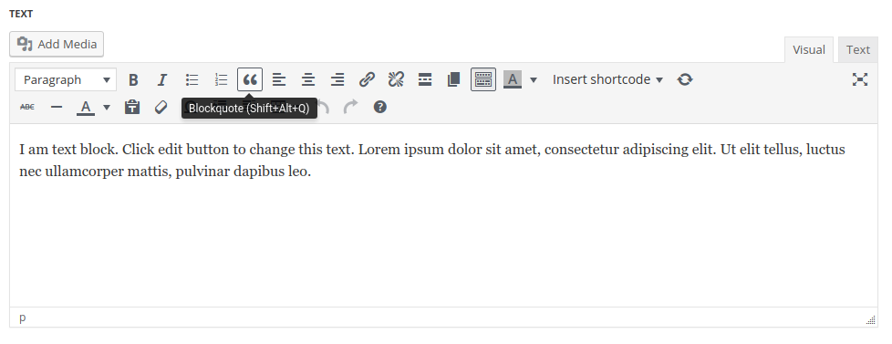
Select the quote content text and click on the Blockquote icon in the WYSIWYG editor.
It’ll add line and quote icon decoration for the text and change font style.
Select the quote content text and click on the Blockquote icon in the WYSIWYG editor.
It’ll add the line and quote icon decoration for the text and change the font style, background etc.
You may check various Blockquotes styles on Blockquotes page.
You may select Testimonial in the drop-down list under Insert shortcode button – it functions in the same way as Blockquote.
Drop caps
Style the first letter differently to attract your visitors.
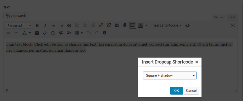
Within our theme there are two variants of Dropcaps styles: New Dropcaps and Old Dropcaps.
Please check the various styles on the Dropcaps page and on Old Dropcaps page.
Select the first letter in the text editor and select Drop caps icon in the editor.
Popovers
Add extra information to the text
See the examples of the popovers used on Popover & Tooltips page.
Select the text where you’d like to add the popover effect on hover. Click on Popover icon in the text editor to reveal the window with additional settings.
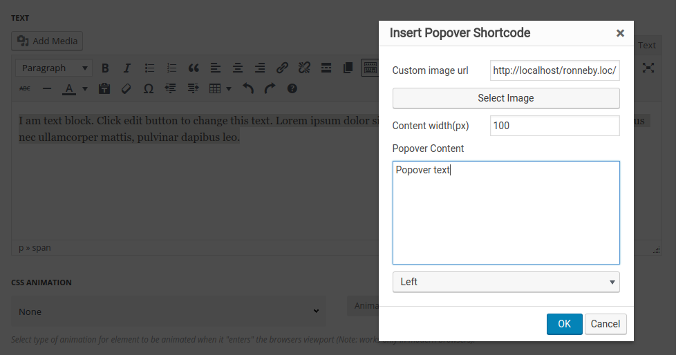
- Custom image URL – enter the link for the image to be displayed on text hover or select it from the media library.
- Content width – set the width for the popover.
- Popover content – enter the text to be displayed on hover.
- Popover position – select the position of the popover from the drop-down list.
Tooltips
Add stylish tooltips for the text to show additional information or description of the text.
Select the text where you’d like to add the tooltip on hover. Click on Tooltip icon in the text editor to reveal the window with additional settings.
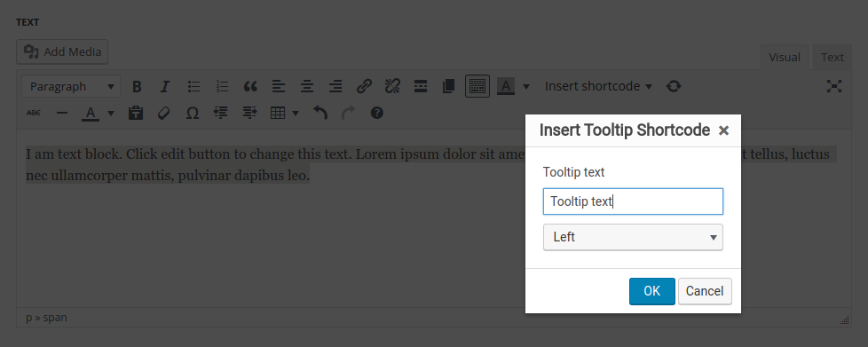
- Tooltip text – enter the content to be displayed on text hover.
- Tooltip position – select the position of the popover from the drop-down list.
See the examples of the tooltips used on Popover & Tooltips page.
Extra features
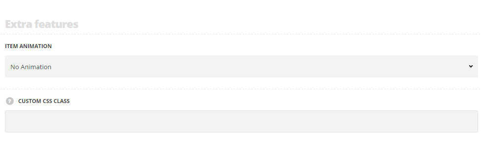
Extra features
- Animation – choose between 14 preset animation effects.
- Custom CSS class – enter our own unique class name for the item – this is a useful option for those who want to create a specific style. E.g.: you can type custom-style class and then go to
Theme optionsGeneral optionsCustom CSS/JSCustom CSSfield and write your own CSS code with this class to get your own style.
