Add the stylish subscribe form to your site and let the users subscribe to your news.
All the styles of the module can be found on Subscribe page.
General settings
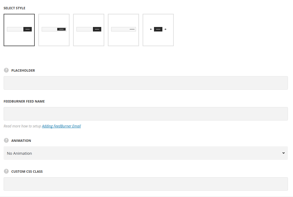
- Style – choose between 5 preset styles.
- Standard – the subscribe form consists of two parts: input field and the subscribe button, with hover effect on input.
- Inside – the subscribe button is displayed inside of the input field.
- Separated – the input field and button are separated by the offset.
- Simple – the input field has no border around with the button displayed on the right side of it.
- Animated – there is subscribe button displayed in idle state only, which on hover reveal the input field to enter the email address.
- Placeholder – enter the text to be displayed in the input field of the subscribe form.
- Feedburner Feed Name – read more how to setup Adding FeedBurner Email.
- Animation – choose between 14 preset animation effects.
- Custom CSS class – enter our own unique class name for the item – this is a useful option for those who want to create a specific style. E.g.: you can type custom-style class and then go to
Theme optionsGeneral optionsCustom CSS/JSCustom CSSfield and write your own CSS code with this class to get your own style.
Style settings
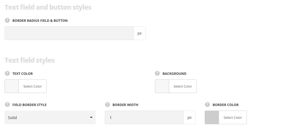
Text fields and button styles
- Border Radius field & button – specify the border radius so add rounded corners.
Text field styles
- Text color – set the text color for the text typed in the field. The default value is inherited from
Theme optionsCustom typographyBox Title Typography - Background – choose the background color for the field.
- Field border style – set the border style for the subscribe field.
- Border width – specify the border width for the subscribe field.
- Border color – specify the border color for the subscribe field.The dafault value is #cdcdcd.
Button styles
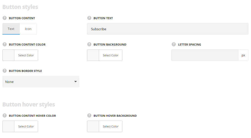
- Button content – select whether you’d like to use text or icon on the button.
- Button text – type the text for the button, for Text style only.
- Letter Spacing – set the letter spacing in the button, for Text style only.
- Select icon – select the icon from the available pack, for Icon style only.
- Icon size – specify the needed icon size, for Icon style only.
- Button content color – set the color for the button content text.
- Button background – set the color for the button background. The default vale is #1b1b1b.
- Button border style – select the border style, and specify Border Width and Border Color.
Button hover styles
- Button content hover color – set the content color on hover.
- Button hover background – set the background color on hover. The default vale is rgba(27,27,27,0.85).
