The excellent way to show the most interesting facts on your site and impress the visitors with stylish presentation.
You may see the example of the module on the Facts module page.
General settings
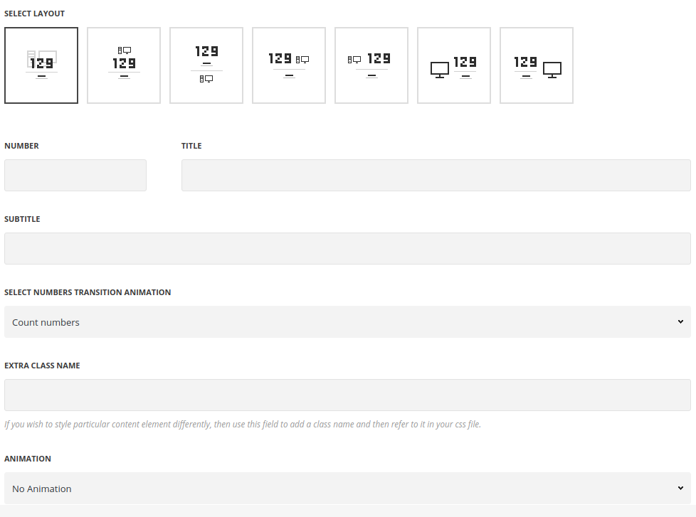
- Style – select the appearance for the module.
- Standard – the icon is set as a background for the module.
- Top icon – the icon is displayed on top of the module.
- Bottom icon – the icon is displayed on the bottom of the module.
- Left icon – the icon is displayed to the left of the module.
- Right icon – the icon is displayed to the right of the module.
- Left counter – the number is displayed to the left from the content with icon on top of it.
- Right counter – the number is displayed to the right from the content with icon on top of it.
- Number – enter the fact’s number.
- Title – enter the title for the fact element.
- Subtitle – enter the subtitle for the fact element.
- Select numbers transition animation – allows you to choose the animation for the number.
- Count – the counting animation effect is applied to the number in fact element.
- Odometer – the numbers will be counted in the stylish odometer container.
- Without – no animation is set for the numbers.
- Custom CSS class – enter our own unique class name for the item – this is a useful option for those who want to create a specific style. E.g.: you can type custom-style class and then go to
Theme optionsGeneral optionsCustom CSS/JSCustom CSSfield and write your own CSS code with this class to get your own style. - Animation – choose between 14 preset animation effects.
Icon settings
 Icon – switch it to Enable to display the icon in fact element.
- Icon to display – select the element to be displayed in the module.
- Icon – select this variant to display the icon in the module.
- Icon library – choose the icon library for the module.
- Select icon – select the icon to be displayed in the module.
- Size – set the size for the icon.
- Opacity (0-100) % – specify the transparency of the icon.
- Color – choose the icon color.
- Custom Image Icon – select this variant to display custom image on the left side from the text.
- Upload image – select the image from media library for the module.
- Size – set the size for the image.
- Icon – select this variant to display the icon in the module.
Typography settings
Title typography
These settings are inherited from Theme options Custom typography Features Title Typography.
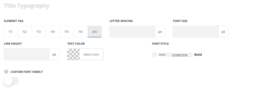
- Element tag – select the tag for the title.
- Font size – set the font size you need to use in the title.
- Letter spacing – set the needed distance between letters.
- Line-height – set the needed distance between lines in the title text.
- Text color – set the color of the font.
- Font style – select the font weight and style (bold, italic) for the title.
- Custom font family – set it to Enable to use custom Google font.
- Font Family – select the font family from the drop-down list.
- Font style – select the font weight and style (bold, italic) for the title.
Subtitle Typography
The typography settings are inherited from Theme options Custom typography Subtitle typography.
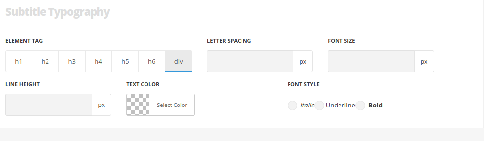
- Element tag – select the tag for the subtitle.
- Font size – set the font size you need to use in the subtitle.
- Letter spacing – set the needed distance between letters in the subtitle.
- Line-height – set the needed distance between lines in the subtitle text.
- Text color – set the color of the font.
- Font style – select the font weight and style (bold, italic) for the subtitle.
- Custom font family – set it to Enable to use custom Google font.
- Font Family – select the font family for the drop-down list.
- Font style – select the font weight and style (bold, italic) for the subtitle.
Content typography
The typography settings are inherited from Theme options Custom typography H1 Title Typography.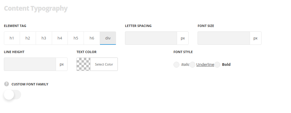
- Element tag – select the tag for the text in Info Box module.
- Font size – set the font size you need to use in the text in Info Box module.
- Letter spacing – set the needed distance between letters.
- Line-height – set the needed distance between lines.
- Text color – set the color of the font.
- Font style – select the font weight and style (bold, italic).
Style settings
Delimiter settings
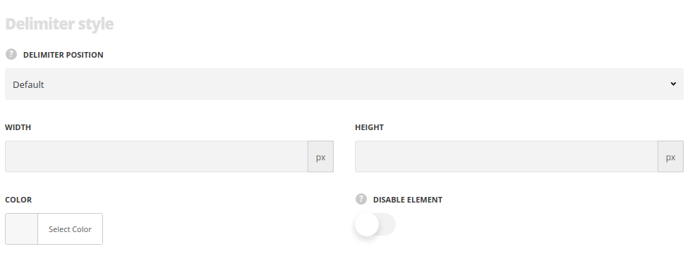
- Delimiter position – select where to position the delimiter in the module.
- Width/Height – specify its width and height to create various shapes.
- Color – assign the delimiter color.
- Hide element – set it to Enable in case you want to hide the element.
