Tabs module allows you to present the information in separate tabs to show any kind of the information on one page.
A number of tabs are unlimited.
You may check the module examples on the Tabs page.
This is a nested shortcode – module that includes other modules. You may style the container and then fill it in with elements.
General settings
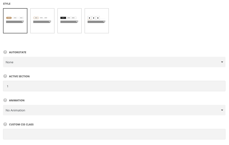
- Style – select the most suitable style of the tabs for your site.
- Autorotate – select the time of accordion tabs autoplay in seconds, if needed.
- Active section – select what section is opened by default. To have all sections closed on initial load enter non-existing number.
- Animation – choose between 14 preset animation effects.
- Custom CSS class – enter our own unique class name for the item – this is a useful option for those who want to create a specific style. E.g.: you can type custom-style class and then go to
Theme optionsGeneral optionsCustom CSS/JSCustom CSSfield and write your own CSS code with this class to get your own style.
Tabs style
- Border radius – set the border radius for the tabs to have rounded corners. For Classic Rounded and Simple styles only.
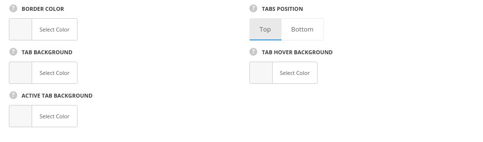
- Border color – choose the border color. The default border color is #e6e6e6.
- Tabs position – select tabs navigation position. Top and bottom positions are available.
- Tab background – set the background color for the tabs. The background color is not set by default.
- Tab hover background – set the background hover color for the tabs. The background color is not set by default.
- Background color – set the background color for inactive tabs. The background is not set by default.
- Hover background color – set the hover background color for inactive tabs. The background is not set by default.
- Active tab background color -select the background color for the active tab. The default background color for the style Classic Rounded is inherited from
Theme OptionsStyling OptionsThird site color. The background color for the style Simple is transparent, for the style Square background color is #1b1b1, for the style Big icon color is #fff.
Content style
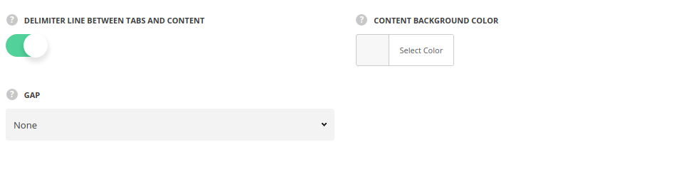
- Delimiter line between tabs and content – set it to Enable display divider between tabs and content.
- Content background color– set the background for tabs content. The color is not set by default.
- Gap – select the gap between the bottom of the tabs and the content.
Title style
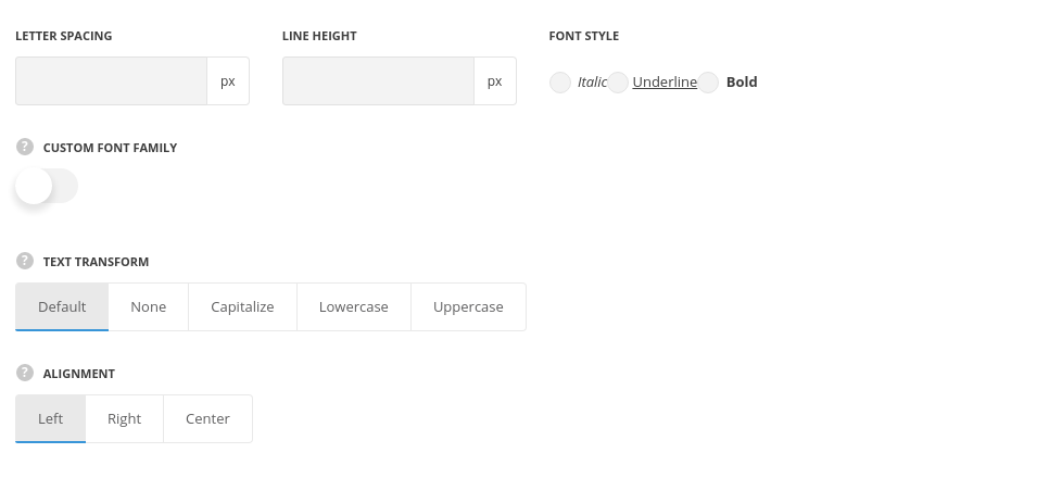
- Line-height – set the needed distance between lines in the title text.
- Letter spacing – set the needed distance between letters.
- Font style – select the font weight and style (bold, italic) for the title.
- Custom font family – set it to Enable to use custom Google font.
- Font Family – select the font family from the drop-down list.
- Font style – select the font weight and style (bold, italic) for the title.
- Text transform – set the text-transform value for the tab’s title. The default value is Uppercase.
- Alignment – set the tab title alignment. Left, right and center positions are available.
- Font size – set the font size of the tabs.
- Title color – set the font color for the tab. The default color is inherited from
Theme OptionsStyling optionsLink optionsLink Typographysection. - Title hover color – set the text color on hover. The default color is inherited from
Theme OptionsStyling optionsLink optionsLink hover color. - Active tab title color – set the text color for the active tab. The default color is inherited from
Theme OptionsStyling optionsLink optionsLink Typographysection. - Active tab title hover – set the text color for the active tab. The default color is inherited from
Theme OptionsStyling optionsThird site colorsection. - Underline in tab – set it to Enable to display the underlined titles.
Icon style
Set the style of the icon used in tab section. Each icon can be set in Section settings of the tab.
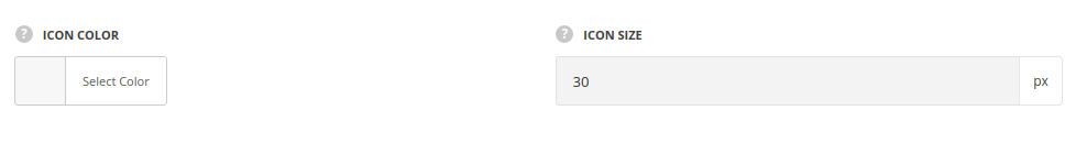
- Icon color – set the icon color.The default color is inherited from
Theme OptionsStyling optionsLink optionsLink Typographysection. - Icon size – set the size for the icon.
Design options
Add any margin, border, and padding. Both, pixels and percents are acceptable.

- Margin – enter the needed value for the margins, negative values and percents can be accepted.
- Border – enter the needed value for the border. Note, you also have to select its style and color to display it on the site.
- Border color – select the color for the border.
- Border style – select the style of the border – solid, dotted, etc.
- Border radius – set the value for border radius to have rounded corners of the border.
- Padding – enter the needed values for the element’s padding.
More information about margin, border and padding you may find in this post.
- Background – select the color.
- Image – select the image to be set as the background.
- Background attachment (in the drop-down list) – select the background-attachment for the image.
- Theme defaults – the default image position – the full size aligned top left.
- Cover – the image will fit it’s container: it’ll be resized to make the narrowest side fit the container so that there will be no blank spaces inside.
- Contain – the image will have the biggest side that will fit the container: at least one side will fit the container and there may be gaps between the image and the container.
- Repeat – the image will be repeated and create a pattern.
- No Repeat – the image will be inserted full width, aligned top left, and with no repeat.
More examples of background image attachment you may find in this post.
- Box controls – set it to Enable in case you want to set the same margins/borders/paddings for all four sides. It’ll save our time, as the inserted value will be applied to the top, right, bottom and left elements.
Section settings
By clicking on edit icon of each section you can set the icons for it and customize it to your needs.
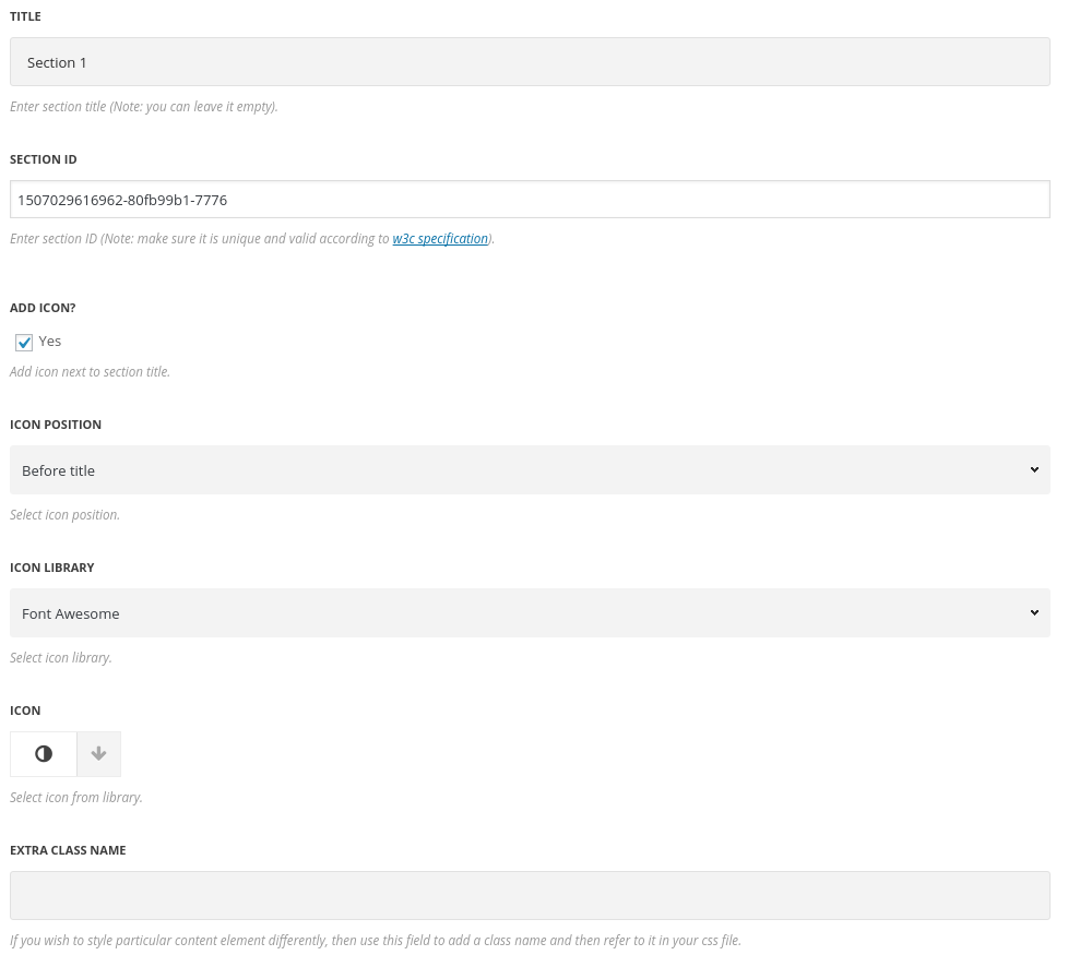
- Title – enter the title of the section.
- Section ID – enter section ID. Note: make sure it is unique and valid according to W3c specification.
- Icon – set it to Enable to show the icon in the Tabs module.
- Icon position – select position of the icon in the tab. It can be set before and after the title.
- Icon library – choose the icon library for the module.
- Select icon – select the icon to be displayed in the module.
- Extra CSS name – enter our own unique class name for the item – this is a useful option for those who want to create a specific style. E.g.: you can type custom-styleclass and then go to
Theme optionsGeneral optionsCustom CSS/JSCustom CSSfield and write your own CSS code with this class to get your own style.
