Before displaying the portfolio items in Portfolio module, you need to create portfolios in the corresponding section of the admin panel. Check the Portfolio item creation section of the theme documentation for more information.
You may check the examples of the portfolio module on the Portfolio module page.
General settings
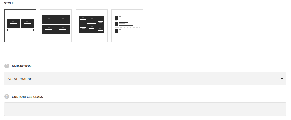
- Style – choose between 4 preset styles.
- Carousel – arranges the portfolio items into a slideshow.
- FitRows – shows regularly spaced horizontal and vertical portfolio items.
- Masonry – allows you to show portfolio items one after another, first in the horizontal direction, then vertically.
- Simple – arranges the portfolios in the list with portfolio thumbnail image displayed on the left.
Extra features
- Animation – choose between 14 preset animation effects.
- Custom CSS class – enter our own unique class name for the item – this is a useful option for those who want to create a specific style. E.g.: you can type custom-style class and then go to
Theme optionsGeneral optionsCustom CSS/JSCustom CSSfield and write your own CSS code with this class to get your own style.
Content settings
Portfolio item settings
- Content – select the content to be displayed in the module.
- Loop – select this style to display multiple portfolio items in the module.
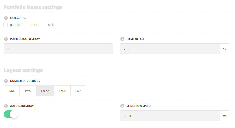
- Categories – select the portfolio categories to display on the site.
- Portfolios to show – set the number of portfolio works to display.
- Items offset – set the space between the portfolio items.
- Content visibility – the visibility options for the portfolio’s content. Show on hover and show on default variants are available.
- Single item – select this style to display certain portfolio item.
- Portfolio item to display – select the portfolio item to display in the module.
- Items offset – set the paddings of the item.
- Content alignment – select how to align the module.
- Content visibility – the visibility options for the portfolio’s content. Show on hover and show on default variants are available.
Layout settings
- Number of columns – set the number of columns for the portfolio items. Five is the maximum value. For all styles except for Simple.
- Auto slideshow – set it to Enable to activate the autoplay for the slider. For Carousel style only.
- Slideshow speed – specify the speed for the slideshow. For Carousel style only.
Content elements
- Sort panel – set it to Enable to display the sort panel with the portfolio categories above the single portfolio items.
- Category – switch it to Enable to display the featured image of the single portfolio item.
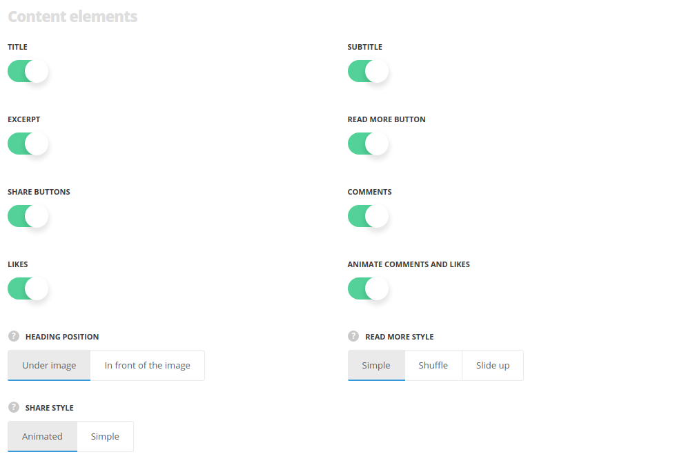
- Title – set it to Enable to display the category of the portfolio on the featured image of the single portfolio item.
- Subtitle – set it to Enable to display the subtitle of the single portfolio item.
- Excerpt – switch it to Enable to display the excerpt of the single portfolio item as its description.
- Sort panel alignment – select the horizontal alignment of the sort panel. Left, right and center positions are available. For Grid and Masonry styles only.
- Heading position – choose the displaying of the gallery info content. You can set the content under or in front of the portfolio items. For all styles except for Simple.
- Read more button – enable the read more button, if needed.
- Share buttons – set on to display share buttons.
- Comments – set of to display the comments counter.
- Likes – enable the like button.
- Animate comments and likes – set on to make the comments and likes appear on hover.
- Read more style – select the style of the read more button.
- Share style – select the style of the share.
Thumbs settings
Set the size of thumbnails. For Carousel and Fitrows styles only.
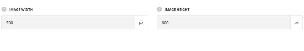
- Image width – type the image width of single portfolio item thumbnail.
- Image height – type the thumbnail height.
Hover settings
More information regarding the portfolio hover settings may find in the Portfolio options post (Portfolio hover options section).
Main hover settings
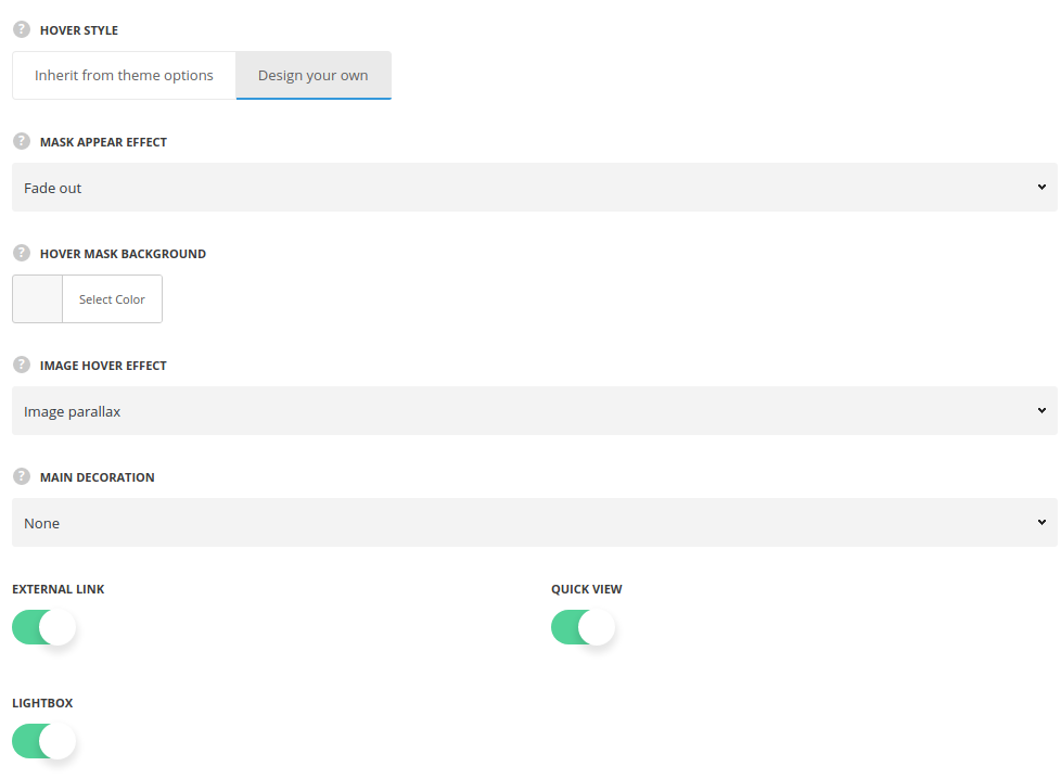
- Hover style – select if you’d like to inherit the hover settings from theme options or to create custom hover effect.
- Mask appear effect – allows you to choose one of the preset appear animations for the portfolio items. If you choose inherit from theme options the displaying will correspond to the theme options.
- Image effect – This option allows you to choose the image behavior for the portfolio items.
- Main decoration – set the decoration element which will be displayed on hover.
- None – no decoration is set for mouse hover effect.
- Heading – allows showing the portfolio item title/subtitle which is possible to link to the portfolio page itself, to the external link or open the image in lightbox.
- Heading decoration – choose the style for the heading hover decoration.
- Hover link – set the link for the plus icon. It can link to inside (inner page of single portfolio item) and to lightbox.
- Show title – set to Enable if you want the portfolio item title to be displayed on hover.
- Show subtitle – set to Enable if you want the portfolio item subtitle to be displayed on hover.
- Plus – the plus icon will be displayed as hover decoration.
- Hover link – set the link for the plus icon. It can link to inside (inner page of single portfolio item) and to lightbox.
- Plus position – set the Plus decoration position.
- Plus background – set the Plus decoration’s background. This option is not available for ‘Middle of the project‘ plus position.
- Lines – the lines will be displayed as hover decoration.
- Hover link – set the link for the plus icon. It can link to inside (inner page of single portfolio item) and to lightbox.
- Dots – three dots will be displayed as hover decoration.
- Hover link – set the link for the plus icon. It can link to inside (inner page of single portfolio item) and to lightbox.
Title typography
These settings are inherited from Theme options Custom typography Blog heading Typography.
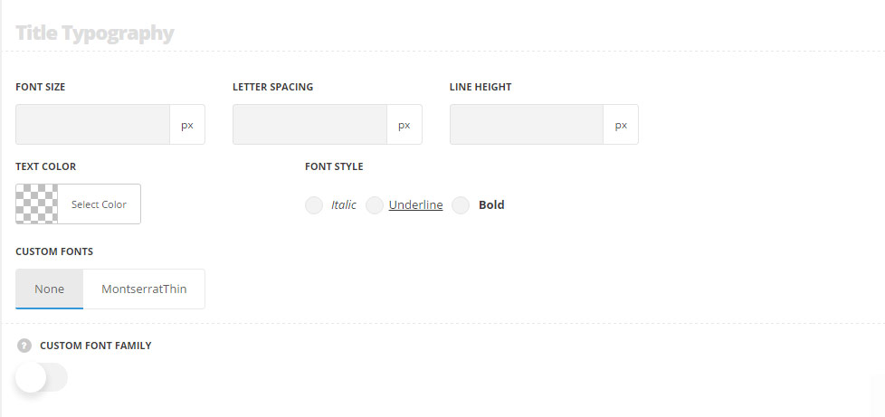
- Font size – set the font size you need to use in the title.
- Letter spacing – set the needed distance between letters.
- Line-height – set the needed distance between lines in the title text.
- Text color – set the color of the font.
- Font style – select the font weight and style (bold, italic) for the title.
- Custom font family – set it to Enable to use custom Google font.
- Font Family – select the font family from the drop-down list.
- Font style – select the font weight and style (bold, italic) for the title.
