Help your site visitors contact you directly with contacts block.
You may see the example of the module on the Contact block page.
General settings
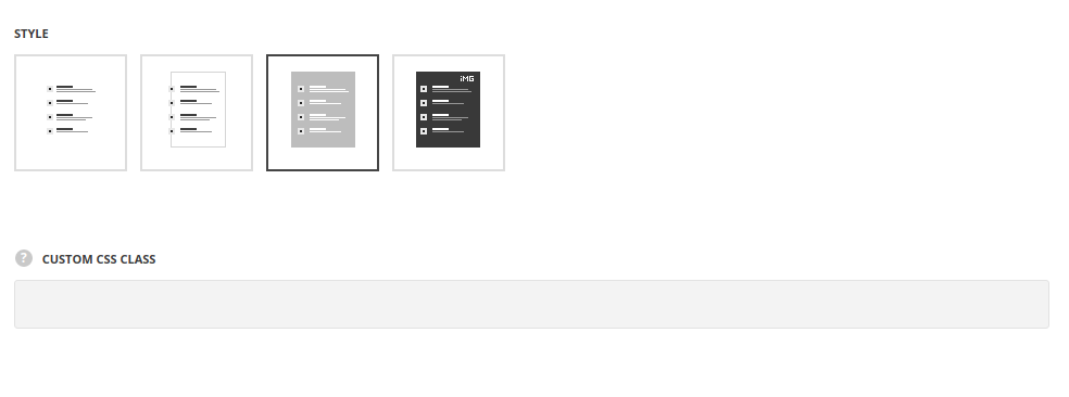
- Style – select the most suitable style of the contact block for your site.
- Simple – each contact block fields are displayed separately as a list.
- Bordered – there is the border around the contact block displayed.
- Background – there is background color set for the contact block.
- Image – there is background image set for the contact block.
- Custom CSS class – enter our own unique class name for the item – this is a useful option for those who want to create a specific style. E.g.: you can type custom-style class and then go to
Theme optionsGeneral optionsCustom CSS/JSCustom CSSfield and write your own CSS code with this class to get your own style.
Content settings
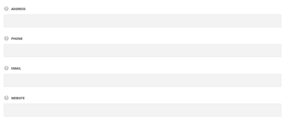
- Address – type the physical address of your company.
- Phone – type the phone number for contacts.
- Email – type the email address.
- Website – specify the website.
Decoration
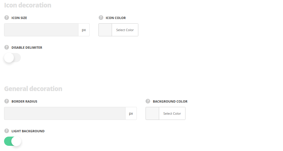
- Icon size – select the size for the icons for the module. The default size is 36px, the max icon size is 50px and min icon size is 10px.
- Thumb size – set the size of the icon’s thumbnail. Max size is 500px.se
- Icon background – specify the background color of the icon.
- Icon color – specify the color of the icon.
- Border radius – set the border radius of the icon’s thumbnail to have rounded corners. Max value is 60px.
- Thumb border style – select one of the available border styles for the icon’s thumbnail.
- Disable delimiter – set it to Enable in case you want to hide the divider line between the titles and contacts.
General decoration
Style the block decoration.
- Border radius – set the value to make the corners rounded.
- General Border Style – select the border style, for Bordered style only.
- General Border Width – set the border width, for Bordered style only.
- General Border Color – set border color, for Bordered style only.
- Background Color – select the background color, for Background and Image styles.
- Background Image – select the background image from the Media library, for Image style only.
- Background Image Repeat – select whether you want to repeat the image to create a pattern, for Image style only.
- Light background– set it to Enable in case the background is dark and you want to switch all fonts for dark color scheme.
Animation
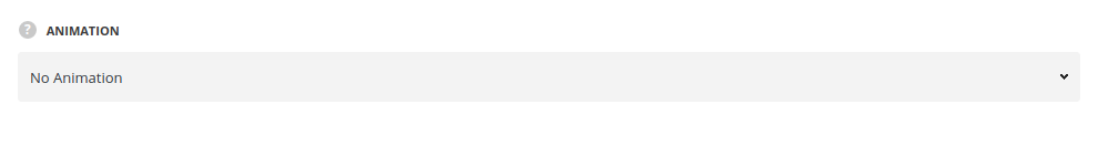
- Animation – choose between 14 preset animation effects.
