Pie Charts are convenient tools for presenting the colored diagrams in a simple and clear way.
You may also add the icons to make to pie charts noticeable and informative.
More examples of the module can be found here.
General settings
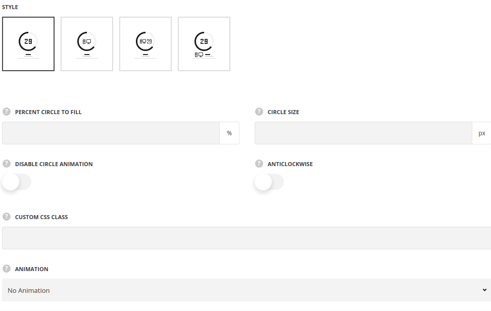
- Style – select the best suitable style for the pie chart element. All the available styles examples can be found on this page.
- Percent circle to fill – select how much of the circle radius to fill.
- Circle size – set the size of the pie chart circle.
- Disable circle animation – switch it to Enable to deactivate the animation on the diagram.
- Anticlockwise – switch it to Enable to set the direction for the animation anticlockwise.
- Animation – choose between 14 preset animation effects.
- Custom CSS class – enter our own unique class name for the item – this is a useful option for those who want to create a specific style. E.g.: you can type custom-style class and then go to
Theme optionsGeneral optionsCustom CSS/JSCustom CSSfield and write your own CSS code with this class to get your own style.
Content settings
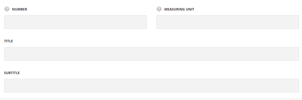
- Number – specify the number of the progress.
- Measuring unit – set the item, e.g. per cents, money, etc.
- Title – enter the title for the module.
- Subtitle – enter the subtitle for the module.
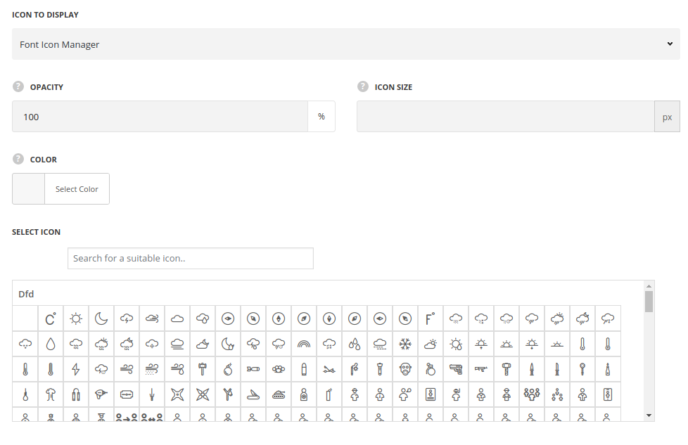
Icon settings
- Icon to display – select the icon to display.
- Font icon manager – select the icon from the installed pack.
- Opacity (0-100) % – specify icon transparency, if needed.
- Size of icon – specify the icon size.
- Color – assign a color for the icon.
- Select icon – select the icon from the pack.
- Custom image icon – set an image instead of the icon.
- Upload image – select the image from the media library.
- Opacity (0-100) % – specify the image transparency.
- Size of icon – set the width of the image.
- Font icon manager – select the icon from the installed pack.
Style settings
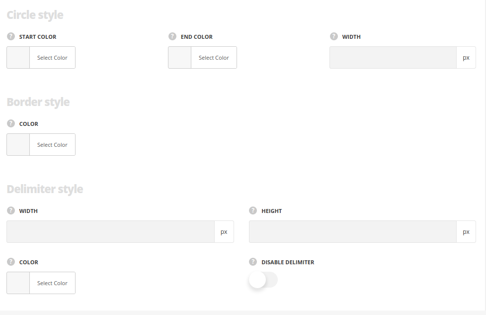
Circle style
- Start color – set the start color for the pie chart circle. The default value is #3498db.
- End color – choose the end color for the pie chart circle. The default value is #3498db.
- Width – specify the width of the pie chart circle.
Border style
- Color – set the border color. The default border color is #e7e7e7.
Delimiter style
- Width – set the width for the delimiter to create different shapes
- Height – set the height for the delimiter to create different shapes.
- Color – specify the delimiter color.
- Hide element – put the check mark in case you want to disable the delimiter.
Typography settings
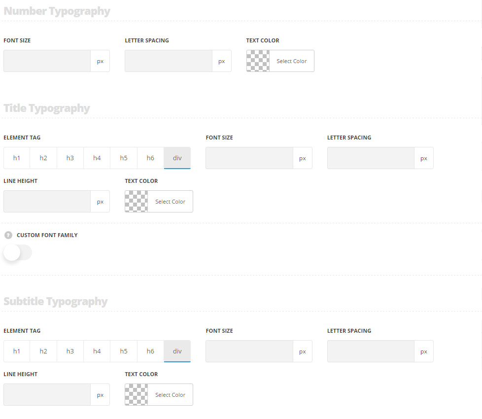
Number typography
These settings are inherited from Theme options Custom typography Feature title typography. And the following values are inherited from theme files are as follows: font-size – 27px.
- Font size – set the font size you need to use in the number in the module.
- Text color – set the color of the text in the module.
- Letter spacing – set the desired distance between letters
Title typography
These settings are inherited from Theme options Custom typography Feature title typography.
- Element tag – select the tag for the title.
- Font size – set the font size you need to use in the title.
- Letter spacing – set the needed distance between letters.
- Line-height – set the needed distance between lines in the title text.
- Text color – set the color of the font.
- Font style – select the font weight and style (bold, italic) for the title.
- Custom font family – set it to Enable to use custom Google font.
- Font Family – select the font family from the drop-down list.
- Font style – select the font weight and style (bold, italic) for the title.
Subtitle typography
These settings are inherited from Theme options Custom typography Subtitle typography.
- Element tag – select the tag for the subtitle.
- Font size – set the font size you need to use in the subtitle.
- Letter spacing – set the needed distance between letters in the subtitle.
- Line-height – set the needed distance between lines in the subtitle text.
- Text color – set the color of the font.
- Font style – select the font weight and style (bold, italic) for the subtitle.
