Mobile header options

Style the mobile header for your site for better naviagtion

Mobile header options

This options section allows you to style the mobile header on the site.

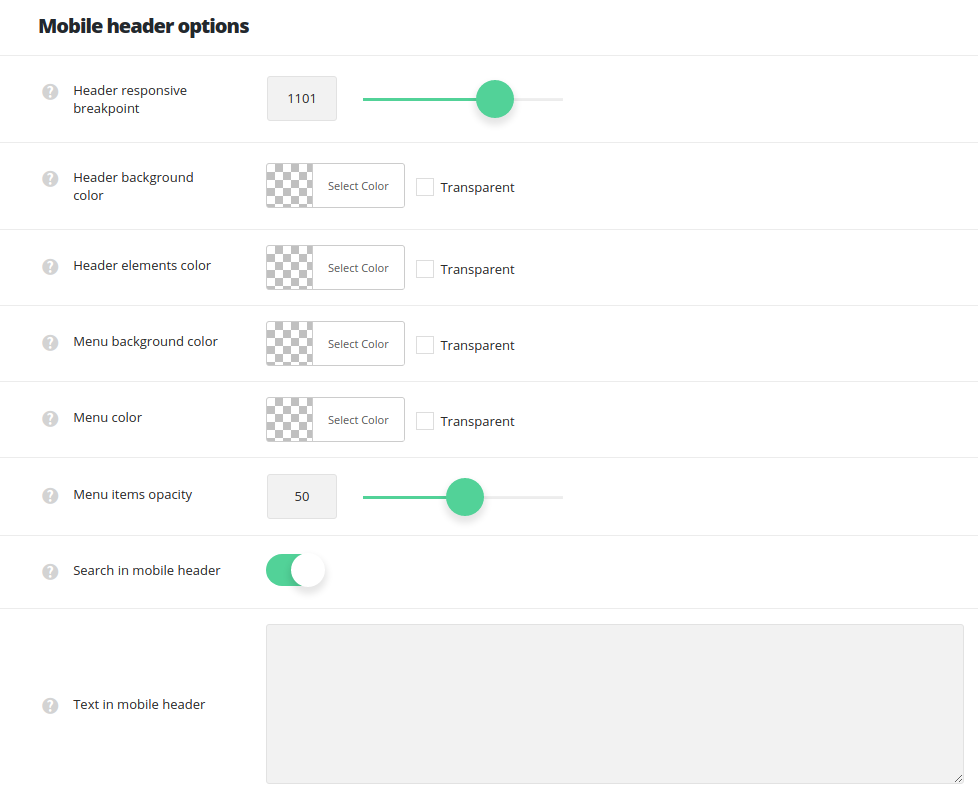
  • Header responsive breakpoint – set the screen size on which the mobile header will appear on the site (768px is the minimum width and 1280px is the maximum one).
  • Header background color – choose the background color for the mobile header.
  • Header elements color – select the text color for the elements set in the mobile header.
  • Menu background color – select the background color for the opened (active) mobile header.
  • Menu color – set the color for the mobile menu items (menu titles and hamburger icon).
  • Menu items opacity – set the transparency of the mobile menu links.
  • Search in mobile header – set on to display search form in mobile menu.
  • Text in mobile header – enter any text you need in this field, it’ll be displayed below the menu and search form.
div#stuning-header .dfd-stuning-header-bg-container {background-image: url(https://rnbtheme.com/documentation/wp-content/uploads/2017/01/hands1.jpg);background-size: cover;background-position: center center;background-attachment: initial;background-repeat: no-repeat;}#stuning-header div.page-title-inner {min-height: 550px;}#main-content .dfd-content-wrap {margin: 0px;} #main-content .dfd-content-wrap > article {padding: 0px;}@media only screen and (min-width: 1101px) {#layout.dfd-portfolio-loop > .row.full-width > .blog-section.no-sidebars,#layout.dfd-gallery-loop > .row.full-width > .blog-section.no-sidebars {padding: 0 0px;}#layout.dfd-portfolio-loop > .row.full-width > .blog-section.no-sidebars > #main-content > .dfd-content-wrap:first-child,#layout.dfd-gallery-loop > .row.full-width > .blog-section.no-sidebars > #main-content > .dfd-content-wrap:first-child {border-top: 0px solid transparent; border-bottom: 0px solid transparent;}#layout.dfd-portfolio-loop > .row.full-width #right-sidebar,#layout.dfd-gallery-loop > .row.full-width #right-sidebar {padding-top: 0px;padding-bottom: 0px;}#layout.dfd-portfolio-loop > .row.full-width > .blog-section.no-sidebars .sort-panel,#layout.dfd-gallery-loop > .row.full-width > .blog-section.no-sidebars .sort-panel {margin-left: -0px;margin-right: -0px;}}#layout .dfd-content-wrap.layout-side-image,#layout > .row.full-width .dfd-content-wrap.layout-side-image {margin-left: 0;margin-right: 0;}