Info banner module is the perfect solution for stylish image banners presentation.
It will attract the visitors and show the necessary information.
You may check the example of the info banner module on the Info banner page.
General settings
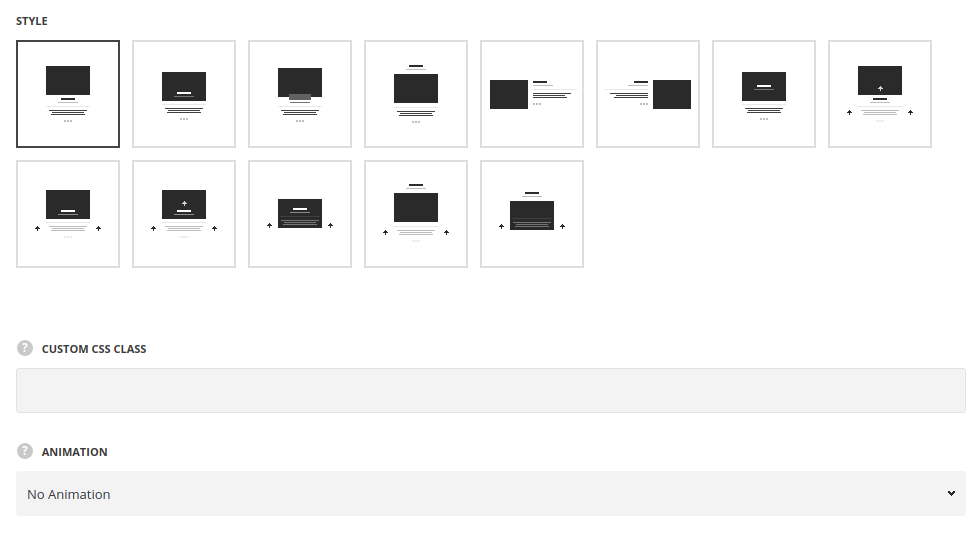
- Style – select the best suitable style for your site among the 11 preset styles. The examples of each style can be found on the Info banner page.
- Content alignment – set the horizontal alignment for the banner’s content. Left, right and center positions are available (for all the styles except for the Left and right content styles).
- Animation – choose between 14 preset animation effects.
- Custom CSS class – enter our own unique class name for the item – this is a useful option for those who want to create a specific style. E.g.: you can type custom-style class and then go to
Theme optionsGeneral optionsCustom CSS/JSCustom CSSfield and write your own CSS code with this class to get your own style.
Content settings
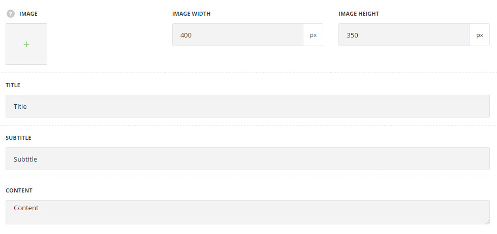
- Image – select image from media library for the Info banner module.
- Image width – specify the width of the image.
- Image height – specify the height of the image.
- Image on hover – select image from media library for the Info banner module to be displayed on hover (for Hover image changing style only).
- Title – enter the title for the Info Banner module.
- Subtitle – enter the subtitle for the Info Banner module.
- Content – enter the main content for the Info Banner module.
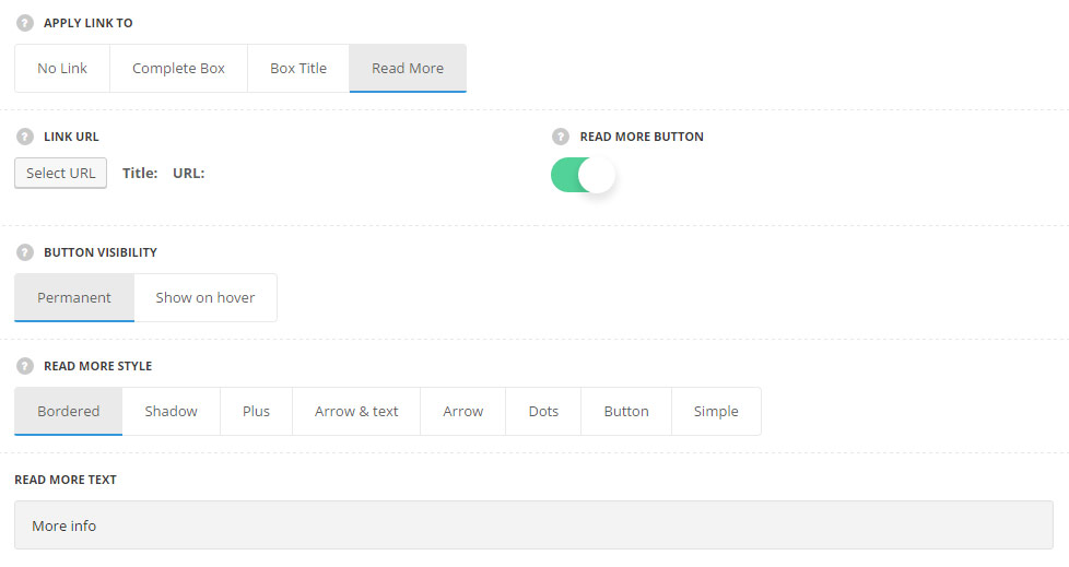
- Apply link to – select whether there will be a link added to Info Banner module and to what element it will be applied.
- No link – select it to disable the link for Info Banner item.
- Complete box – select this variant to apply the link to the whole Info Banner item.
- Box title – the link will be applied to the Info Banner ox title.
- Read more – select it to apply the link to the read more button.
- Read more button – set it to Enable to activate the read more button for Info Banner module.
- Button visibility – choose the visibility options for the Read more button. Permanent and Show on hover variants are available.
- Read more style – choose one of the 8 preset read more styles.
- Bordered – the read more button has a border around in idle state.
- Shadow – the read more button displays the text in idle state only and on hover the shadow decoration is added.
- Plus – plus icons is displayed as a read more button.
- Arrow & text – the arrow icon is displayed in idle state and the text of the button slides on hover.
- Arrow – the arrow icon is displayed as a read more button with sliding effect on hover.
- Dots – three dots are displayed as the button.
- Button – button with a colored background is displayed.
- Simple – the read more has transparent background with icon on hover and animation effect on hover.
- Read more text – enter the text for your button. Available for Bordered, Shadow, Arrow & Text, Button and Simple styles only.
Style settings
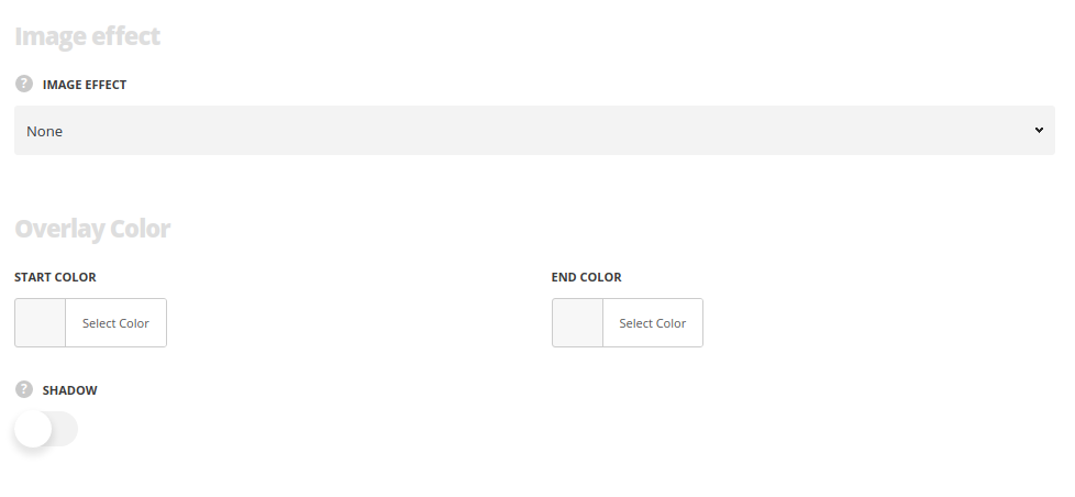 Image effect – select the hover effect for the image. You may select image parallax, blur, grow and grow with rotation effects or select none to disable the hover effect.
Overlay gradient
For Bottom content, Centered title, Content on image, Hovered title bottom, Hovered title center, Hovered center styles only.
- Start color – select the start color for the background mask which is displayed on hovered image (the solid color will be displayed).
- End color – select the end color for the background gradient mask which is displayed on hovered image (to have the gradient hover effect).
- Shadow – set it to Enable to display shadow for the module.
- Shadow visibility – select style of item shadow – select the shadow style – always visible or only on hover.
Delimiter options
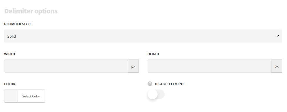
- Delimiter style – select the delimiter style.
- Width/Height – specify the width and height of the module to achieve different shapes.
- Color – assign the color for a delimiter.
- Hide element – set it to Enable in case you want to hide delimiter in the module.
Typography settings
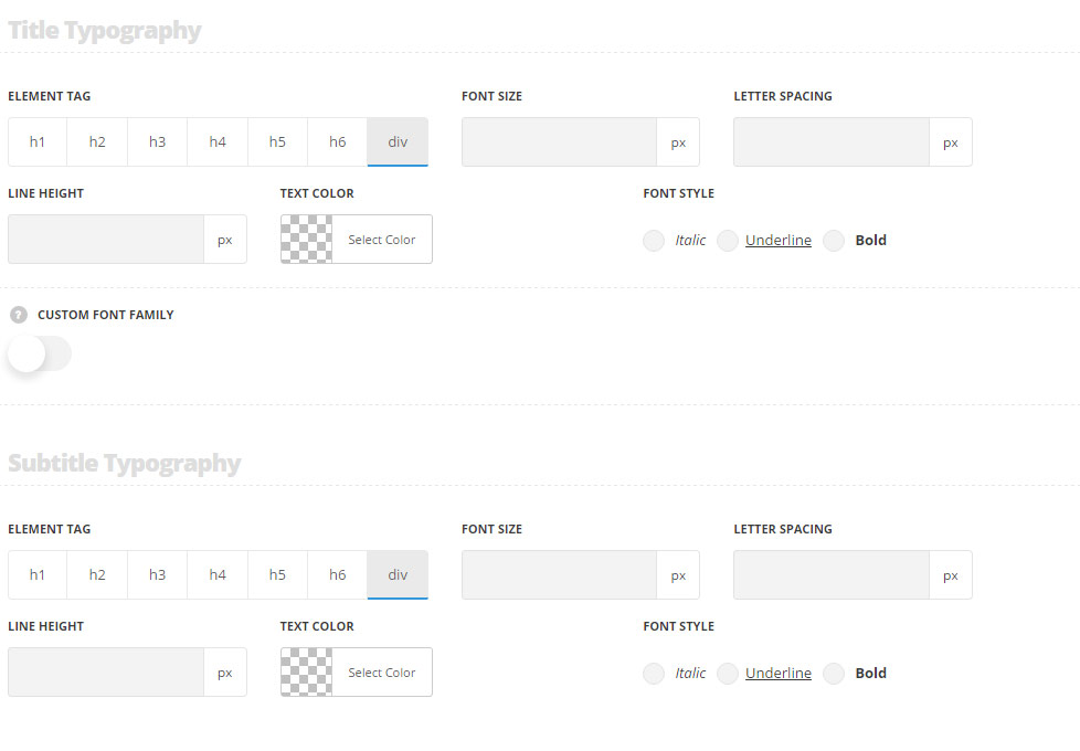
Title typography
These settings are inherited from Theme options Custom typography Feature Title Typography.
- Element tag – select the tag for the title.
- Font size – set the font size you need to use in the title.
- Letter spacing – set the needed distance between letters.
- Line-height – set the needed distance between lines in the title text.
- Text color – set the color of the font.
- Font style – select the font weight and style (bold, italic) for the title.
- Custom font family – set it to Enable to use custom Google font.
- Font Family – select the font family from the drop-down list.
- Font style – select the font weight and style (bold, italic) for the title.
Subtitle typography
The typography settings are inherited from Theme options Custom typography Subtitle typography.
- Element tag – select the tag for the subtitle.
- Font size – set the font size you need to use in the subtitle.
- Letter spacing – set the needed distance between letters in the subtitle.
- Line-height – set the needed distance between lines in the subtitle text.
- Text color – set the color of the font.
- Font style – select the font weight and style (bold, italic) for the subtitle.
- Custom font family – set it to Enable to use custom Google font.
- Font Family – select the font family for the drop-down list.
- Font style – select the font weight and style (bold, italic) for the subtitle.
Content typography
The typography settings are inherited from Theme options Custom typography Text typography.
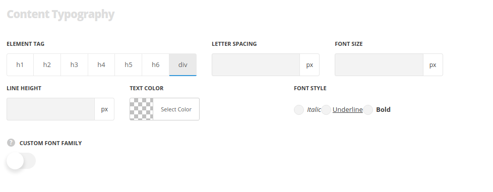
- Element tag – select the tag for the text in module.
- Font size – set the font size you need to use in the text in module.
- Letter spacing – set the needed distance between letters.
- Line-height – set the needed distance between lines.
- Text color – set the color of the font.
- Font style – select the font weight and style (bold, italic).
