The columns are alwsays added inside the rows. You may find more information about Row in this post and more details about the Row Responsive options can be found in this post. of the theme documentation.
After you create a row, you may divide it into columns to structure the content. Find the columns icon in the top left corner of the row and divide the row into the preset columns. You may also select Custom columns settings and insert the needed values.
You may use fractions or span tags to specify columns. Note, the page consists of 12 columns – keep that in mind while dividing the row.
As an example, you may divide the row into 4 columns with 1st and 3rd smaller ones using such division: span2 + span4 + span2 + span4 or 1/6 + 1/3 + 1/6 + 1/3.
Similarly, you may divide the row into 5 equal columns. However, you’ll have to set 1 column as left and right paddings: span1 + span2 + span2 + span2 + span2 + span2 + span1 or 1/12 + 1/6 + 1/6 + 1/6 + 1/6 + 1/6 + 1/12.
Default 12 columns grid
1/12 or span 1
1/12 or span 1
1/12 or span 1
1/12 or span 1
1/12 or span 1
1/12 or span 1
1/12 or span 1
1/12 or span 1
1/12 or span 1
1/12 or span 1
1/12 or span 1
1/12 or span 1
4 columns with smaller 1st and 3rd columns
1/6 or span 2
1/3 or span 4
1/6 or span 2
1/3 or span 4
5 columns with side paddings
1/12 or span 1
1/6 or span 2
1/6 or span 2
1/6 or span 2
1/6 or span 2
1/6 or span 2
1/12 or span 1
After you create a column, you may proceed to its customization. Click on the Edit column button at the top of it to open the settings.
General settings
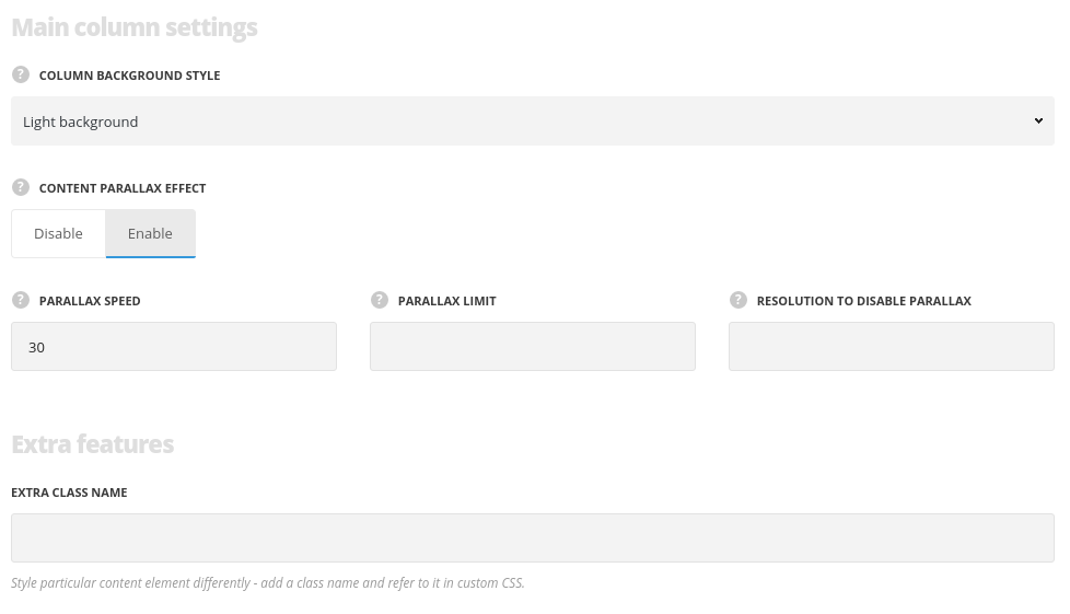
Main column settings
- Column background style – choose the background style for the column. The text colors will be changed according to the style you choose to make it more readable. Light and dark variants are available.
- Content parallax effect – switch it to Enable to have the parallax effect for the content.
- Parallax speed – control the speed of parallax. Values from 1 to 100 are acceptable.
- Parallax limit – set the parallax shift limit. Values from 50 to 400 are acceptable. Units should be set in px.
- Resolution to disable parallax – set the width of the device from which the parallax should be deactivated.
Column background style and Parallax effect
Column with Light Background style
Text color is dark by default and it’s properly visible on light background. Custom text color can be applied to the text.
Column with Dark Background style
Text color is changed to white so that it could be properly visible on dark background. Custom text color isn’t changed to white.
Column with Content parallax effect
The column and is content slide up and down while one is scrolling the page. Parallax speed and vertical shift limit can be set in the options.
Extra features
- Custom CSS class – enter our own unique class name for the item – this is a useful option for those who want to create a specific style. E.g.: you can type custom-style class and then go to
Theme optionsGeneral optionsCustom CSS/JSCustom CSSfield and write your own CSS code with this class to get your own style.
Design settings
Add any margin, border, and padding for the column. Both, pixels and percents are acceptable.

- Margin – enter the needed value for the margins, negative values and percents can be accepted.
- Border – enter the needed value for the border. Note, you also have to select its style and color to display it on the site.
- Border color – select the color for the border.
- Border style – select the style of the border – solid, dotted, etc.
- Border radius – set the value for border radius to have rounded corners of the border.
- Padding – enter the needed values for the element’s padding.
- Background – select the color of the column.
- Image – select the image to be set as the column background.
- Background attachment (in the drop-down list) – select the background-attachment for the image.
- Theme defaults – the default image position – the full size aligned top left.
- Cover – the image will fit it’s container: it’ll be resized to make the narrowest side fit the container so that there will be no blank spaces inside.
- Contain – the image will have the biggest side that will fit the container: at least one side will fit the container and there may be gaps between the image and the column.
- Repeat – the image will be repeated and create a pattern.
- No Repeat – the image will be inserted full width, aligned top left, and with no repeat.
- Box controls – set it to Enable in case you want to set the same margins/borders/paddings for all four sides of the column. It’ll save our time, as the inserted value will be applied to the top, right, bottom and left elements.
Margin, border and padding
Margin is a space between the element and its container. It’s blue in the example. In this case, margin is set for the inner row (and it indicates the space to the containing column).
Border is a frame of the column. It’s dark blue in the example.
Padding is an inner space in the column – from the border to the content. It’s white in the example.
Background image position
Theme default, Cover and Contain
Background image is bigger than the column.
Theme default style displays the image at its original size. You can set the background image position within a certain option. It’s set to center center in this example.
Background image is bigger than the column.
Cover style shrinks the image so that its smaller side fits the column size, i.e., it covers the column background completely.
Background image is bigger than the column.
Contain style shrinks the image so that it’s largest side fits the column size, i.e., it may leave gaps in the column background.
Background image position
No Repeat and Repeat
Background image is smaller than the column.
No Repeat style displays the image at its original size and it won’t be duplicated to fill the column background. You can set the background image position within a certain option. It’s set to center center in this example.
Background image is smaller than the column.
Repeat style displays the image at its original size and it duplicates to fill the column background. You can set the background image position within a certain option. It’s set to center center in this example.
Responsive options
You may check more information in the official Visual Composer tutorials. Please, check this video on the Responsive Controls for Width and Offset.
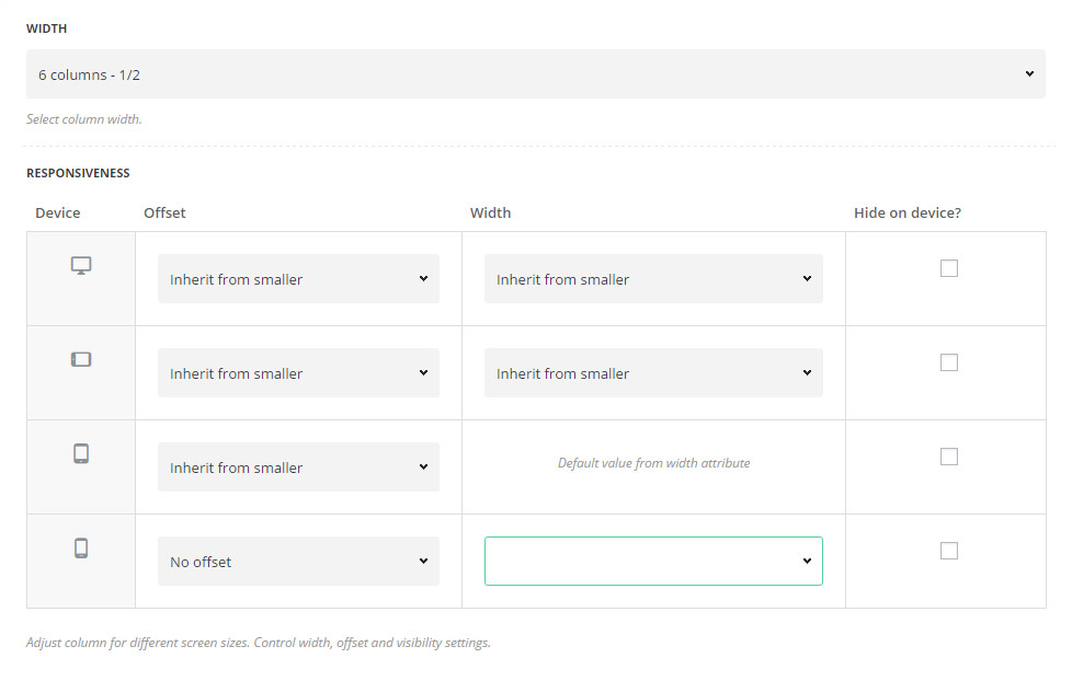
- Width – set the column width from the list of the available options.
Responsiveness
Adjust column for different screen sizes. Control width, offset and visibility settings.
Device allows you to set different column behavior on different screen sizes:
- Large – for screen sizes bigger than 1280px.
- Medium – for screen sizes from 1280px to 1024px.
- Small – for screen sizes from 1024px to 800px.
- Extra-small – for screen sizes smaller than 800px.
- Offset – allows you to set the offset for the column. You may use columns to specify the offset value.
- Width – allows you to set the different width for the column on different screen sizes to restructure the content properly.
- Hide on device? – set it to Enable to hide the elements on certain screen sizes.
Responsive settings
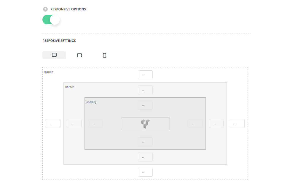
- Responsive options – switch it to Enable to customize the column settings for different devices.
- Desktop – set the desired margins, borders, and paddings for the column for the screen resolutions from 1280px to 1025px.
- Tablet – set the desired margins, borders, and paddings for the column for the screen resolutions from 1024px to 800px.
- Mobile – set the desired margins, borders, and paddings for the column for the screen resolutions less than 800px.
