Present the progress bar in the stylish way for your customers with multi-purpose Progress Bar module.
You may check the examples of the modules with this link.
General settings
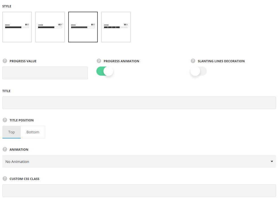
- Style – select the style of the progress bar which suits you more.
- Simple – the progress bar is displayed in a simple style, without the decorations borders.
- Bordered – the progress bar is displayed with border for the unfilled area.
- Diagonal – there is diagonal line decoration added for the progress bar.
- Tiled – the progress bar content is divided into tiles as a decoration effect.
- Progress value – enter the progress value.
- Progress animation – switch it to Enable to activate the progress bar animation.
- Slanting lines decoration – set it to Enable to add the slanting lines decoration on progress line. For Diagonal style only.
- Title – enter the title for the progress bar element.
- Title position – select the position for the progress bar text. Top and bottom positions are available.
- Animation – choose between 14 preset animation effects.
- Custom CSS class – enter our own unique class name for the item – this is a useful option for those who want to create a specific style. E.g.: you can type custom-style class and then go to
Theme optionsGeneral optionsCustom CSS/JSCustom CSSfield and write your own CSS code with this class to get your own style.
Style settings
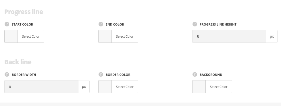
Progress line
Style the color of the filled progress value.
- Start Color – add the first color.
- End Color – add the second color to create gradient effect.
- Progress line height – allows you to set the progress bar height.
Back line
Style the general line background of the module not filled with the progress line.
- Border width – set the width of the module frame. For Bordered and Diagonal styles only.
- Border Color – set the color of the module border. For Bordered and Diagonal styles only.
- Background – set the background of the module. For Simple and Tiled styles only.
Typography settings
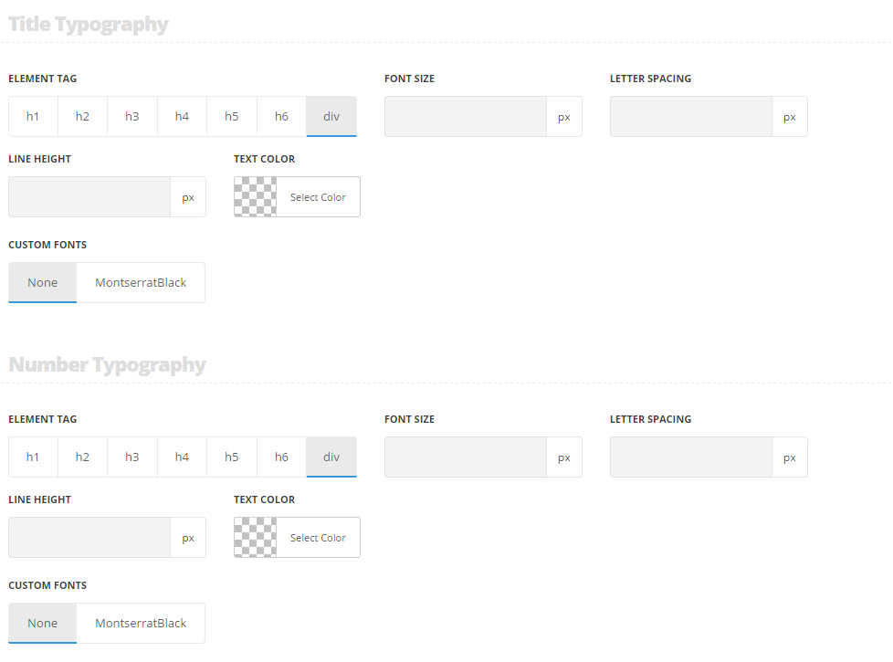
Title typography
These settings are inherited from Theme options Custom typography Subtitle Typography.
- Element tag – select the tag for the title.
- Font size – set the font size you need to use in the title.
- Letter spacing – set the needed distance between letters.
- Line-height – set the needed distance between lines in the title text.
- Text color – set the color of the font.
- Custom font family – set it to Enable to use custom Google font.
- Font Family – select the font family from the drop-down list.
- Font style – select the font weight and style (bold, italic) from the list.
Number typography
The typography settings are inherited from Theme options Custom typography Text typography.
- Element tag – select the tag for the numbers.
- Font size – set the font size you need to use in the numbers.
- Letter spacing – set the needed distance between letters in the numbers.
- Line-height – set the needed distance between lines in the numbers text.
- Text color – set the color of the font.
- Custom font family – set it to Enable to use custom Google font.
- Font Family – select the font family from the drop-down list.
- Font style – select the font weight and style (bold, italic) from the list.
