Using the Video player module you are able to present videos on your site. Customize the shortcode to get the unique design. Impress your visitors.
You may customize the shortcode and get the unique design.
You may add both full screen videos or simple players to the site.
See the examples of the Video player module on the Video module page.
General settings
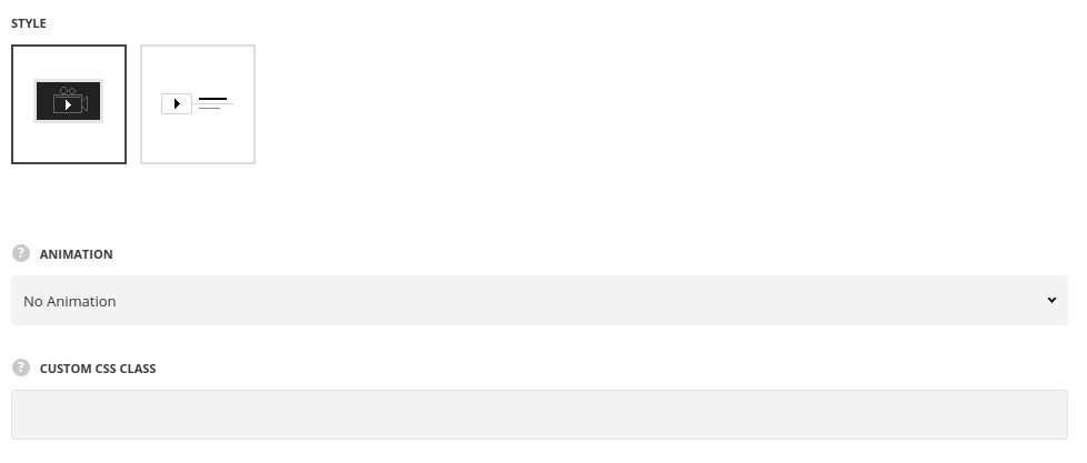
- Style – choose between 2 styles for the video player.
- Background – there is thumbnail image set for the video player as a background.
- Simple – the play button is displayed without thumbnail image.
- Select layout – select the decoration of the button, for Simple style only.
- Button alignment – select the alignment of the module in the container, for Simple style only.
- Full screen video animation – select the appear effect among the available 14 preset styles from the drop-down list. It will be applied to the full-screen video when you click on pay button.
- Animation – choose between 14 preset animation effects.
- Custom CSS class – enter our own unique class name for the item – this is a useful option for those who want to create a specific style. E.g.: you can type custom-style class and then go to
Theme optionsGeneral optionsCustom CSS/JSCustom CSSfield and write your own CSS code with this class to get your own style.
Content settings
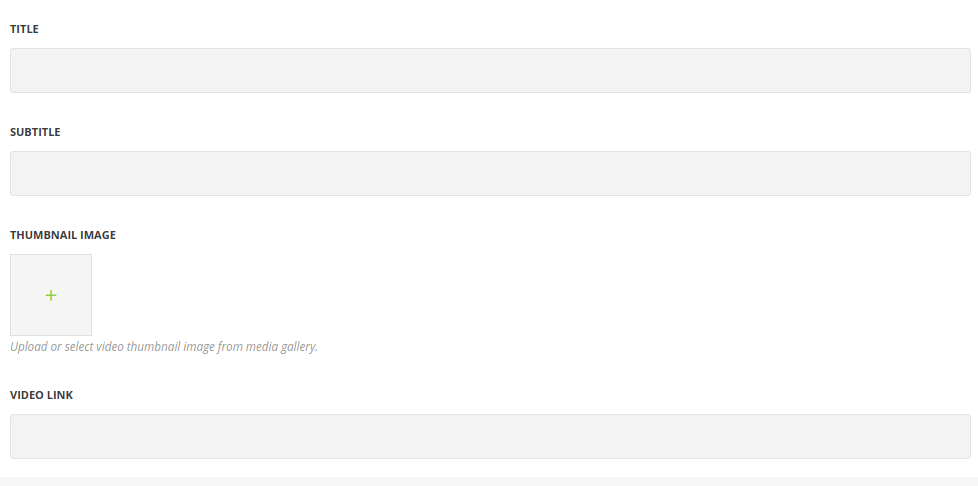
- Title – enter the title for the module.
- Subtitle – enter the subtitle for the module.
- Video link – add the link to the video. Note, the videos from media library are not supported, the link should be from the external resource.
- Thumbnail image – upload the image for the video player. For Background style only.
Style settings
For Background style
Note, if the thumbnail image is not set for the video player, the play button will have the default styles(e.g.: the video uploaded from youtube will have the default youtube button).
If you upload the thumbnail image, you can customize the play button for your site.
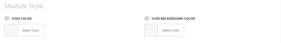
- Icon color – choose the icon color. The default color is #fff. The color for the style simple is #1b1b1b.
- Icon background – set the icon background color.The default color is rgba(27,27,27,0.7),
For Simple style
Module styles
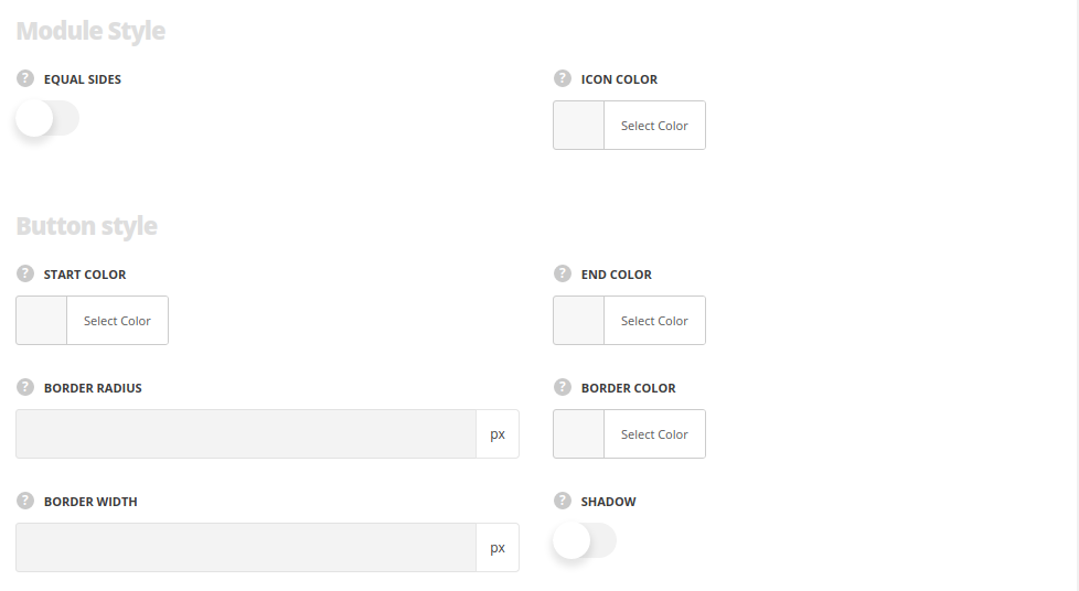
- Equal slides – switch it to Enable to make play icon’s background square or circle. To make the button circle, please, set the border radius for the icon.
- Icon color – choose the icon color. The default color is #fff. The color for the style simple is #1b1b1b.
Button style
- Start color – set the background color of the button.
- End color – set one more color to create gradient.
- Border radius – specify the border radius to make the corners rounded.
- Border color – set the border color. The default value is rgba(0,0,0,0.1).
- Border width – specify the width of the border. The default value is 1px.
- Shadow – switch it to Enable in case you want to display shadow under the button.
Delimiter style
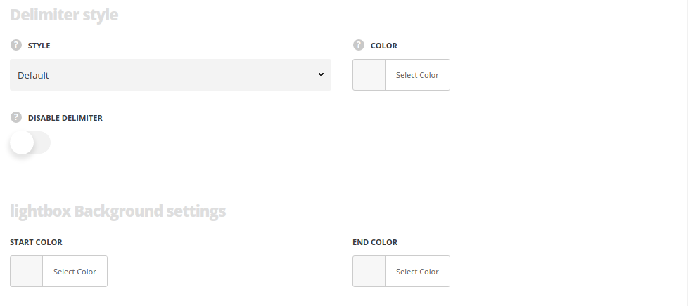
- Style – select the style of the delimiter.
- Color – set the delimiter’s color. The default value is rgba(0,0,0,0.1).
- Disable delimiter – set it to Enable in case you want to disable it in the module.
Lightbox background settings
- Start color – set the background color of the lightbox.
- End color – add one more color to create gradient effect.
Typography settings
For Simple style only
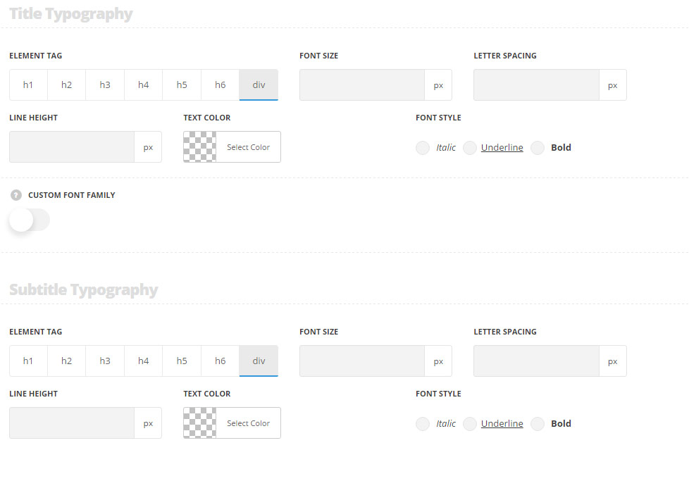
Title typography
These settings are inherited from Theme options Custom typography Feature Title Typography.
- Element tag – select the tag for the title.
- Font size – set the font size you need to use in the title.
- Letter spacing – set the needed distance between letters.
- Line-height – set the needed distance between lines in the title text.
- Text color – set the color of the font.
- Font style – select the font weight and style (bold, italic) for the title.
- Custom font family – set it to Enable to use custom Google font.
- Font Family – select the font family from the drop-down list.
- Font style – select the font weight and style (bold, italic) for the title.
Subtitle typography
The typography settings are inherited from Theme options Custom typography Subtitle typography.
- Element tag – select the tag for the subtitle.
- Font size – set the font size you need to use in the subtitle.
- Letter spacing – set the needed distance between letters in the subtitle.
- Line-height – set the needed distance between lines in the subtitle text.
- Text color – set the color of the font.
- Font style – select the font weight and style (bold, italic) for the subtitle.
