With Heading module used on the page, you can easily attract the attention of your customers and highlight the necessary titles on the page.
General settings
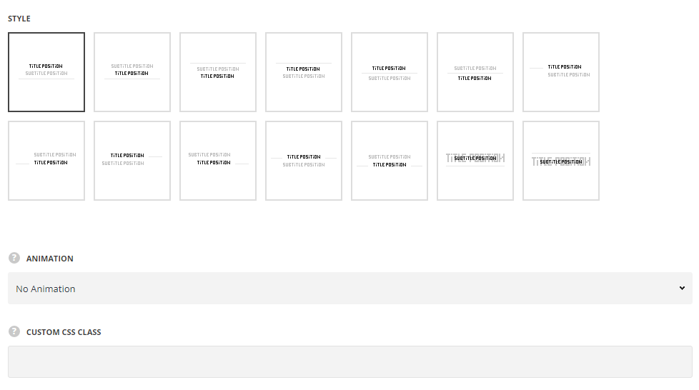
- Style – choose between 9 preset styles.
- Classic – the title is displayed on top with subtitle and delimiter below it.
- Classic title bottom – the title is displayed below the subtitle with the delimiter displayed below.
- Title top – select this style to display the title above subtitle with the delimiter between them.
- Title bottom – select this style to display the title below subtitle with the delimiter between them.
- Left delimiter – the delimiter is displayed on the left site from the content.
- Right delimiter – the delimiter is displayed on the right site from the content.
- Slides delimiter – the delimiter is displayed on the both sides: left and right from the content.
- Bottom delimiter back – the title is displayed as a background for the subtitle with the delimiter below.
- Top delimiter back – the title is displayed as a background for the subtitle with the delimiter on the top.
Extra features
- Animation – choose between 14 preset animation effects.
- Custom CSS class – enter our own unique class name for the item – this is a useful option for those who want to create a specific style. E.g.: you can type custom-style class and then go to
Theme optionsGeneral optionsCustom CSS/JSCustom CSSfield and write your own CSS code with this class to get your own style.
Content settings
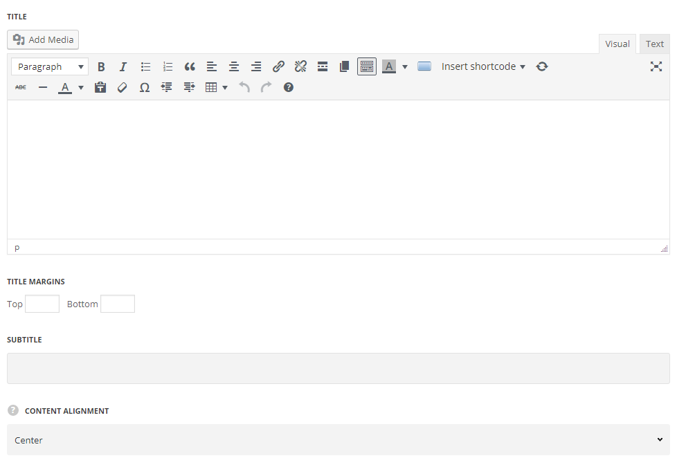
- Title – enter the title for the Heading module.
- Title margins – set the margins for the title.
- Top – set the top margin for the heading title to add the space above it.
- Bottom – set the bottom margin for the heading title to add the space below it.
- Subtitle – enter the subtitle for the Heading module.
- Subtitle margins – set the margins for the subtitle.
- Top – set the top margin for the subtitle to add the space above it.
- Bottom – set the bottom margin for the subtitle to add the space below it.
- Content alignment – select the horizontal alignment for the content. Left, right and center positions are available.
Delimiter settings
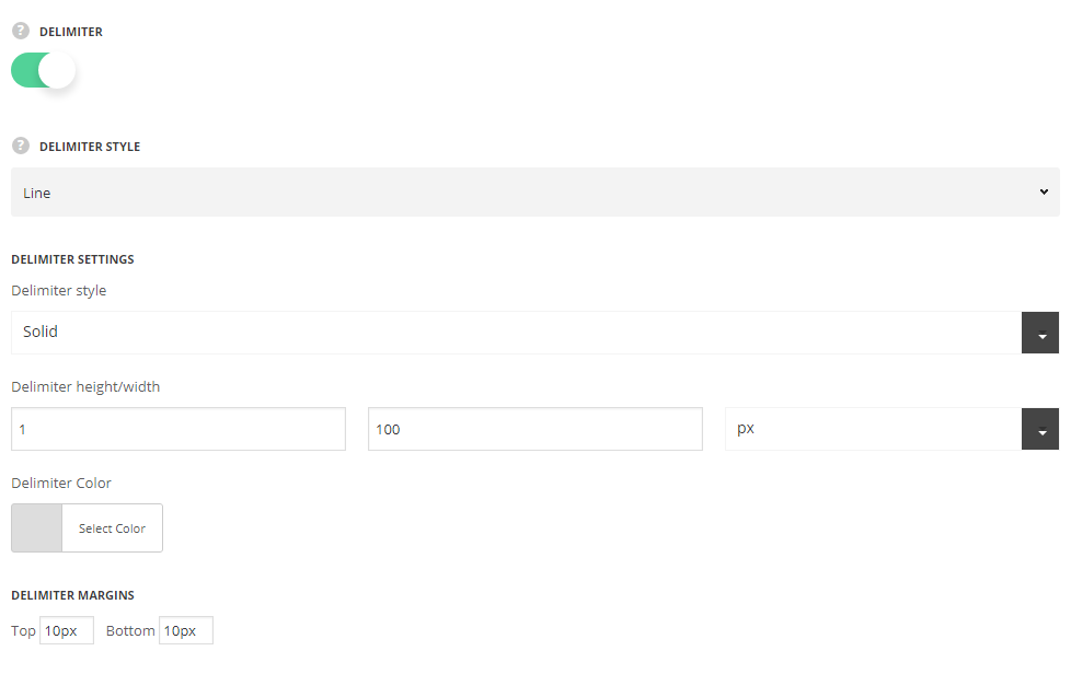
- Delimiter – set it to Enable to display the delimiter for the heading.
- Delimiter style – select the most suitable style of the delimiter for your heading.
- Line – select this style to display the line as the heading delimiter.
- Delimiter style – select one of the available delimiter styles. Dotted, dashed and solid variants are available.
- Delimiter height/width – specify the height and width for the delimiter line.
- Color – set the color for the delimiter line. The default color is inherited from
Theme OptionsStyling OptionsMain site color.
- Icon – select this variant to display the icon as the heading delimiter.
- Icon to display – select the element to be displayed in the module.
- Icon – select it to display the icon as the delimiter.
- Icon library – choose the icon library for the module.
- Select icon – select the icon to be displayed in the module.
- Icon size – set the size for the icon.
- Icon color – set the necessary color for the icon.
- Icon style – select the most suitable style fo the icon from the list of the available ones.
- Simple – the icon is displayed on the transparent background.
- Circle background – the icon is displayed in the circle with the background color set.
- Square background – the icon is displayed in the square with the background color set.
- Design your own – select this style to design the style of the icon.
- Background color – select the background color for the icon.
- Background size – select the size of the background for the icon.
- Icon border style – select the suitable style for the border of the icon. You may select the solid, dotted, dashed, double, outset and inset border styles.
- Border radius – select the border radius for button module to have rounded corners.
- Border width – set the width of the border. You may set the desired width each border: top, right, left and bottom.
- Image – select this style to display the image as the delimiter.
- Upload image – select the image to display.
- Image width – specify the width of the image.
- Image – select this style to display the image in its original sizes as the heading delimiter.
- Delimiter image – select the image to display.
- Line – select this style to display the line as the heading delimiter.
Delimiter margins
- Top – set the top margin for the delimiter to some space above it.
- Bottom – set the bottom margin for the delimiter to some space below it.
Typography settings
Title typography
These settings are inherited from Theme options Custom typographyH2 Title Typography.
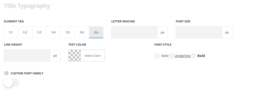 Element tag – select the tag for the title.
- Font size – set the font size you need to use in the title.
- Letter spacing – set the needed distance between letters.
- Line-height – set the needed distance between lines in the title text.
- Text color – set the color of the font.
- Font style – select the font weight and style (bold, italic) for the title.
- Custom font family – set it to Enable to use custom Google font.
- Font Family – select the font family from the drop-down list.
- Font style – select the font weight and style (bold, italic) for the title.
Subtitle typography
These settings are inherited from Theme options Custom typographyH3 Subtitle Typography.
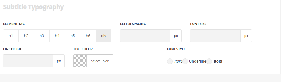 Element tag – select the tag for the subtitle.
- Font size – set the font size you need to use in the subtitle.
- Letter spacing – set the needed distance between letters in the subtitle.
- Line-height – set the needed distance between lines in the subtitle text.
- Text color – set the color of the font.
- Font style – select the font weight and style (bold, italic) for the subtitle.
- Custom font family – set it to Enable to use custom Google font.
- Font Family – select the font family from the drop-down list.
- Font style – select the font weight and style (bold, italic) for the subtitle.
Responsive settings
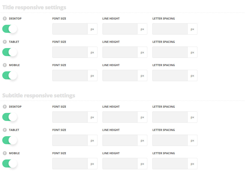
Title responsive settings
- Desktop – set the title font size, line height and letter spacing for the screen resolutions from 1280px to 1025px.
- Tablet – set the title font size, line height and letter spacing for the screen resolutions from 1024px to 800px.
- Mobile – set the title font size, line height and letter spacing for the screen resolutions less than 800px.
Subtitle responsive settings
- Desktop – set the subtitle font size, line height and letter spacing for the screen resolutions from 1280px to 1025px.
- Tablet – set the subtitle font size, line height and letter spacing for the screen resolutions from 1024px to 800px.
- Mobile – set the subtitle font size, line height and letter spacing for the screen resolutions less than 800px.
