Galleries are the most simple post types for creation.
To create a new gallery item simply navigate to Galleries section of your admin area and click on Add New button.
You need to select the images for your Gallery item in Images Gallery meta box and set the featured image for the gallery item in Featured image meta box in the right sidebar of the gallery item editor.
Before the gallery item creation, check the Gallery categories and tags since they are also important for easy navigation among gallery projects.
Gallery Categories
The categories for gallery items will help you to arrange the projects structurally and will be helpful for navigation.
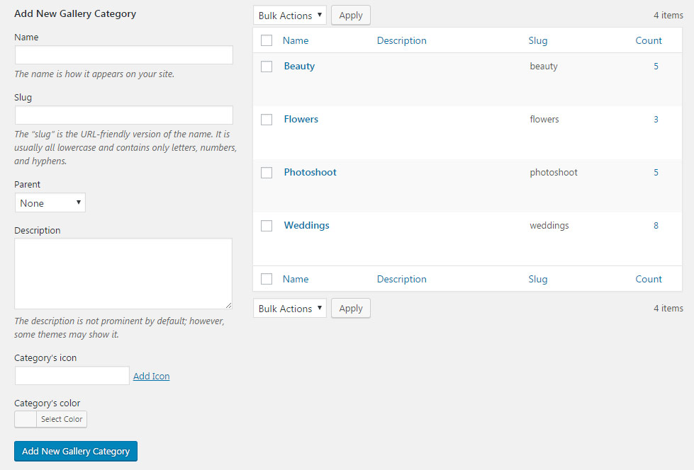
The Categories can be added in Galleries Categories section of the admin panel.
To create a new Category for gallery items, check the short steps to be followed:
- Name – add the title of the category.
- Slug – enter the title of the category in the URL. Leave the field blank to make Slug the same as the Name.
- Parent – you may also select the Parent category to achieve the hierarchy on the site.
- Description – you may leave this field empty, the description will be visible in admin panel only.
- Category’s icon – category’s icon will be used in the Category, Tags and Author sort panel on the gallery page.
- Category’s color – set the category’s color for category button to be displayed on single gallery items.
Gallery Tags
Create gallery tags to provide a useful way to group related gallery items together and to quickly inform visitors what a gallery is about.
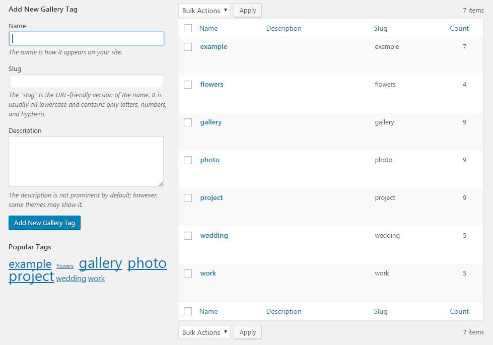
To add new Tag for gallery item, go to Galleries Tags section of the admin area.
Check the step by step instruction on creating new tags for gallery items below:
- Name – add the title of the tag.
- Slug – enter the title of the tag in the URL. Leave the field blank to make Slug the same as the Name.
- Description – you may leave this field empty, the description will be visible in admin panel only, it is added for your convenience.
Single Gallery Options
All the settings are inherited from theme options by default, so you can style all the single gallery items in the same way from one place and have the same styling for each item.
These settings are inherited from the Theme options Gallery options Single Gallery Item options section.
However, you may overwrite those settings on the individual gallery item using the Single Gallery Options meta box.
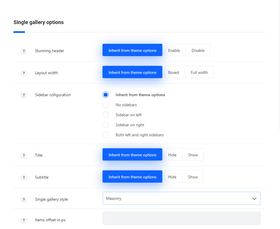
- Stunning header – set it to Enable to show the stunning header on gallery item page. If you choose inherit from theme options the displaying will correspond to the theme options settings.
- Layout width – allows you select the width of the gallery item page. Boxed and full width variants are available. If you choose inherit from theme options the displaying will correspond to the theme options settings.
- Sidebar configuration – set the sidebars to be shown on the gallery item page. No sidebars, sidebar on left, sidebar on right and both left and right sidebars are available. If you choose inherit from theme options the displaying will correspond to the theme options settings.
- Title – set the title of the gallery item will be shown or hidden above the gallery item.
- Subtitle – set the subtitle of the gallery item will be shown or hidden above the gallery item.
- Media style – allows you to select the gallery appearance on the single gallery item inner page. You may add the gallery images to the Images gallery meta box. If you choose theme default the displaying will correspond to the theme options settings.
- Carousel – arranges the images into a slideshow with the big image and the gallery carousel under it. The Carousel media style can be checked here.
- Autoslideshow – set it to Enable you to activate the autoslideshow. If you choose inherit from theme options the displaying will correspond to the theme options settings.
- Slideshow speed – set the slideshow speed.
- Image width – allows you to adjust the image width in px.
- Image height – allows you to adjust the image height in px.
- Grid – shows regularly spaced horizontal and vertical images. Check the Grid gallery item here.
- Items offset in px – set the space in px to add space between images in your images gallery.
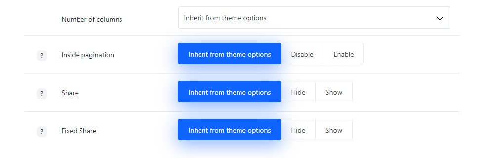
- Number of columns – set the number of columns for the images inside gallery item. Five is the maximum value. If you choose theme default the displaying will correspond to the theme options settings.
- Image width – allows you to adjust the image width in px.
- Image height – allows you to adjust the image height in px.
- Masonry – allows you to show images one after another, first in the horizontal direction, then vertically. Check the example of Masonry gallery item following this link.
- Items offset in px – set the space in px to add space between images in your images gallery.
- Number of columns – set the number of columns for the images inside gallery item. Five is the maximum value. If you choose theme default the displaying will correspond to the theme options settings.
- Advanced gallery – select this media type to displays one big image top left and small images around it. Check the example of Advanced gallery item following this link.
- Items offset in px – set the space in px to add space between images in your images gallery.
- Image width – allows you to adjust the image width in px.
- Image height – allows you to adjust the image height in px.
- Carousel – arranges the images into a slideshow with the big image and the gallery carousel under it. The Carousel media style can be checked here.
- Pagination to previous and next gallery style – allows you to show or hide the pagination inside the gallery item or to select the desired style.
- Fixed – the pagination arrows for previous and next gallery items will be displayed on scroll.
- Top – the pagination arrows are displayed on top of the gallery items.
- Share – allows you to show or hide the share in meta on gallery item.
- Share style – choose one of the preset styles for the Share button. If you choose inherit from theme options the displaying will correspond to the theme options settings.
- Fixed share – allows you to show or hide the side share on gallery item.
The social networks can be set in Theme options Social Accounts Social share options section.
Stunning Header Options
Style the stunning header section for your gallery if you want to add something special on your page.
The stunning header options are inherited from Theme options Header options Stunning Header Options section.
The configurations set in this meta box section will be applied to the single gallery item only and will not affect other pages of your site.
Since the Stunning Header options meta box is the same for all posts and pages types, more details can be found in Single Page Creation Stunning Header Options section.
Follow this link to check the post.
Page options
Allows to select the style for the layout for your gallery item.
The configurations set in this meta box section will be applied to the single gallery item only and will not affect other pages of your site.
Since the Page options meta box is the same for all posts and pages types, more details can be found in Single Page Creation Page Options section.
Follow this link to check the post.
Preloader options
Contains options for setting special preloader style for the gallery item which will appear on the screen till the content is fully loaded.
The configurations set in this meta box section will be applied to the single gallery item only and will not affect other pages of your site.
Since the Preloader options meta box is the same for all posts and pages types, more details can be found in Single Page Creation Preloader Options section.
Follow this link to check the post.
