If you want to present your team to the visitors, Team Member module will help you to do this in effortless and stylish way.
You may see the examples of the module on the Team Member page.
General settings
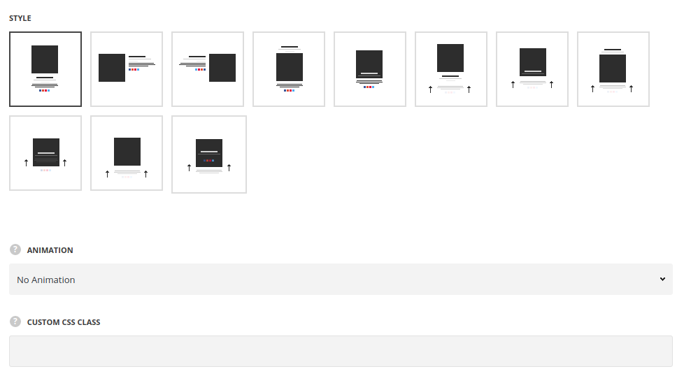
- Style – select the most suitable style for the team section on your site.
- Classic – the module structure has the following displaying: team member image, title, subtitle, description and social accounts below.
- Classic Left – all the content is displayed on the left side of the team member image.
- Classic Right – all the content is displayed on the right side of the team member image.
- Classic Top – the title and subtitle of the team member are displayed above the image with description and social accounts below it.
- Classic Overlay – the title and subtitle of the team member are displayed over the image in its bottom part with description and social accounts appearing on hover below it.
- Hovered slide – the title and subtitle of the team member are displayed over the image in its bottom part with all the content appearing on hover in the center of the image.
- Hovered bottom – the title and subtitle of the team member are displayed over the image in its bottom part with all the content appearing on hover in the bottom of the image.
- Bottom content – the title and subtitle of the team member are displayed over the image in its bottom part with description and social accounts below it.
- Hovered description – the description and social accounts of the team member are displayed on hover below the image with the title and subtitle displayed above the image.
- Hovered overlay – social accounts of the team member are displayed on hover below the image with the title and subtitle and the description displayed over the image.
- Hovered thumbnail – the title and subtitle of the team member are displayed on the bottom the image on hover with description and social accounts appearing on hover below it.
Extra features
- Animation – choose between 14 preset animation effects.
- Custom CSS class – enter our own unique class name for the item – this is a useful option for those who want to create a specific style. E.g.: you can type custom-style class and then go to
Theme optionsGeneral optionsCustom CSS/JSCustom CSSfield and write your own CSS code with this class to get your own style.
Member info
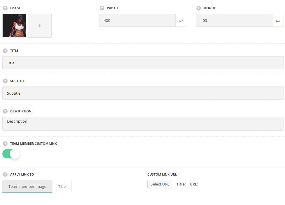
- Image – upload the image for the team member.
- Image width –
- Image height – set the height of the image.
- Title – enter the title of the team member on your site.
- Subtitle – enter the subtitle of the team member on your site.
- Description – add the description of the team member on your site.
- Team member custom link – set it to Enable to add the custom link or choose the existing page for the team member.
- Apply link to – select the element to apply the link to.
- Team member image – select it to have the whole team member clickable.
- Title – select this variant to apply the link to the team member title.
- Custom link URL – add the custom link for the team member.
- Apply link to – select the element to apply the link to.
Typography settings
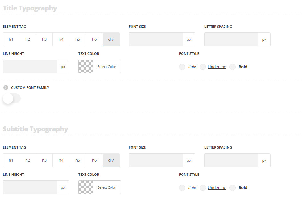
Title typography
These settings are inherited from Theme options Custom typography Feature Title Typography.
- Element tag – select the tag for the title.
- Font size – set the font size you need to use in the title.
- Letter spacing – set the needed distance between letters.
- Line-height – set the needed distance between lines in the title text.
- Text color – set the color of the font.
- Font style – select the font weight and style (bold, italic) for the title.
- Custom font family – set it to Enable to use custom Google font.
- Font Family – select the font family from the drop-down list.
- Font style – select the font weight and style (bold, italic) for the title.
Subtitle typography
The typography settings are inherited from Theme options Custom typography Subtitle typography.
- Element tag – select the tag for the subtitle.
- Font size – set the font size you need to use in the subtitle.
- Letter spacing – set the needed distance between letters in the subtitle.
- Line-height – set the needed distance between lines in the subtitle text.
- Text color – set the color of the font.
- Font style – select the font weight and style (bold, italic) for the subtitle.
Content typography
The typography settings are inherited from Theme options Custom typography Text typography.
- Font size – set the font size you need to use in the text in Info Box module.
- Letter spacing – set the needed distance between letters.
- Line-height – set the needed distance between lines.
- Text color – set the color of the font.
- Font style – select the font weight and style (bold, italic).
Style settings
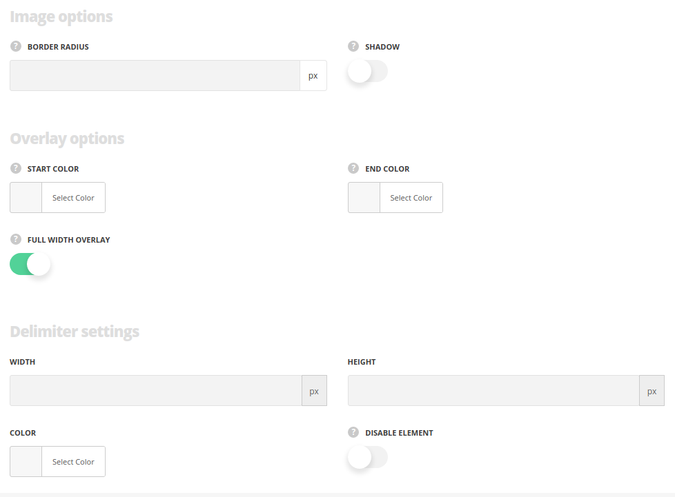
Image options
Style the Team member Thumbnail image
- Border radius – type the border radius in case you want to make the rounded thumbnail image.
- Shadow – enable in case you want to add the shadow on the image.
- Select style of item shadow – available, when the Shadow is enabled – select the shadow style Permanent shadow or Shadow on hover.
Overlay Color
Add the colors in case you want to have overlay effects on the image.
- Start Color – add the idle overlay color.
- End Color – set the hover overlay color.
- Full width overlay – set it to Enable to display full width for the overlay background and content according to the container width.
Delimiter settings
Style the delimiter element
- Width/Height – configure the width/height of the delimiter to get various shapes.
- Color – set delimiter’s color.
- Hide element – put the check mark in case you want to remove the delimiter.
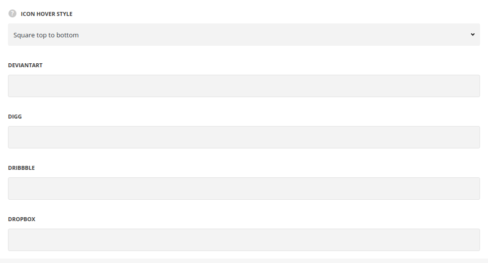
Social accounts
Here you may add links to social profiles of the team member.
- Icon hover style – choose one of the preset icon’s hover styles from the list.
The full list of the social accounts can be viewed in the module settings.
