This module gives a great possibility to inform your visitors about events, meetings, exhibitions, sales, etc.
You may check the customization example on the Countdown page.
General settings
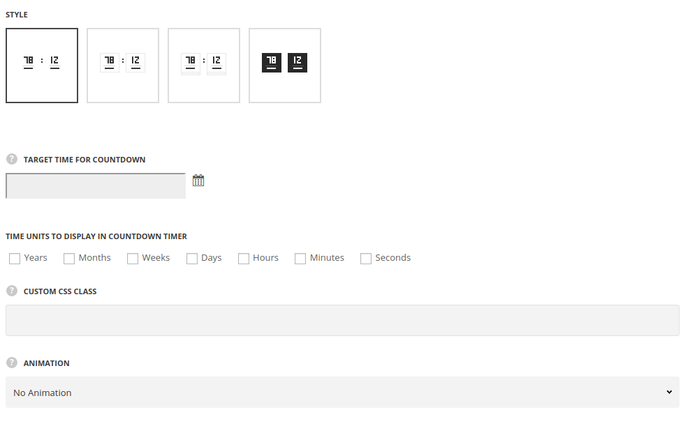
- Style – choose between 3 preset styles.
- Simple – only the number are displayed in count-down.
- Bordered – the border is displayed around the module.
- Underline – the border is displayed below the numbers in Countdown module.
- Background – the background color is set for the countdown.
- Target time for countdown – select the target time using the built-in calendar. The data and time are displayed in the following format:(yyyy/mm/dd hh:mm:ss).
- Time units to display in countdown timer – select the necessary units among the following: years, month, days, hours, minutes, seconds.
It is important to keep logic when selecting the time units. Please note! Do not select ‘Months’, ‘Days’, ‘Hours’ etc, without weeks and years for proper date calculation. - Custom CSS class – enter our own unique class name for the item – this is a useful option for those who want to create a specific style. E.g.: you can type custom-style class and then go to
Theme optionsGeneral optionsCustom CSS/JSCustom CSSfield and write your own CSS code with this class to get your own style. - Animation – choose between 14 preset animation effects.
Style settings
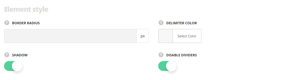
- Border radius – specify, whether you want the module to have rounded corners.
- Border Color – set the color of the borders, for all styles, except the Simple one.
- Background – set the background color of the module, for Background style only.
- Delimiter Color – set the color for the delimiter between the counter number and units.
- Shadow – enable the shadow, if needed.
- Disable dividers – set it to Enable to hide the dividers between the countdown units.
Typoraphy settings
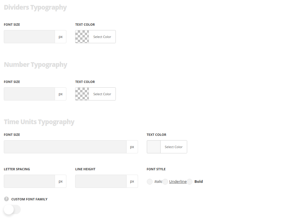
Dividers typography
- Font size – enter the font size for the divider.
- Color – choose the color for the divider.
Number Typography
- Font size – specify the size of the size for colon delimiter between the time elements.
- Text color – set the color for the colon delimiters.
Time Units Typography
- Font size – set the font size you need to use in the time units.
- Letter spacing – set the needed distance between letters.
- Line-height – set the needed distance between lines in the time units text.
- Text color – set the color of the font.
- Font style – select the font weight and style (bold, italic) for the time units.
- Custom font family – set it to Enable to use custom Google font.
- Font Family – select the font family from the drop-down list.
- Font style – select the font weight and style (bold, italic) for time units.
