Add the creative and stylish container with elements inside on your page.
This is a nested shortcode – module that includes other modules. You may style the container and then fill it in with elements.
You may add the VC elements inside the container.
Masonry/Grid Container settings
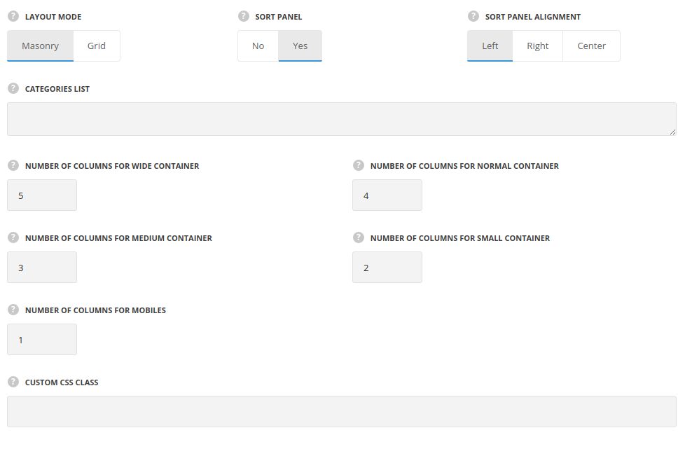
- Layout mode – select the masonry or grid style for the elements displaying.
- Masonry – the elements are aligned into a masonry sections. The content takes as much space as needed and the thumbnails are not cropped and adjusted to it.
- Grid – the elements are aligned into a grid equal sections. The content is adjusted to take equal space and the thumbnails are cropped respectively.
- Sort panel – set it to Enable to display the sort panel for the elements inside the container.
- Sort panel alignment – this option allows you to align the sort panel horizontally. Left, right and center positions are available.
- Categories list – enter the categories for the container. Please, note! You need to enter each string on a new line, categories should be written in one word in lowercase.
- Number of columns for wide container – enter the number of columns for the container width more then 1280px. Enter value between 1 to 8.
- Number of columns for normal container – enter the number of columns for the container width more then 1024px and less then 1280px. Enter value between 1 to 8.
- Number of columns for medium container – enter the number of columns for the container width more then 800px and less then 1024px. Enter value between 1 to 8.
- Number of columns for small container – enter the number of columns for the container width more then 460px and less then 800px. Enter value between 1 to 8.
- Number of columns for mobiles – enter the number of columns for the container width less then 460px. Enter value between 1 to 8.
- Custom CSS class – enter our own unique class name for the item – this is a useful option for those who want to create a specific style. E.g.: you can type custom-style class and then go to
Theme optionsGeneral optionsCustom CSS/JSCustom CSSfield and write your own CSS code with this class to get your own style.
Masonry/Grid Item Settings
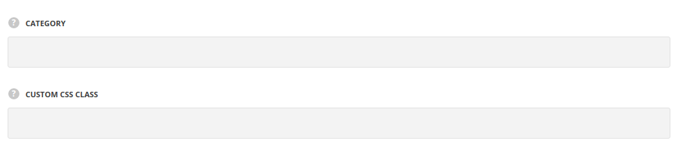
- Category – enter the category name for the Masonry/Grid item, the category should be in sort panel category as well. Please note! The category should be written in one word in lowercase.
- Custom CSS class – enter our own unique class name for the item – this is a useful option for those who want to create a specific style. E.g.: you can type custom-style class and then go to
Theme optionsGeneral optionsCustom CSS/JSCustom CSSfield and write your own CSS code with this class to get your own style.
By clicking on ‘PLUS’ icon you may add the element inside the container.
