Icon list module allows you to add the list with the custom icons or dots. This is a nested shortcode – module that includes other modules. You may style the container and then fill it in with elements.
General settings
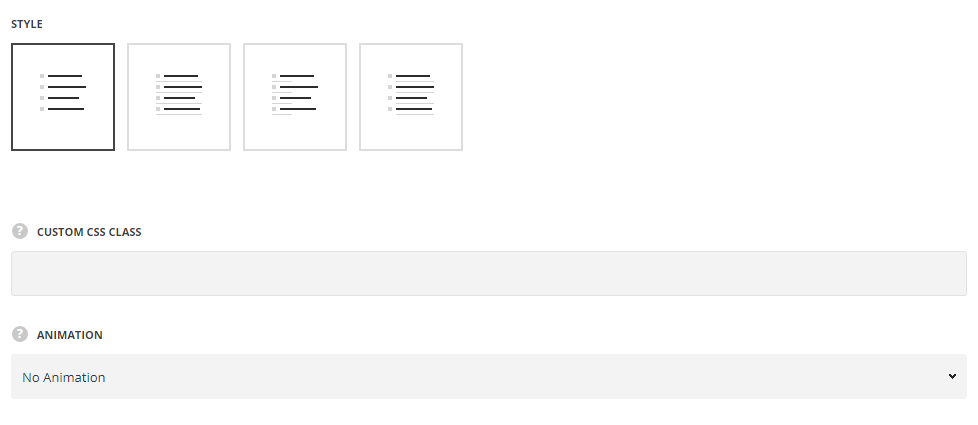
- Style – choose between 3 preset styles.
- Simple – the icons and content are displayed in a simple list, without delimiters.
- Separated – there is delimiter added between each list item, including the icon.
- Half-divided – there is a short delimiter (under icon) added between each list item.
- Underlined – there is delimiter added between each list item, without icon.
Extra features
- Animation – choose between 14 preset animation effects.
- Custom CSS class – enter our own unique class name for the item – this is a useful option for those who want to create a specific style. E.g.: you can type custom-styleclass and then go to
Theme optionsGeneral optionsCustom CSS/JSCustom CSSfield and write your own CSS code with this class to get your own style.
Icon Style
Icon style
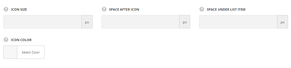
- Icon size – select the size for the icons for Icon List module. The default size is 18px, the max icon size is 72px. If you set icon size more than 36px, please do not forget to specify the thumb size as well.
- Space after icon – set the offset between the icon and the content.
- Space under list item – set the offset between the list items.
- Icon color – specify the color of the icon.
Thumb style
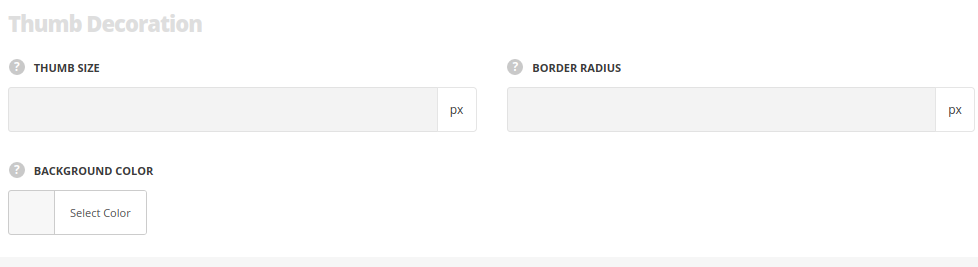
- Thumb size – set the size of the icon’s thumbnail. Max size is 500px.se
- Border radius – set the border radius of the icon’s thumbnail to have rounded corners. Max value is 500px.
- Background color – specify the background color for the icon’s thumbnail.
- Thumb border style – select one of the available border styles for the icon’s thumbnail.
- Border width – set the border width in px.
- Border color – select the suitable color for the border.
Delimiter style
For Separated, Half-Divided and Underlined styles only.
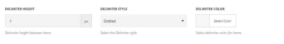
- Delimiter height – specify the height for the delimiter between list icons items in px.
- Delimiter style – select one of the available border styles. Dotted, dashed, double and solid variants are available.
- Delimiter color – specify the color of the delimiter between list icons items.
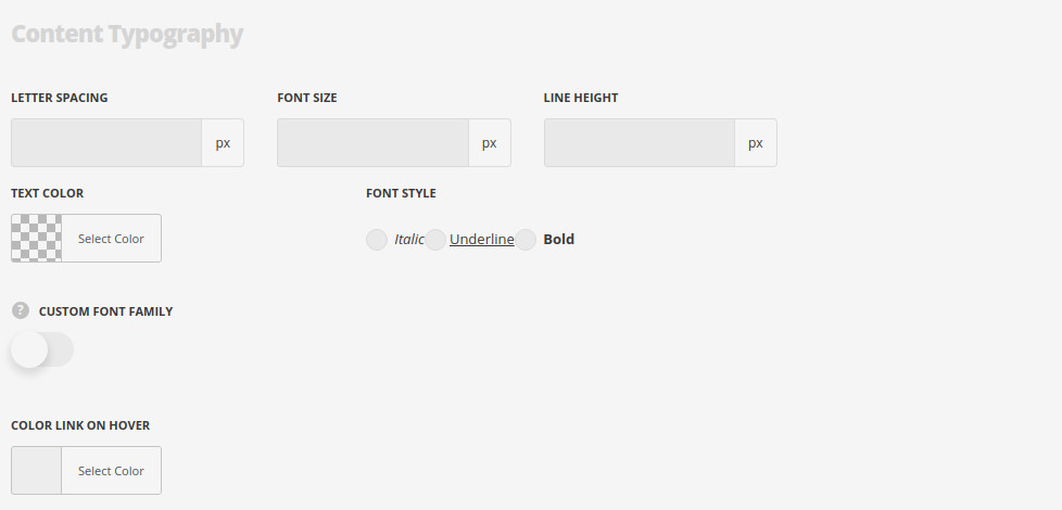
Typography settings
Default settings are inherited from Theme options Styling options Link options Link Typography section.
- Font size – set the font size you need to use in the list.
- Letter spacing – set the needed distance between letters.
- Text color – set the color of the font.
- Font style – select the font weight and style (bold, italic) from the list.
- Custom font family – set it to Enable to use custom Google font.
- Font Family – select the font family from the drop-down list.
- Font style – select the font weight and style (bold, italic) from the list.
List Icon Item settings
In this section, you can customize the list icon items of the module.
By clicking on the arrow down icon you can reveal the whole section to adjust it to your needs. Here you are also able to duplicate, change their order (simply drag-n-drop the blocks) and delete the unnecessary ones as well.
Content Typography
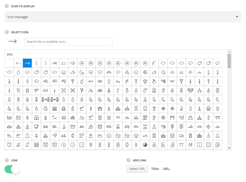
- Icon to display – select whether the list will be with or without the icon or the custom image will be displayed instead.
- Icon – select the icon from the list of available ones for the Icon List module.
- Link – set it to enable to add the link to the icon list item.
- Add link – add a custom link or select existing page.
- Custom image – select this option to use the custom image.
- Upload image – upload the custom image from media library.
- Link – set it to enable to add the link to the icon list item.
- Add link – add a custom link or select existing page.
- Without icon – select this style if you do not need to use custom image or icons in the module.
- Link – set it to enable to add the link to the icon list item.
- Add link – add a custom link or select existing page.
Content settings
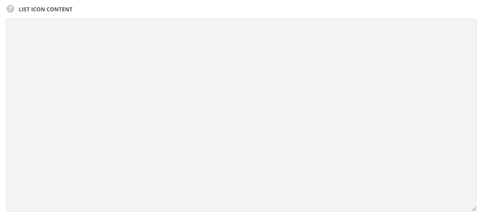
- List icon content – enter the content for your icon list item.
