The Services 2 module is the element for presenting the services available for your customers which allow you to attract more visitors with customizable hover effect. This is a nested shortcode – module that includes other modules. You may style the container and then fill it in with elements.
More module examples can be found here.
Service 2 settings
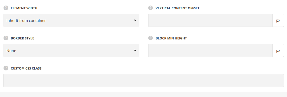
- Element width – specify the width of the columns for the service item.
- Inherit – the module will take the full width of the container it is inside.
- Half size – the module will take the half of the width of the container it is inside.
- 1/3 – the module will take the third part of the width of the container it is inside.
- 1/4 – the module will take the quarter of the width of the container it is inside.
- 1/5 – the module will take the fifth part of the width of the container it is inside.
- 1/6 – the module will take the sixth part of the width of the container it is inside.
- Vertical content offset – add the top and bottom offset for the content in Service module.
- Border style – select the border style between the services items.
- Border color – specify the color for the border between the service items. The default border color is #1b1b1b.
- Block min height – set the minimum height for the services block in px.
- Custom CSS class – enter our own unique class name for the item – this is a useful option for those who want to create a specific style. E.g.: you can type custom-style class and then go to
Theme optionsGeneral optionsCustom CSS/JSCustom CSSfield and write your own CSS code with this class to get your own style.
General settings
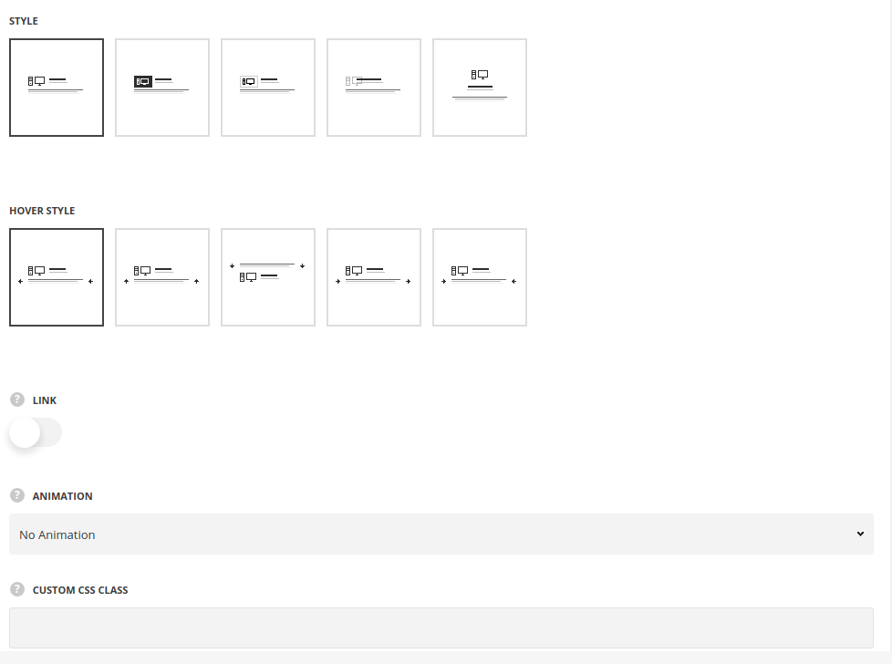
- Style – choose between 4 preset styles.
- Simple – the service item has the icon, title and subtitle on the front and description on the back part.
- Background – the service item has the icon with the background color.
- Bordered – the service item has the icon with the border around it.
- Overlay – the icons is displayed as a background for the front part of the service item.
- Top icon – the icon of the service item is displayed on top with the content below it.
- Hover style – select the hover style you’d like to use from the list of available ones.
- Front content alignment – specify the horizontal alignment of the front side content. For Top Icon style only.
- Link – set it to Enable to add the link to the service item.
- Link URL – add a custom link or select existing page.
- Animation – choose between 14 preset animation effects.
- Custom CSS class – enter our own unique class name for the item – this is a useful option for those who want to create a specific style. E.g.: you can type custom-style class and then go to
Theme optionsGeneral optionsCustom CSS/JSCustom CSSfield and write your own CSS code with this class to get your own style.
Content settings
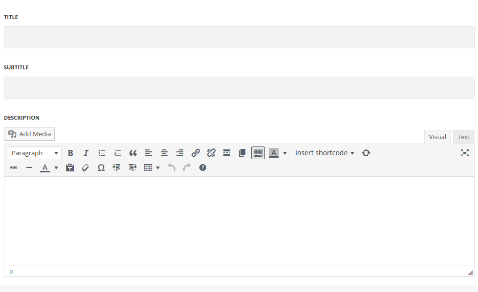
- Title – enter the title for the module.
- Subtitle – enter the subtitle for the module.
- Description – enter the text for the description.
Icon settings
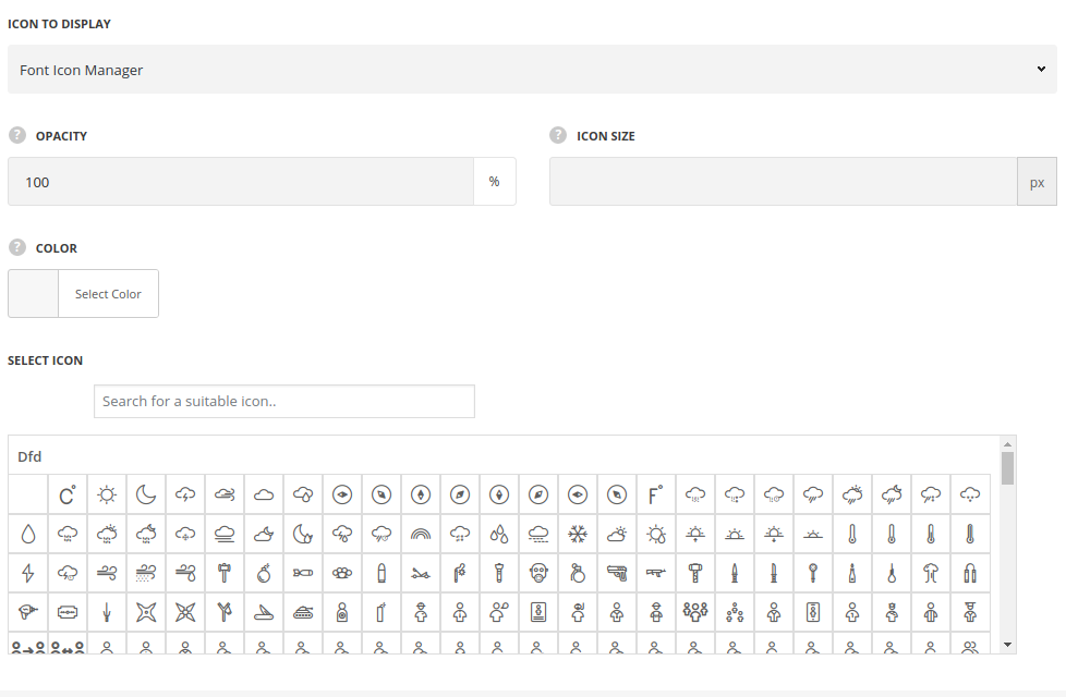
- Icon to display – select the element to be displayed in Info Box module.
- Icon – select this variant to display the icon in Info Box module.
- Icon library – choose the icon library for the module.
- Select icon – select the icon to be displayed in the module.
- Opacity – specify icon transparency, if needed.
- Size of icon – select the size for the icon for Info Box module.
- Custom image – select this variant to display custom image on the left side from the text.
- Upload image – select the image from media library for Info Box module.
- Opacity – specify the image transparency, if needed.
- Size – select the size for the image for Info Box module.
- Icon – select this variant to display the icon in Info Box module.
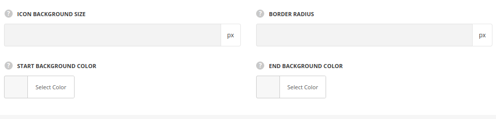
Icon background settings
Available for all style, except for Top Icon style.
- Icon background size – specify the width of background for the icon.
- Border radius – set the border radius of the icon decoration, if needed.
- Start Background color – set the background color for the icon.
- End Background color – set the end background color to create gradient effect.
- Border color – set the border color, for Bordered style only.
- Border width – specify the width of the border decoration, for Bordered style only.
Typography settings
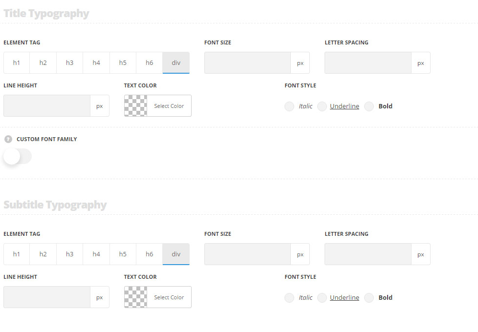
Title typography
These settings are inherited from Theme options Custom typography Feature Title Typography.
- Element tag – select the tag for the title.
- Font size – set the font size you need to use in the title.
- Letter spacing – set the needed distance between letters.
- Line-height – set the needed distance between lines in the title text.
- Text color – set the color of the font.
- Font style – select the font weight and style (bold, italic) for the title.
- Custom font family – set it to Enable to use custom Google font.
- Font Family – select the font family from the drop-down list.
- Font style – select the font weight and style (bold, italic) for the title.
Subtitle typography
The typography settings are inherited from Theme options Custom typography Subtitle typography.
- Element tag – select the tag for the subtitle.
- Font size – set the font size you need to use in the subtitle.
- Letter spacing – set the needed distance between letters in the subtitle.
- Line-height – set the needed distance between lines in the subtitle text.
- Text color – set the color of the font.
- Font style – select the font weight and style (bold, italic) for the subtitle.
- Custom font family – set it to Enable to use custom Google font.
- Font Family – select the font family for the drop-down list.
- Font style – select the font weight and style (bold, italic) for the subtitle.
Content typography
The typography settings are inherited from Theme options Custom typography Text typography.
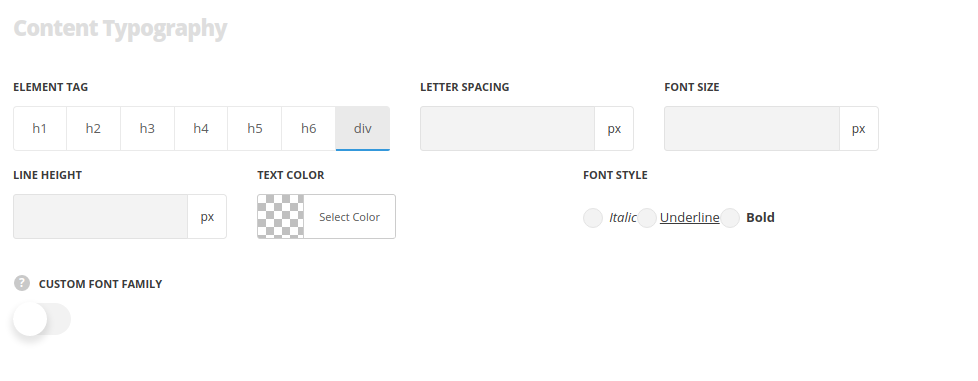
- Element tag – select the tag for the text in module.
- Font size – set the font size you need to use in the text in module.
- Letter spacing – set the needed distance between letters.
- Line-height – set the needed distance between lines.
- Text color – set the color of the font.
- Font style – select the font weight and style (bold, italic).
