Similar to Gradation, Milestone module allows you to create ordered information blocks for your visitors in order to diversify the page appearance.
Hover effect is the key difference between these modules.
General settings
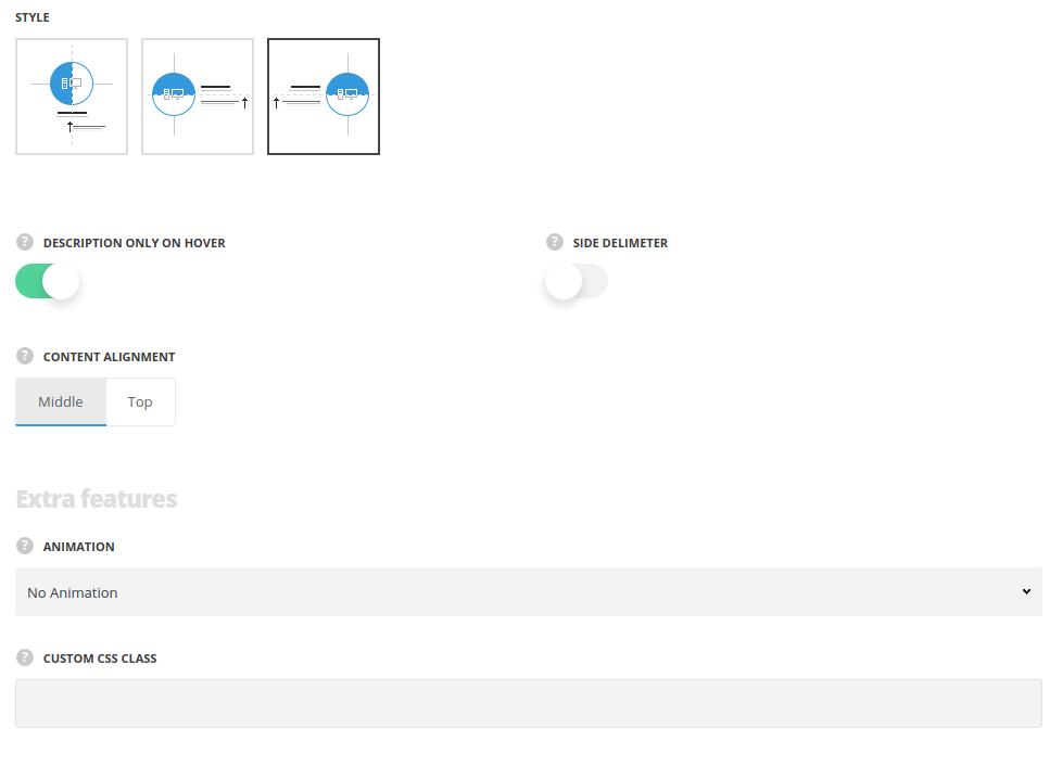
- Style – choose between 3 preset styles.
- Simple – the icon is displayed on top with title and subtitle below it.
- Right align – the icon is displayed on the right and the content is displayed on the left side.
- Left align – the icon is displayed on the left and the content is displayed on the right side.
- Element width – select the width of the elements depending on the width of the container.
- Full width – the module will take the full width of the container it is inside.
- Half size – the module will take the half of the width of the container it is inside.
- Third size – the module will take the third part of the width of the container it is inside.
- Quarter size – the module will take the quarter of the width of the container it is inside.
- Description only on hover – switch it to Enable to show the description only when you hover over the element.
- Side delimiter – set it to Enable to have the delimiter not only between the items, but also from the left and right sides.
- Content alignment – select the content alignment according to the icon. Top and center positions are available. (For Left and Right align styles only).
Extra features
- Animation – choose between 14 preset animation effects.
- Custom CSS class – enter our own unique class name for the item – this is a useful option for those who want to create a specific style. E.g.: you can type custom-style class and then go to
Theme optionsGeneral optionsCustom CSS/JSCustom CSSfield and write your own CSS code with this class to get your own style.
Content settings
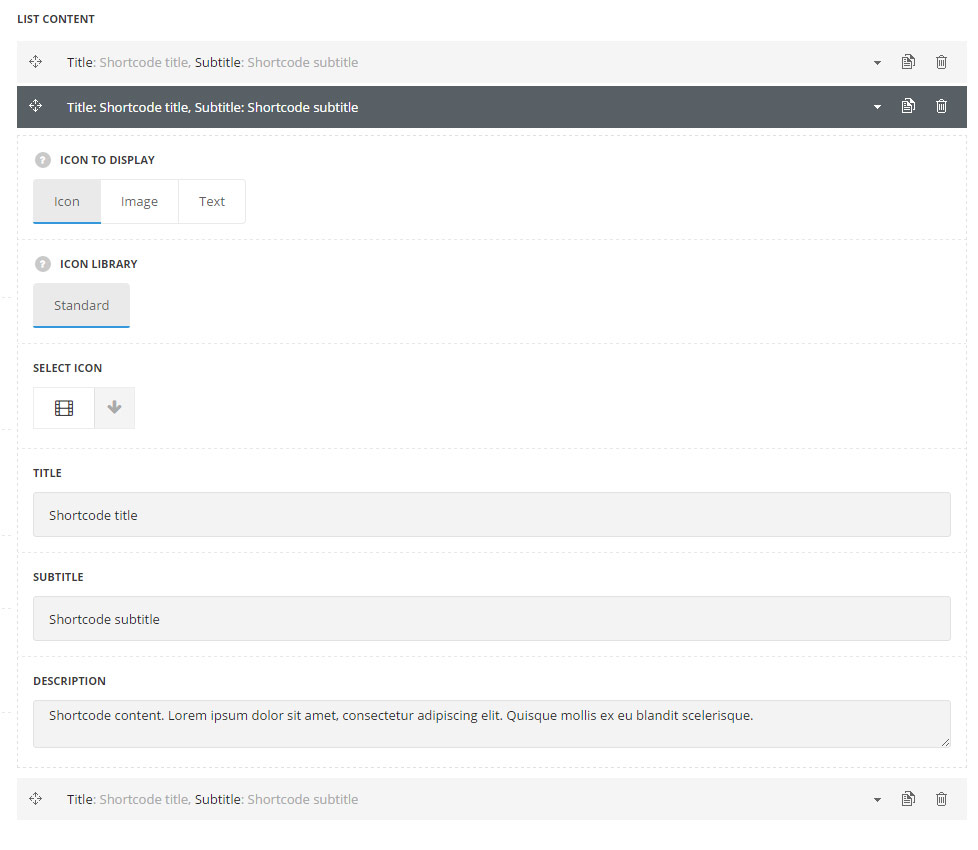
List content
In this section, you can customize the informative blocks of the module.
By clicking on the arrow down icon you can reveal the whole section to adjust it to your needs. Here you are also able to duplicate the blocks, change their order (simply drag-n-drop the blocks) and delete the unnecessary blocks as well.
- Icon to display – select the element to be displayed in the module.
- Icon – select this variant to display the icon in the module.
- Icon library – choose the icon library for the module.
- Select icon – select the icon to be displayed in the module.
- Image – select this variant to display custom image on the left side from the text.
- Upload image – select the image from media library for the module.
- Text – select this variant to display custom text for the module.
- Text – enter the content to be displayed in the module.
- Icon – select this variant to display the icon in the module.
- Title – enter the title for the Milestone module.
- Subtitle – enter the subtitle for the Milestone module.
- Description – enter the text for the Milestone description.
Style settings
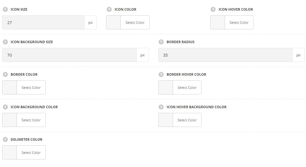
- Icon size – set the desired size for the icon.
- Icon color – choose the color for the icon. The default icon color is #fff.
- Icon hover color – choose the hover color for the icon.
- Icon background size – allows you to set the background size for the icon.
- Border radius – allows you to set the border radius for the icon background to have rounded corners.
- Border color – choose the border color for the milestone element. T
- Border hover color – choose the border color for the milestone element which will be displayed on hover.
- Icon background color – choose the icon background color. The default color is transparent.
- Icon hover background color – choose the icon background color on hover.
- Delimiter color – choose the delimiter color (the element which is displayed between the blocks).
Typography settings
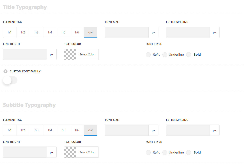
Title typography
These settings are inherited from Theme options Custom typography Feature Title Typography.
- Element tag – select the tag for the title.
- Font size – set the font size you need to use in the title.
- Letter spacing – set the needed distance between letters.
- Line-height – set the needed distance between lines in the title text.
- Text color – set the color of the font.
- Font style – select the font weight and style (bold, italic) for the title.
- Custom font family – set it to Enable to use custom Google font.
- Font Family – select the font family from the drop-down list.
- Font style – select the font weight and style (bold, italic) for the title.
Subtitle typography
The typography settings are inherited from Theme options Custom typography Subtitle typography.
- Element tag – select the tag for the subtitle.
- Font size – set the font size you need to use in the subtitle.
- Letter spacing – set the needed distance between letters in the subtitle.
- Line-height – set the needed distance between lines in the subtitle text.
- Text color – set the color of the font.
- Font style – select the font weight and style (bold, italic) from the title.
Content typography
The typography settings are inherited from Theme options Custom typography Text typography.
- Font size – set the font size you need to use in the text in the module.
- Letter spacing – set the needed distance between letters.
- Line-height – set the needed distance between lines.
- Text color – set the color of the font.
- Font style – select the font weight and style (bold, italic).
