The hotspot module is a creative way to attract your visitors’ attention and add a hotspot icon with a tooltip in an image.
Watch the video tutorial on Hotspot module creation for more details.
General settings
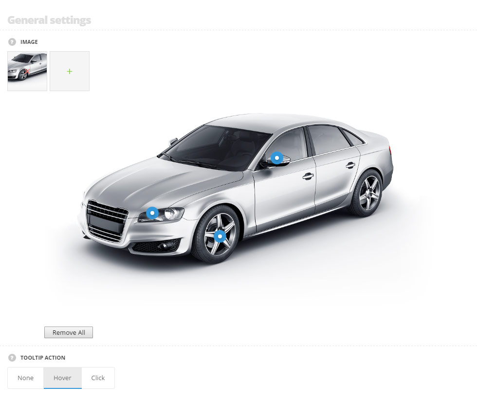
- Image – choose the image from the media library to add the hotspots on it. After the image is uploaded, please click on the area where the hotspot should be added and you’ll be able to enter the hotspot tooltip content (title and message).
- Tooltip action – define the action on which the hotspot tooltip will be displayed. If None action is selected the tooltips will be displayed by default, hover and click variants are also available.
Extra features
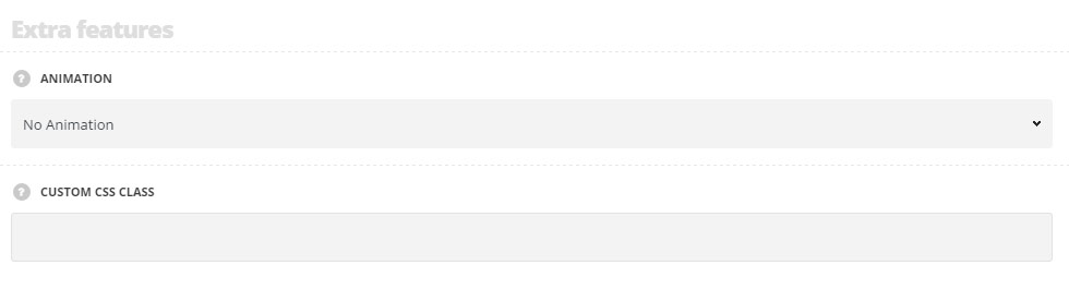
- Animation – choose between 14 preset animation effects.
- Custom CSS class – enter our own unique class name for the item – this is a useful option for those who want to create a specific style. E.g.: you can type custom-style class and then go to
Theme optionsGeneral optionsCustom CSS/JSCustom CSSfield and write your own CSS code with this class to get your own style.
Marker settings
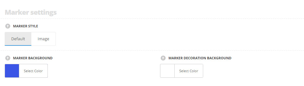
- Marker style – select the style of the hotspot marker which is the most suitable to you.
- Default – the default rounded hotspot marker is displayed.
- Marker background – set the background of hotspot marker. The default color is #3b55e6.
- Marker decoration background – set the background of the hotspot marker decoration background. The default color is #ffffff.
- Image – choose the image from the media library to be used as a hotspot marker.
- Default – the default rounded hotspot marker is displayed.
Tootip settings
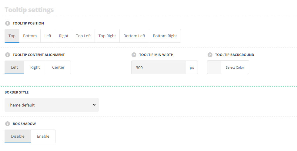
- Tooltip position – set the tooltip position from the hotspot marker from the list of the available positions.
- Tooltip content alignment – set the tooltip content text alignment. Left, right and center positions are available.
- Tooltip min width – define the minimal width for hotspot item tooltip.
- Tooltip background – set the background color of the tooltip message. Default tooltip background color is set to #ffffff.
- Border style – select one of the available border styles for the Hotspot module. Dotted, dashed and solid variants are available.Theme default style will be inherited directly from theme files.
- Color – select the color for the border.
- Border radius – select the border radius for Hotspot module to have rounded corners.
- Border width – set the width of the border. You may set the desired width each border: top, right, left and bottom.
- Box shadow – set it to Enable to activate the shadow for the tooltip.
- Shadow parameters – choose shadow parameter and set the color, in accordance with the following structure: horizontal shadow, vertical shadow, blur, and spread. More details can be found following this link.
- Color – set the color for the product category shadow.
Typography settings
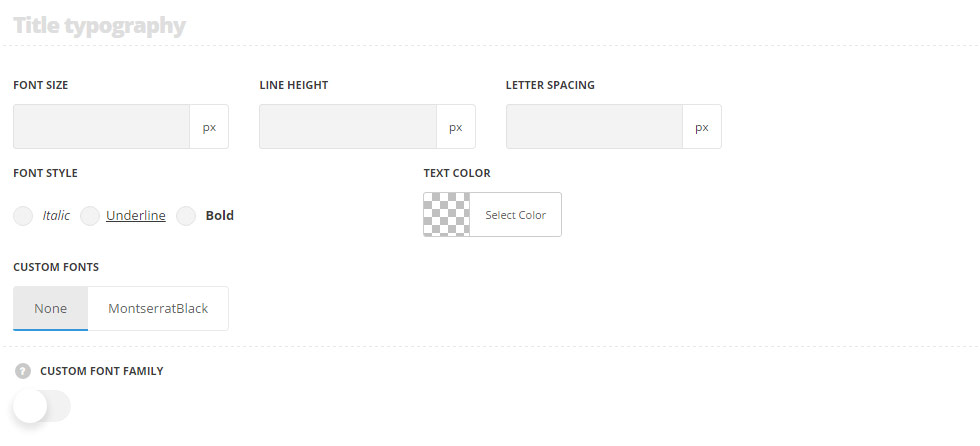
- Font size – set the font size you need to use in the Hotspot module.
- Letter spacing – set the needed distance between letters.
- Text color – set the color of the font.
- Font style – select the font weight and style (bold, italic) from the list.
- Custom font family – set it to Enable to use custom Google font.
- Font Family – select the font family from the drop-down list.
- Font style – select the font weight and style (bold, italic) from the list.
Content typography
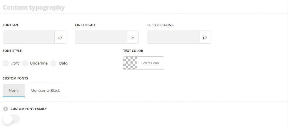
- Font size – set the font size you need to use in the text in Hotspot module.
- Letter spacing – set the needed distance between letters.
- Line-height – set the needed distance between lines.
- Text color – set the color of the font.
- Font style – select the font weight and style (bold, italic).
