Add the creative horizontal scrolling element on your page.
This is a nested shortcode – module that includes other modules. You may style the container and then fill it in with elements.
You may add the VC elements inside the container or add the Horizontal scroll item and add single image or portfolio item inside of it.
Horizontal Scroll Gallery settings

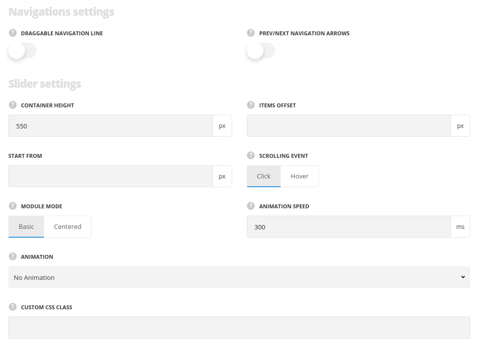
Navigation settings
- Enable draggable navigation line – switch it to Enable to show draggable scrollbar under the horizontal scroll items.
- Scrolling animation – allows you scroll between horizontal scroll items with the help of the mouse wheel if Module is chosen. The Scrollbar will allow you to scroll with the help of the draggable scrollbar.
- Prev/next navigation arrows – set it to Enable to show navigation arrows for the horizontal scroll items.
- Arrows color – set the color for the navigation arrows. The default color is white with opacity 0.5.
- Scrollbar color – set the color for the navigation bar. The default color is inherited from
Theme OptionsStyling optionsBorder colorwith opacity 0.5.
Slider settings
- Container height – set the height of the scrolling items container.
- Items offset – add the space between the scrolling items. The offset is not set by default.
- Scrolling event – specify what event will scroll the items. Click and hover variants are available.
- Module mode – select the module mode: Centered mode will add the extra space before and after scrolling items. Basic will display items without extra space.
- Animation speed – set the speed of the scrolling animation in ms.
- Animation – choose between 14 preset animation effects.
- Custom CSS class – enter our own unique class name for the item – this is a useful option for those who want to create a specific style. E.g.: you can type custom-styleclass and then go to
Theme optionsGeneral optionsCustom CSS/JSCustom CSSfield and write your own CSS code with this class to get your own style.
Horizontal scroll shortcode item container Settings

- Item width – set the scrolling item’s width.
- Content alignment – allows you to align the content placed inside the container horizontally. Top and middle options are available.
- Background scheme – set whether dark or light background is set for the container. According to the color scheme you choose the text colors will be changed to make it more readable.
- Custom CSS class – enter our own unique class name for the item – this is a useful option for those who want to create a specific style. E.g.: you can type custom-style class and then go to
Theme optionsGeneral optionsCustom CSS/JSCustom CSSfield and write your own CSS code with this class to get your own style.
Design options
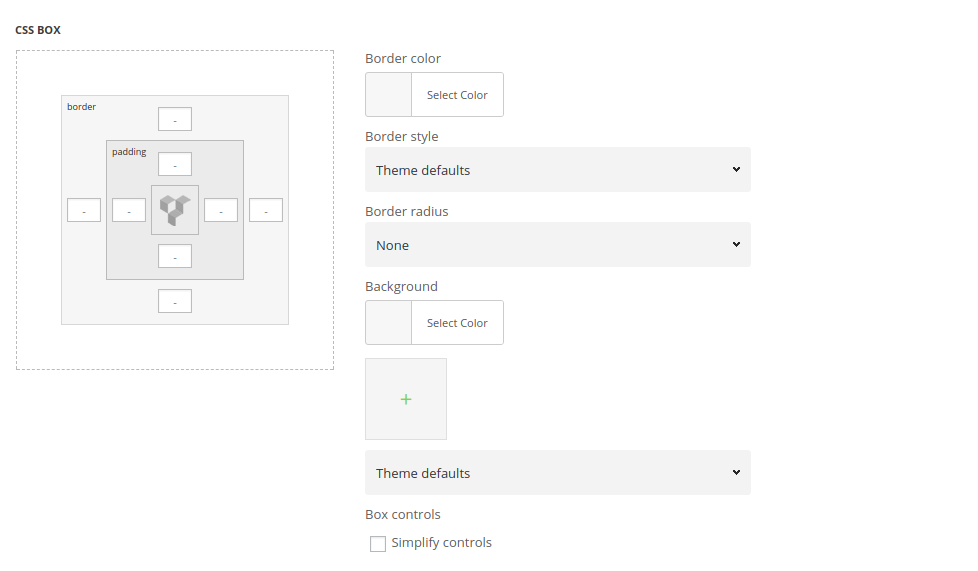
The settings are similar to the Design tab of the row options. You may check the settings in this post of the theme documentation.

- CSS Box – add paddings for the content of the inner container.
- Border – set the border for the container, if needed.
- Background – set the background image for the column section.
Horizontal scroll Item Settings

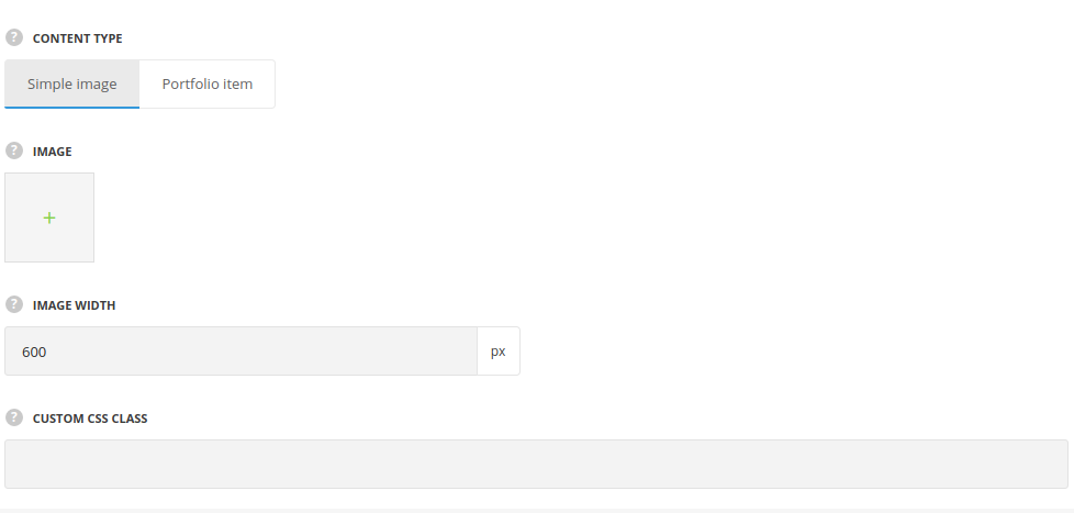
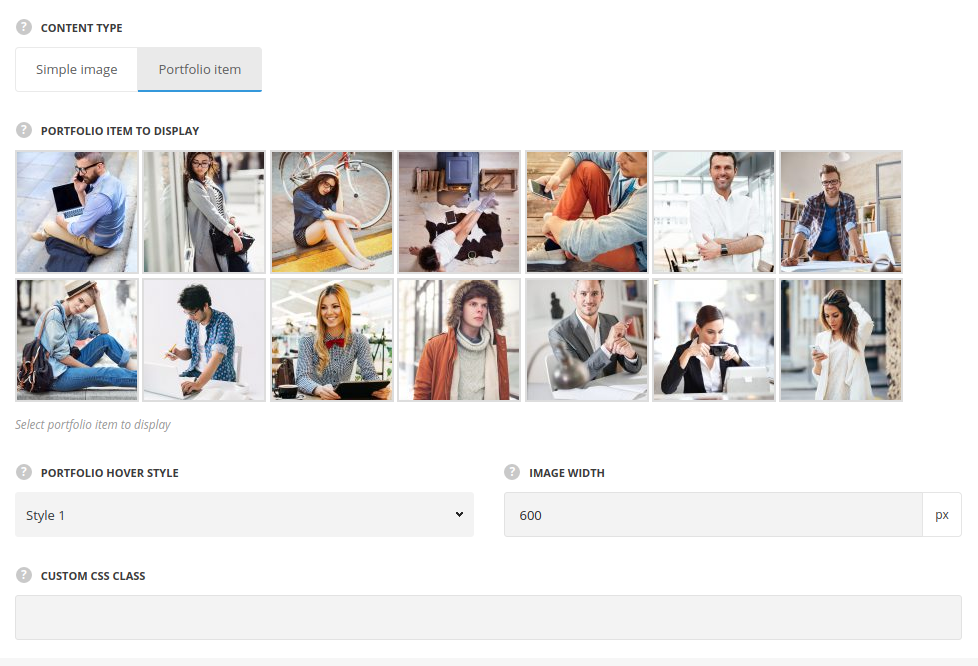
- Content type – specify what content should be placed.
- Single image – select this type to display the image in horizontal scroll.
- Image width – set the scrolling item’s image width.
- Single image – select this type to display the image in horizontal scroll.

- Portfolio item – select this type to display the portfolio item in horizontal scroll.
- Portfolio item to display – select the portfolio item which should be displayed as scrolling item.
- Portfolio hover style – select one of the 24 preset portfolio hover styles.
- Image width – set the scrolling item’s image width.
- Custom CSS class – enter our own unique class name for the item – this is a useful option for those who want to create a specific style. E.g.: you can type custom-style class and then go to
Theme optionsGeneral optionsCustom CSS/JSCustom CSSfield and write your own CSS code with this class to get your own style.

