You have to combine the module with certain page template to get it work properly. Please, select the For side by side page template in Page Attributes section.
This is a nested shortcode – module that includes other modules. You may style the container and then fill it in with elements.
You may see the example on the Side by Side page.
Please note! On mobile devices, the scripts for creating side by side sites are working in the following way:
Side by Side module displays left column modules (from top to bottom) first, and then it displays the modules from the right column – top to bottom.
Side by Side Containers
Add the needed elements to make up the structure.

Side by Side Slider
Select the Side by Side module to create slider.
- Side by Side Slider Settings – allows you to add extra class name for the slider.
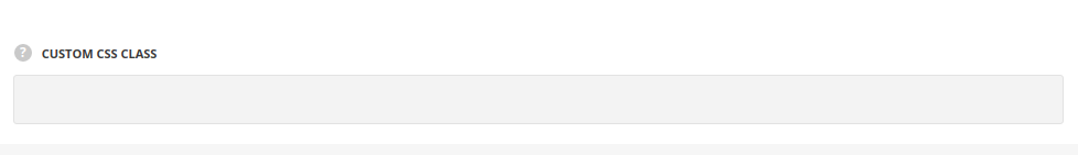
- Custom CSS class – enter our own unique class name for the item – this is a useful option for those who want to create a specific style. E.g.: you can type custom-styleclass and then go to
Theme optionsGeneral optionsCustom CSS/JSCustom CSSfield and write your own CSS code with this class to get your own style.
- Custom CSS class – enter our own unique class name for the item – this is a useful option for those who want to create a specific style. E.g.: you can type custom-styleclass and then go to
Side by Side Left/Right Container
Select the left or right container to fill it with content.
- Side by Side Left/Right Container – add the container to distinguish the columns division – left and right columns respectively. After that you’ll be able to fill them with content.
Note, that the slider items from different columns are aligned respectively. And the first Side by Side Slider Item of left column will always be aligned with the first item in the right column.
Make sure that the quantity of the slider items in both columns is equal for proper module functioning.- Custom CSS class – enter our own unique class name for the item – this is a useful option for those who want to create a specific style. E.g.: you can type custom-styleclass and then go to
Theme optionsGeneral optionsCustom CSS/JSCustom CSSfield and write your own CSS code with this class to get your own style.
- Custom CSS class – enter our own unique class name for the item – this is a useful option for those who want to create a specific style. E.g.: you can type custom-styleclass and then go to
Side by Side Slider Item
Style the containers according to your needs.
- Side by Side Slider Item – style the containers according to your needs.
Design options
The settings are similar to the Design tab of the row options. You may check the settings in this post of the theme documentation.
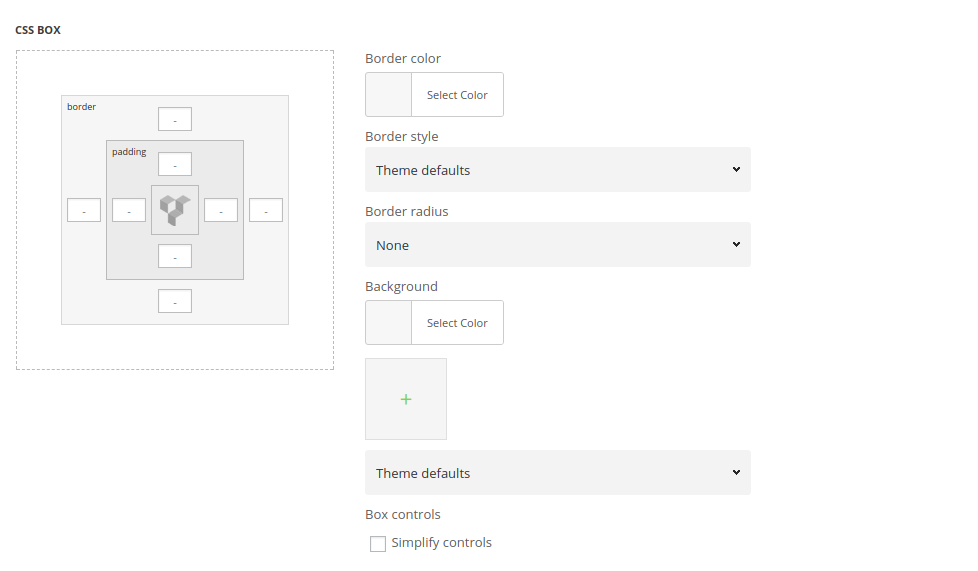
- CSS Box – add paddings for the content of the inner container.
- Border – set the border for the container, if needed.
- Background – set the background image for the column section.
General settings
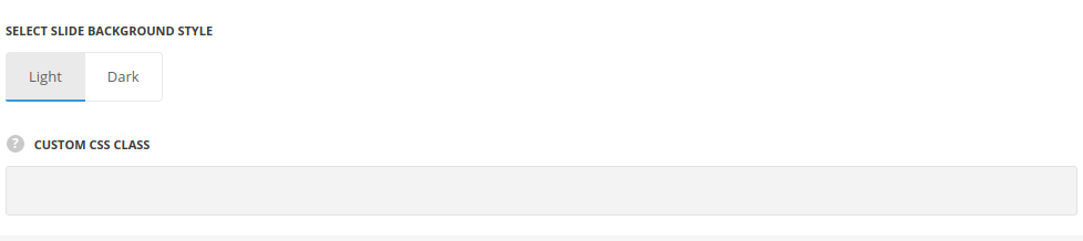
- Select slide background style – choose the background style for the slide. The text colors will be changed according to the style you choose to make it more readable. Light and dark variants are available.
- Custom CSS class – enter our own unique class name for the item – this is a useful option for those who want to create a specific style. E.g.: you can type custom-style class and then go to
Theme optionsGeneral optionsCustom CSS/JSCustom CSSfield and write your own CSS code with this class to get your own style.
Responsive options
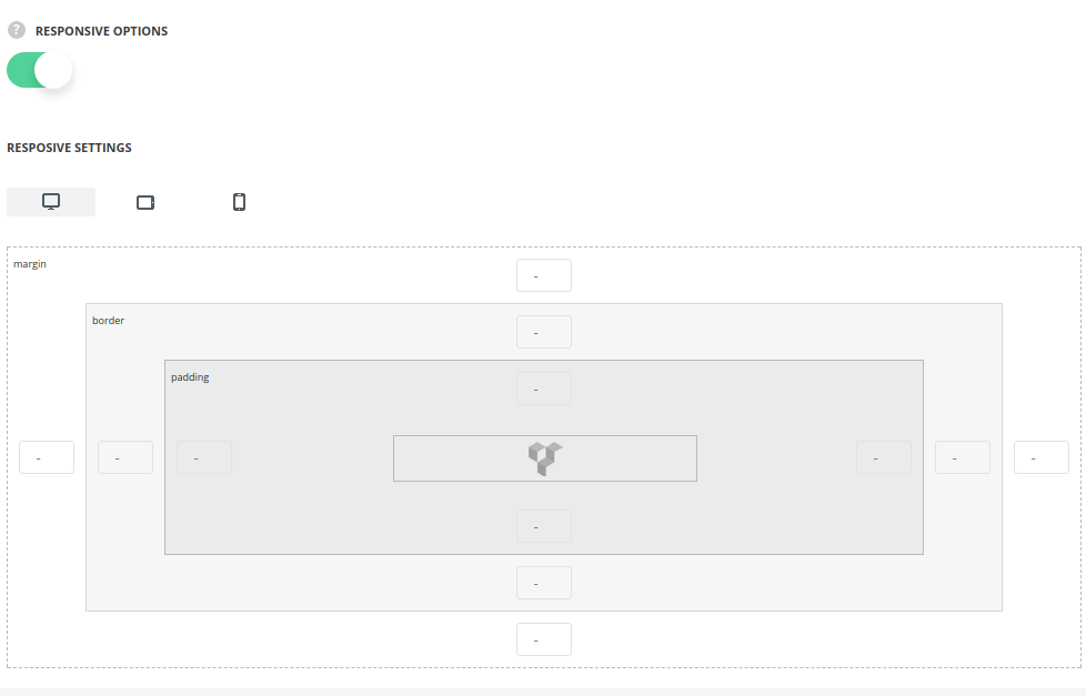
- Responsive options – switch it to Enable to customize the slide settings for different devices.
- Desktop – set the desired margins, borders, and paddings for the slide for the screen resolutions from 1280px to 1025px.
- Tablet – set the desired margins, borders, and paddings for the slide for the screen resolutions from 1024px to 800px.
- Mobile – set the desired margins, borders, and paddings for the slide for the screen resolutions less than 800px.
