Add various carousels and sliders with this module.
More examples of the carousel can be found here.
This is a nested shortcode – module that includes other modules. You may style the container and then fill it in with elements.
Add various elements int a carousel and style their sliding effects.
General settings
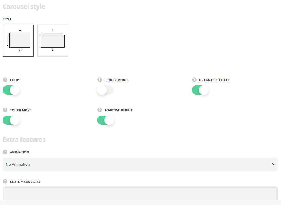
- Style – select the style of the carousel module for your site.
- Horizontal – select this style to create the carousel with the horizontal slide.
- Vertical – select this style to create the carousel with the vertical slide.
- Loop – set it to Enable to make the carousel always slide.
- Center mode – set it to Enable to set the active element in the center.
- Draggable effect – set it to Enable to allow drag the carousel with the mouse.
- Touch move – switch it to Enable to allow scroll the carousel with touch actions. For Horizontal style only.
- Adaptive height – switch it to Enable to adapt the carousel according to the content size. The option is available when you set one slide to show.
Extra features
- Animation – choose between 14 preset animation effects.
- Custom CSS class – enter our own unique class name for the item – this is a useful option for those who want to create a specific style. E.g.: you can type custom-style class and then go to
Theme optionsGeneral optionsCustom CSS/JSCustom CSSfield and write your own CSS code with this class to get your own style.
Slideshow settings
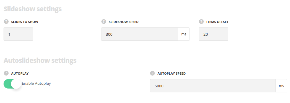
- Slides to show – specify the number of slides to show at a time.
- Slideshow speed – set the speed of the slideshow.
- Items offset – set the spacing between carousel elements.
Auto slideshow settings
- Autoplay – switch it to Enable to activate the autoplay for the carousel.
- Autoplay speed – specify the speed automatically sliding carousel.
Responsive settings
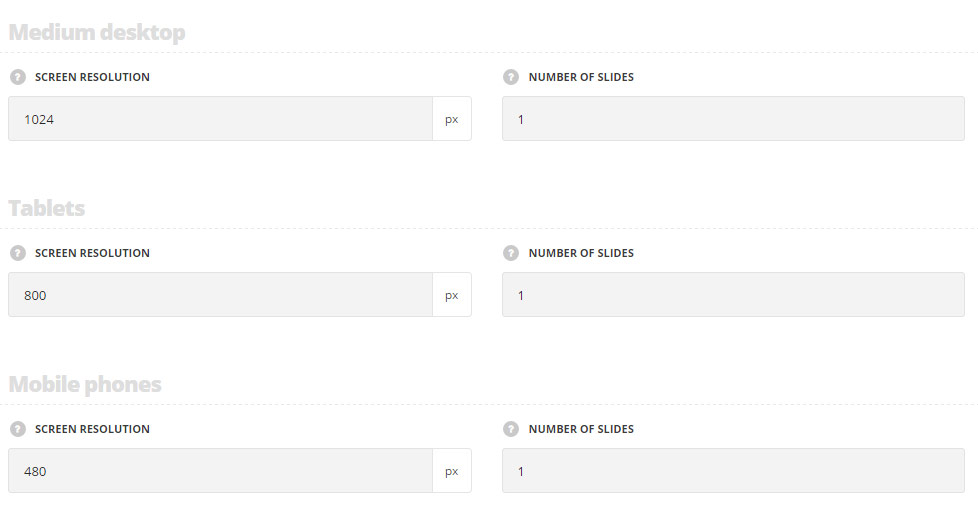
Medium desktop
- Screen resolution – set the screen resolution for the medium desktops.
- Number of slides – set the number of slides to show for the medium desktops.
Tablets
- Screen resolution – set the screen resolution for the tablets.
- Number of slides – set the number of slides to show for the tablets.
Mobile phones
- Screen resolution – set the screen resolution for the mobile devices.
- Number of slides – set the number of slides to show for the mobiles.
Navigation style
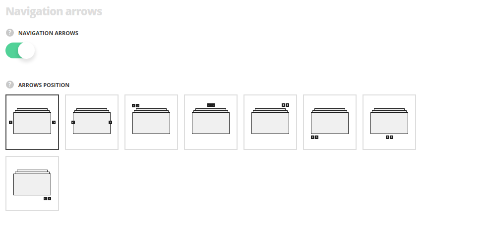
- Navigation – set it to Enable to activate the navigation between the previous and next slides inside the carousel.
- Arrows position – select the best suitable position of the navigation arrows.
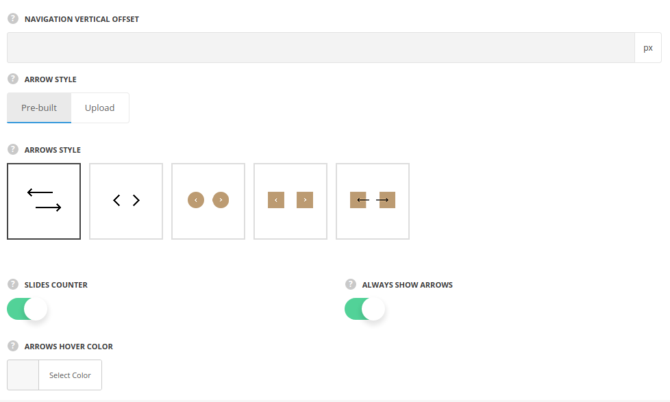
- Navigation vertical offset – add the offset for the navigation arrows to adjust their position.
- Arrow style – specify the style of the arrows – you may select pre-built arrows or upload custom ones.
- Slides counter – set it to Enable to display the number of slides and the current slide.
- Always show arrows – set it to Enable in case you want the arrows to be displayed permanently.
- Active dot color – choose the color for the active dot. The default color is inherited from
Theme OptionsStyling OptionsMain site color. - Arrows hover color – select the icon hover color.
Navigation dots
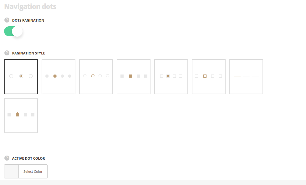
- Dots pagination – switch it to Enable to display the the bullets in carousel.
- Pagination style – select the pagination dots style from the list of available ones.
- Active dot color – specify the color of the current dot. The default color is inherited from
Theme OptionsStyling OptionsThird site color.
