Add a slider and carousel with one module.
You may see the example of the module in the first section on the Testimonials page.
General settings
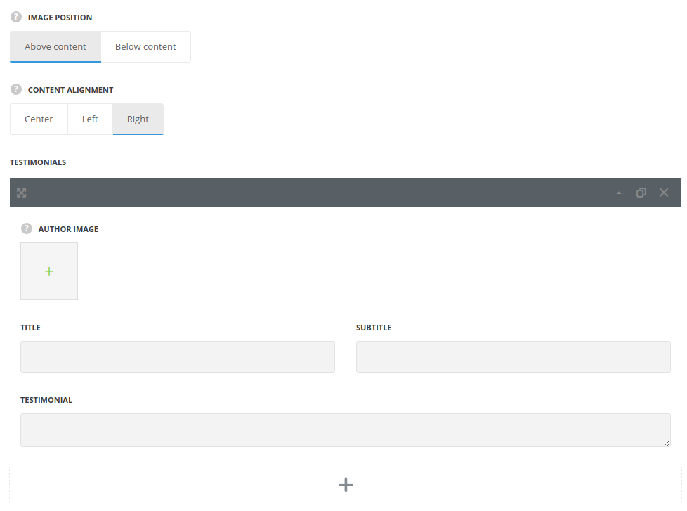
- Image position – select where to display the authors thumbnails – above or below content.
- Content align – set the alignment of the testimonial content in horizontal respect. Left, right and center positions are available.
Testimonials
In this section, you can customize the testimonials of the module.
By clicking on the arrow down icon you can reveal the whole section to adjust it to your needs. Here you are also able to duplicate the testimonials, change their order (simply drag-n-drop the blocks) and delete the unnecessary testimonials as well.
- Author image – select the image to be displayed as author image in the testimonial.
- Title – enter the title for the module.
- Subtitle – enter the subtitle for the module.
- Testimonial – enter the testimonial text.
Extra features
- Animation – choose between 14 preset animation effects.
- Custom CSS class – enter our own unique class name for the item – this is a useful option for those who want to create a specific style. E.g.: you can type custom-style class and then go to
Theme optionsGeneral optionsCustom CSS/JSCustom CSSfield and write your own CSS code with this class to get your own style.
Slider settings
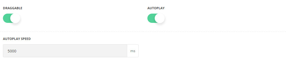
- Draggable – set it to Enable to activate the mouse drag effect while scrolling the slides.
- Autoplay – set it to Enable to activate automatic slides scrolling.
- Autoplay speed – specify the speed of the slides scrolling.
Style settings
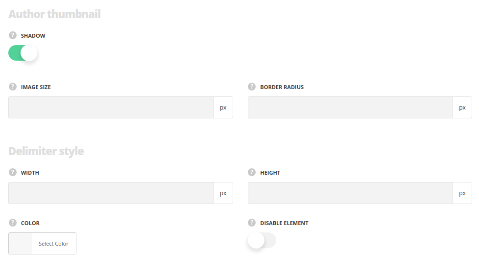
Author thumbnail
- Shadow – set it to Enable to display shadow effect around author image.
- Image size – specify the size of the image displayed as author thumbnail image.
- Border radius – set the border radius of the image to have rounded corners.
Delimiter style
- Width/Height – set the width and height of the delimiter to manage its shape.
- Color – set the color for the delimiter line.
- Disable element – put the check mark in case you want too disable it in the module.
Quote style
- Size – specify the size of the icon.
- Color – assign color for the icon.
- Disable element – put the check mark in case you want to disable it in the element.
Typography
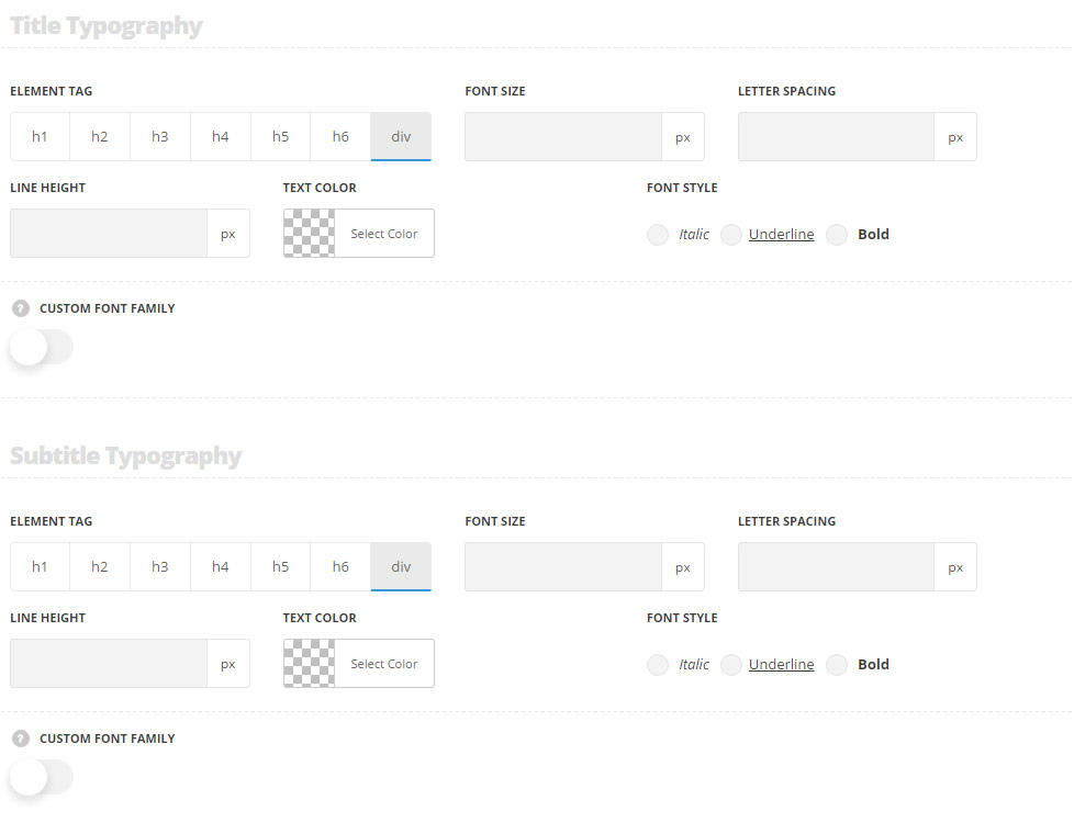
Title typography
These settings are inherited from Theme options Custom typography Feature Title Typography.
- Element tag – select the tag for the title.
- Font size – set the font size you need to use in the title.
- Letter spacing – set the needed distance between letters.
- Line-height – set the needed distance between lines in the title text.
- Text color – set the color of the font.
- Font style – select the font weight and style (bold, italic) for the title.
- Custom font family – set it to Enable to use custom Google font.
- Font Family – select the font family from the drop-down list.
- Font style – select the font weight and style (bold, italic) for the title.
Subtitle typography
The typography settings are inherited from Theme options Custom typography Subtitle typography.
- Element tag – select the tag for the subtitle.
- Font size – set the font size you need to use in the subtitle.
- Letter spacing – set the needed distance between letters in the subtitle.
- Line-height – set the needed distance between lines in the subtitle text.
- Text color – set the color of the font.
- Font style – select the font weight and style (bold, italic) from the subtitle.
- Custom font family – set it to Enable to use custom Google font.
- Font Family – select the font family from the drop-down list.
- Font style – select the font weight and style (bold, italic) for the subtitle.
Content typography
The default settings are inherited from Theme optionsTypography/Fonts Text typography Default text Typography.
- Font size – set the font size you need to use in the text in the testimonial.
- Letter spacing – set the needed distance between letters.
- Line-height – set the needed distance between lines.
- Text color – set the color of the font.
- Font style – select the font weight and style (bold, italic).
- Custom font family – set it to Enable to use custom Google font.
- Font Family – select the font family from the drop-down list.
- Font style – select the font weight and style (bold, italic) for the text in the testimonial.
