Create convenient services presentation with prices and features displayed at a time.
You may check the customization example on the Pricing Tables page.
General settings
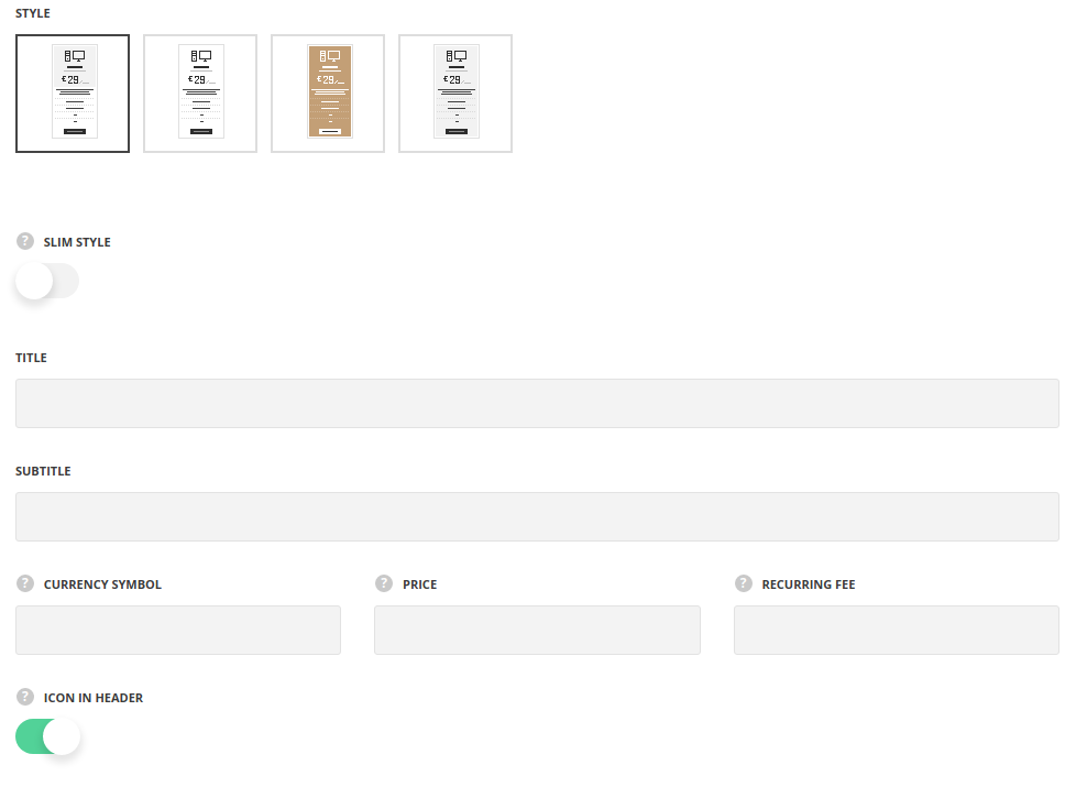
- Style – select one of the pre-defined styles.
- Slim style – set it to Enable to display pricing tables without the unnecessary paddings and make its content fit the container nicely into 4-column row. You may see the bottom example on the shortcode presentation page.
- Title – type the title of the pricing block.
- Subtitle – type the subtitle for more explanations on the module.
- Currency symbol – specify the used currency.
- Price – set the money payed for the certain service or product.
- Recurring fee – specify the time period for the service/product payment.
- Icon to header – switch it to Enable to set the icon, if needed. It’ll add extra tab with icon settings.
- Animation – choose between 14 preset animation effects.
- Custom CSS class – enter our own unique class name for the item – this is a useful option for those who want to create a specific style. E.g.: you can type custom-style class and then go to
Theme optionsGeneral optionsCustom CSSfield and write your own CSS code with this class to get your own style.
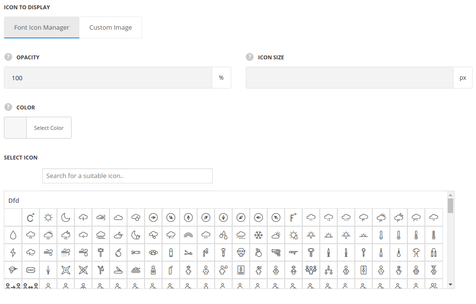
Icon settings
- Icon to display – select the element to be displayed in the module.
- Icon – select this variant to display the icon in the module.
- Icon library – choose the icon library for the module.
- Select icon – select the icon to be displayed in the module.
- Size – set the size for the icon.
- Opacity (0-100) % – specify the transparency of the icon.
- Color – choose the icon color.
- Custom Image Icon – select this variant to display custom image on the left side from the text.
- Upload image – select the image from media library for the module.
- Size – set the size for the image.
- Icon – select this variant to display the icon in the module.
Content settings
In this section, you can customize the list items of the module.
By clicking on the arrow down icon you can reveal the whole section to adjust it to your needs. Here you are also able to duplicate the list items, change their order (simply drag-n-drop the blocks) and delete the unnecessary ones as well.
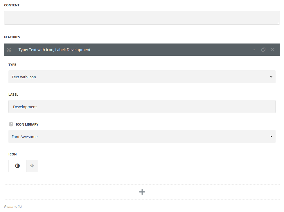
- Content – type the extra information above the available features in the pack.
- Type – select the type of the feature.
- Text with icon – to make list with various icons.
- Only text – to add simple text.
- Only icon – to display only icons.
- Dot enabled – to display available feature in the pack, it’ll inherit the main site color.
- Dot disabled – to show that the feature is excluded from the pack, the dot has transparent black color.
- Dot custom – allows to style the dot color.
- Label – add the text for feature description, for Text with icon and Only text styles.
- Icon library – select the icon pack, for Text with icon and Only icon styles.
- Icon – select the icon.
- Color – specify the color for the dot, for Dot custom style.
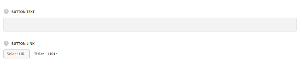
- Button text – type the text for the button to display it, if needed.
- Button link – set the link to the button.
Style settings
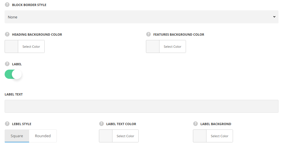
- Block border style – select the style of the module border.
- Border color – specify the color of the border.
- Border width – select the width of the module border.
- Heading background color – set the color for the header background of the module.
- Description background color – set the color of the content background.
- Label – set it to Enable to display the label mark on the top of the pricing table.
- Label text – type the text of the mark at the top of the mark.
- Label style – select the style of the mark: Square and Rounded styles are available.
- Label text color – select the text color of the mark.
- Label background – specify the background mark color.
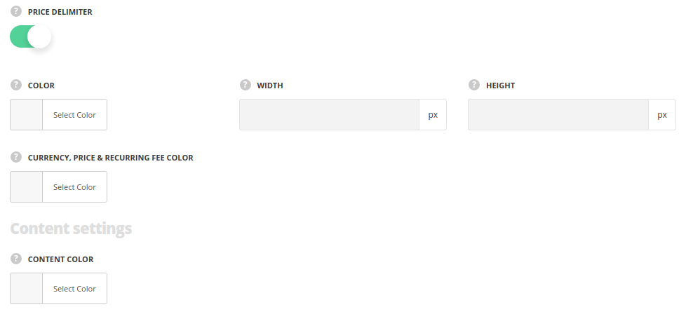
- Price delimiter – set it to Enable to display the separator between title and price.
- Color – select the color of the divider.
- Width – type its width to customize shape.
- Height – type its height to customize shape.
- Currency, price & recurring fee color – set the color for the currency symbol, price amount and recurring fee.
Content settings
- Content color – set the text color for the content.
Button settings
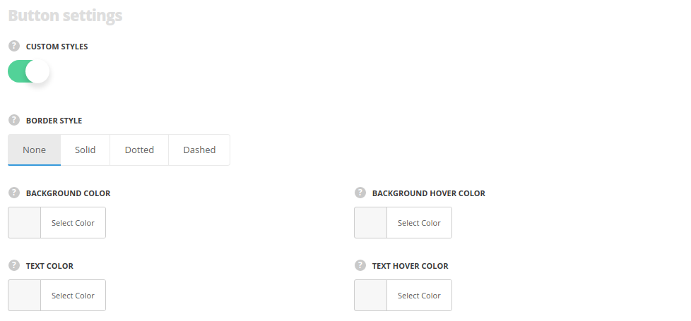
- Custom styles – set it to Enable to use the custom styles for the pricing block buttonю
- Block border style – select the style of the button border.
- Border width – select the width of the button border.
- Border color – specify the color of the border.
- Border hover color – specify the color of the border on hover.
- Background color – set the background color for the button.It is inherited from
Theme optionsGeneral optionsDefault button optionsDefault button background color. The default background color for the style Main is #fff. - Hover background color – set the hover background color for the button.It is inherited from
Theme optionsGeneral optionsDefault button optionsDefault button hover background color.The default background hover color for the style Main is rgba(255,255,255,0.8). - Text color – set the text color for the button. It is inherited from
Theme optionsGeneral optionsDefault button optionsDefault Button Typographysection. The default text color for the style Main is #1b1b1b. - Hover text color – set the text color on hover for the button. It is inherited from
Theme optionsGeneral optionsDefault button optionsDefault button hover text color. The default text hover color for the style Main is #1b1b1b.
- Block border style – select the style of the button border.
Typography settings
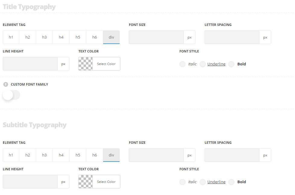
Title typography
These settings are inherited from Theme options Custom typography Features Title Typography.
- Element tag – select the tag for the title.
- Font size – set the font size you need to use in the title.
- Letter spacing – set the needed distance between letters.
- Line-height – set the needed distance between lines in the title text.
- Text color – set the color of the font.
- Font style – select the font weight and style (bold, italic) for the title.
- Custom font family – set it to Enable to use custom Google font.
- Font Family – select the font family from the drop-down list.
- Font style – select the font weight and style (bold, italic) for the title.
Subtitle typography
These settings are inherited from Theme options Custom typography Subtitle Typography.
- Element tag – select the tag for the subtitle.
- Font size – set the font size you need to use in the subtitle.
- Letter spacing – set the needed distance between letters in the subtitle.
- Line-height – set the needed distance between lines in the subtitle text.
- Text color – set the color of the font.
- Font style – select the font weight and style (bold, italic) from the title.
Content typography
The typography settings are inherited from Theme options Custom typography Text typography.
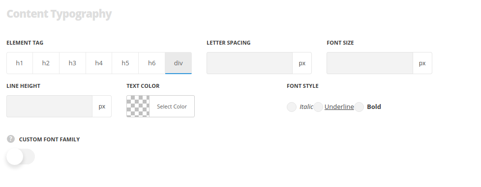
- Element tag – select the tag for the text in the module.
- Font size – set the font size you need to use in the text in the module.
- Letter spacing – set the needed distance between letters.
- Line-height – set the needed distance between lines.
- Text color – set the color of the font.
- Font style – select the font weight and style (bold, italic).
The price and currency symbol typography settings are inherited from Theme options Custom typography H1 Title typography.
The recurring fee settings are inherited from Theme options Custom typography Subtitle Typography.
Pricing Labels Module
Add extra notes for the Pricing boxes.
You may check the customization example on the Pricing Tables page (bottom example).
Pricing labels help to add more information to the Price Block module with bullets cntent. Explain the availability of the feature in the pack with common labels.
General settings
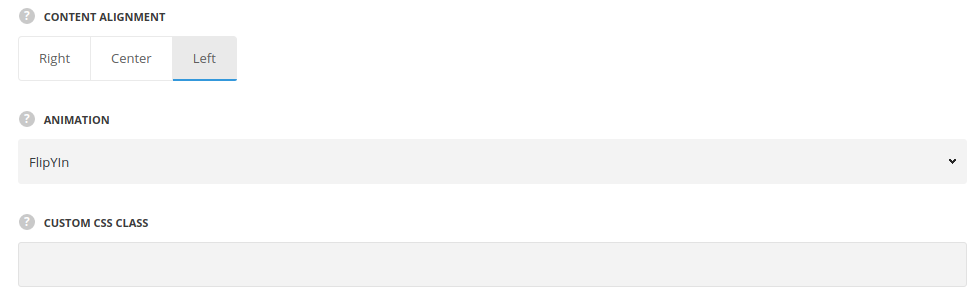
- Content alignment – select where to align the labels: left, right and center positions are available.
- Animation – choose between 14 preset animation effects.
- Custom CSS class – enter our own unique class name for the item – this is a useful option for those who want to create a specific style. E.g.: you can type custom-style class and then go to
Theme optionsGeneral optionsCustom CSSfield and write your own CSS code with this class to get your own style.
Content settings
In this section, you can customize the list items of the module.
By clicking on the arrow down icon you can reveal the whole section to adjust it to your needs. Here you are also able to duplicate the list items, change their order (simply drag-n-drop the blocks) and delete the unnecessary ones as well.
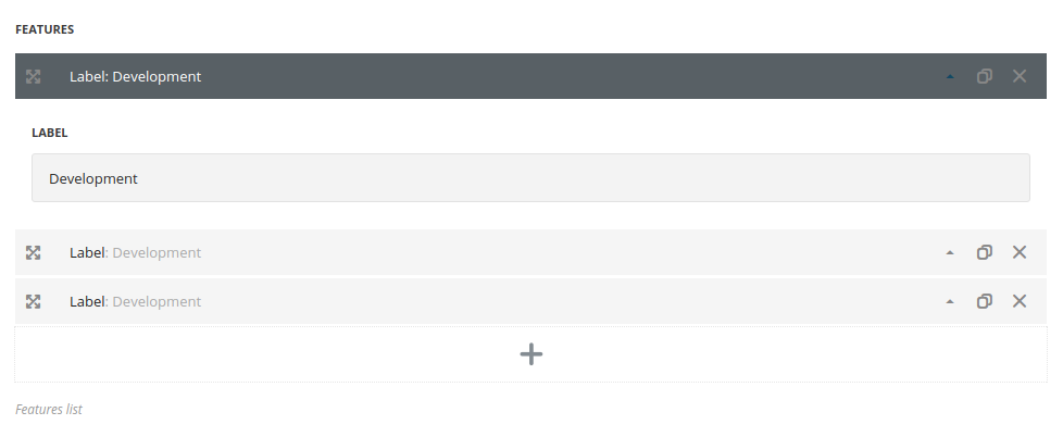
- Label – type the extra information above the available features in the pack.
The labels will be automatically aligned with the content features of the Price Boxes. So you’ll be able to use bullets to indicate the presence/absence of the feature in a pack.
Typography settings
Content typography
The typography settings are inherited from Theme options Custom typography Text typography.
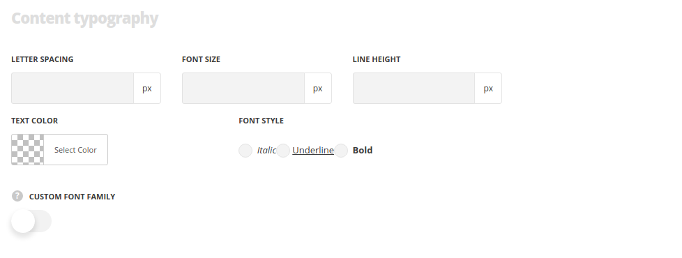
- Element tag – select the tag for the title.
- Font size – set the font size you need to use in the title.
- Letter spacing – set the needed distance between letters.
- Line-height – set the needed distance between lines in the title text.
- Text color – set the color of the font.
- Font style – select the font weight and style (bold, italic) for the title.
- Custom font family – set it to Enable to use custom Google font.
- Font Family – select the font family from the drop-down list.
- Font style – select the font weight and style (bold, italic) for the title.
