Styling base options
This section allows you to style the color schemes on your site. Note, you can overwrite these settings from every page editor.
You can also style the login page and lightbox for your site in this section.
Main site colors setup
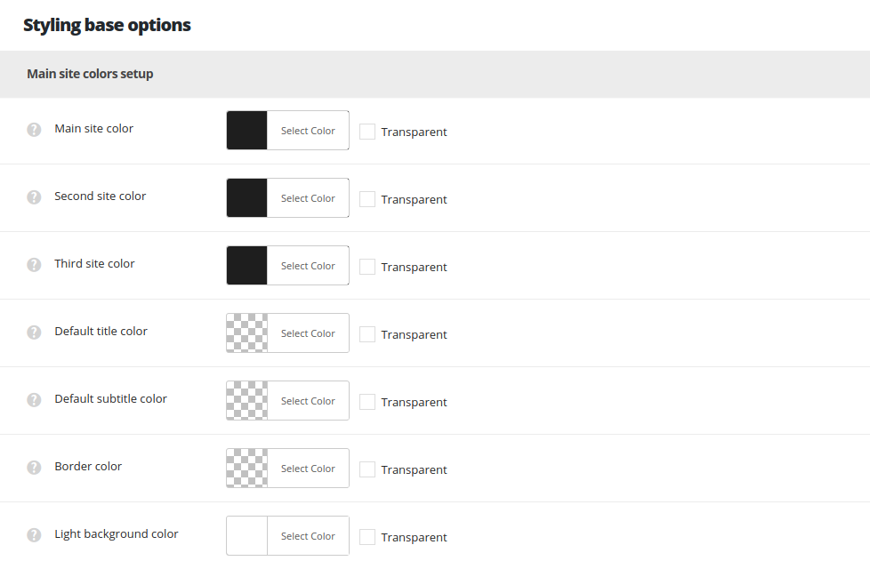
- Main site color – set the main site color. Please, find the short list of the elements using this color below:
- Links hover color in vCard Simple Widget
- Mask color for Facebook Widget
- Menu icon hover color for Custom menu widget in Footer
- Read more style hover color for shuffle style
- Read more style color for Slide up style
- Hover color for the Sort panel items
- Quote’s author on single post page
- Pagination’s hover color
- Pagination type – Ajax border color when click on button
- Text hover color for author’s name and category in meta
- Play and Volume hover color on Single audio post
- Background color in TABBED WIDGET active tab
- Active tab title hover color Tabs module
- Second site color – select the second site color. This color is used as default border and delimiter color and background color for the popover, the feature for the text editor on single post, single portfolio and in Text module.
- Third site color – set the third site color. The color is used in the elements below:
- Category label background color on posts thumbnails.
- Comments label background color on posts thumbnails.
- Decoration color in Categories widget.
- Links background color in Widgets.
- Sort panel active element border color.
- Blog/Portfolio/Shop/Gallery top link sorce button color.
- Categories, tags and author dropdown decoration hover color.
- Read more button decoration hover color.
- Lock icon color when login form is active.
- Checkbox hover color in Login Widget button background in header login form.
- Delimiter colors on hover in Filter by sorter on Blog page, Portfolio page and Shop page.
- Border of the current category in he sort panel on Blog page and Portfolio page.
- Coments counter background on Blog page and Portfolio page.
- Category button background on Blog page, Portfolio page and Shop page, in case no custom color is set for the category.
- Underline decoration of the links on meta for Blog page and Portfolio page.
- Read more decoration on hover for Blog page and Portfolio page.
- Product title on hover for Shop page.
- Sale badge text color on hover for Shop page and inner Product page.
- Submit comment button background color on Post inner page.
- Reviews decoration near the title on Product inner page.
- Add to cart button background color on Product inner page.
- Add to wishlist and Caregories decoration color on hover for Product inner pages.
- Tabs border color on Product inner page.
- Comments and button background color on hover for Fixed inner pages navigation.
- List decoration for Widgets: Categories, Meta, Archives, News Categories List, WooCommerce Product Categories, Categories and Archives.
- Vcard Simple widget background.
- Login widget button background.
- Task Custom Field decoration on Portfolio inner page.
- Default title color – set the title color for the title used in:
- Blockquote color.
- Contact block horizontal (icon and texts).
- Text color Categories, tags and author dropdown.
- Default subtitle color – set the title color for the subtitle.
- Border color – set the color for borders on the site.
- Light background color – this color will be used for sidebar and portfolio description section backgrounds.
- Sidebar background color.
- Animated hover background on Blog page and Portfolio page items titles.
Boxed site options
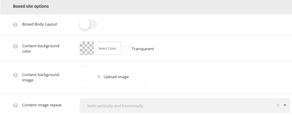
- Boxed body layout – set it to Enable to have the boxed site layout (1280px width).
- Content background color – set the default color for the content of your site.
- Content background image – select the default background image for the content.
- Content image repeat – select whether the page background image will be repeated or not repeated. You can select horizontal repeat, vertical repeat or disable repeat of the image.
Body styling options
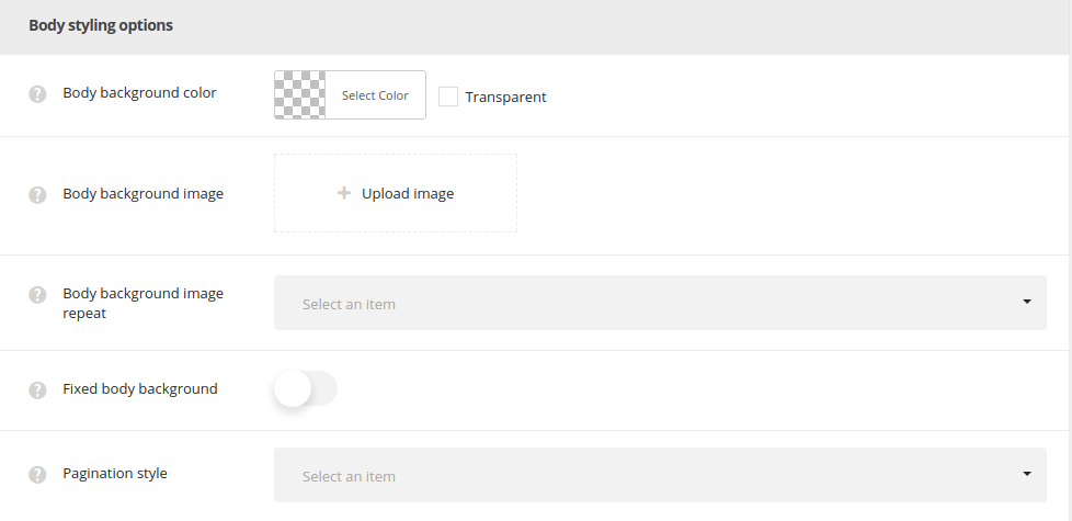
- Body background color – allows you to set the default color for the body by default for the whole site. You may overwrite these settings in each item’s editor
Page optionsmeta box. - Body background image – upload the image to be displayed as a background of the page or enter the URL of the image.
- Body background image repeat – select whether the page background image will be repeated or not repeated. You can select horizontal repeat, vertical repeat or disable repeat of the image.
- Fixed body background – enable fixed background to make the background image fixed, so the content will scroll separately over it. When Disable is selected, the background image scrolls with the content.
- Pagination style – set one of the preset pagination styles. The pagination will be used for blog, portfolio, gallery and shop pages as default one. 5 styles are avaiable.
