Create the stylish representation of gallery works arranging multipurpose gallery section.
Check this post to learn more about Gallery page creation.
Base gallery options
In this section, you’ll be able to adjust main gallery settings for your site.
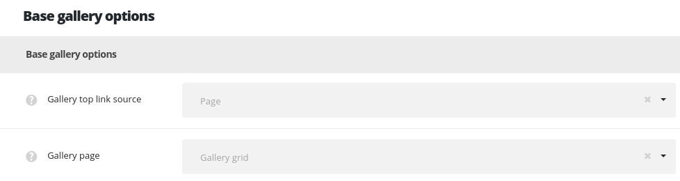
- Gallery top link source – allows you to set the page or custom link which will be used for the button placed next to the categories and tags dropdown on pages with Gallery page template selected.
- Page – allows you to select the page from the existing on your site to be set as main gallery page.
- Gallery page – select the page which will be used as main gallery page from the drop-down list.
- Custom URL – allows you to set the custom link for the gallery page.
- Gallery page URL – enter the link which will be used as the main gallery page.
Layout settings
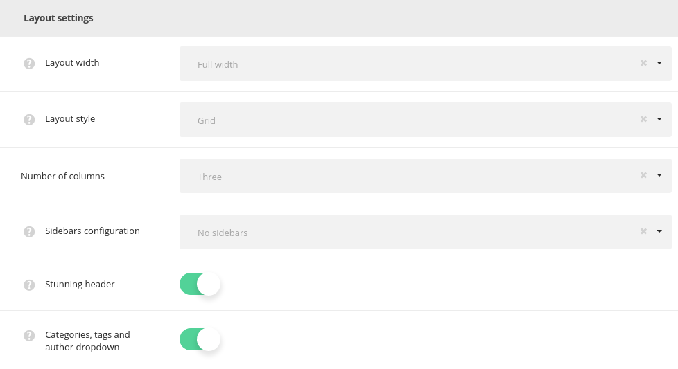
- Layout width – set the gallerypage content width. Boxed and full width variants are available.
- Layout style – select layout style for the gallery items on your gallery page.
- Grid – allows you to show regularly spaced horizontal and vertical elements. The example of grid Gallery page can be found here.
- Masonry – the style when the elements are shown one after another, first in the horizontal direction, then vertically. Check the Masonry Gallery page example.
- Standard – the featured image of the gallery item is displayed in one column with the description below it. Find the example of the page here.
- Number of columns – select the number of columns for gallery items on the gallery page. Five is the maximum value (for Grid and Masonry styles only!).
- Sidebar configuration – set the sidebars to be shown on the gallery page. No sidebars, sidebar on left, sidebar on right and both left and right sidebars are available.
- Stunning header – switch it to Enable to have the stunning header on gallery pagees by default. It inherits the settings from
Theme optionsHeader optionsStunning header optionssection or you may overwrite them in gallery page editorStunning Header optionsmeta box. - Categories and tags dropdown – adds categories, tags and author drop-down sorter before gallery works.
Content settings
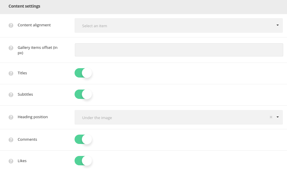
- Gallery items offset (in px) – adds space between gallery items on the gallery page.
- Content alignment – choose the content alignment for the gallery item. Left, right and center variants are available.
- Titles – select whether the title of the single gallery item will be shown or hidden on the gallery page under the featured image of a single gallery item.
- Subtitle s– select whether the subtitle of the single gallery item will be shown or hidden on the gallery page under the featured image of a single gallery item.
- Heading position – choose heading position on gallery page. Over and under image positions are available.
- Comments – select whether to show or hide the comments count of the gallery items.
- Likes – select if you’d like to show or hide the likes count of the gallery items.
Extra features
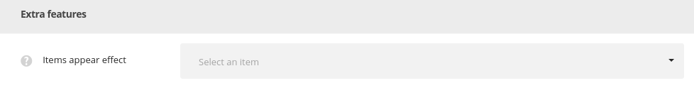
- Items appear effect – allows you to select the animation appear effect for the single gallery item.
Archive gallery pages inherit the settings from Theme options Blog options Archive page options section.
Single gallery item options
Adjust the default settings for all the gallery items on your site using the options from this section.
All the settings can be overwritten for each gallery item individually in galley item editor Single Gallery Options meta box.
Layout settings
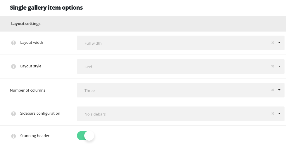
- Layout width – set the single gallery content width. Boxed and full width variants are available.
- Gallery layout style – choose layout style for the single gallery item. Carousel, Masonry, Grid, Advanced gallery variants are available. Check more about each layout style in this post (
Single Gallery optionsAdvanced settingsmeta box). - Number of columns – set the number of columns for the images inside gallery item. Five is the maximum value.
- Sidebar configuration – set the sidebars to be shown on the gallery page. No sidebars, sidebar on left, sidebar on right and both left and right sidebars are available.
- Stunning header – set it to Enable to show the stunning header on gallery item page. It inherits the settings from
Theme optionsHeader optionsCustom header optionssection or you may overwrite them in single gallery item editorCustom Header optionsmeta box.
Content settings
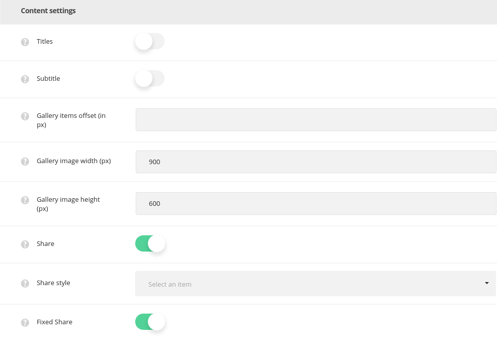
- Title – set the title of the gallery item will be shown or hidden above the gallery item.
- Subtitle – set the subtitle of the gallery item will be shown or hidden above the gallery item.
- Gallery items offset (in px) – add space between gallery images, don’t include “px”.
- Gallery image width (in px) – set the width of the gallery thumbnails images.
- Gallery image height (in px) – set the height of the gallery thumbnails images.
- Inside pagination – switch it to Enable if you want to display pagination between previous and next single galleries in single gallery item page.
- Pagination position – select the position of the inside pagination on single gallery page. Fixed and Top variants are available. You can also disable pagination.
- Share – allows you to show or hide the share in meta on gallery item.
- Share style – choose one of the preset styles for the Share button.
- Fixed share – select whether you want to show or hide the fixed share (side share) on the single gallery page.
Pagination settings
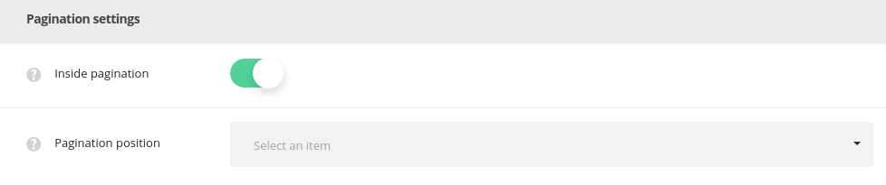
Inside pagination – allows you to select the inner pagination style for gallery items. Switch it to Disable to remove inside pagination.
- Fixed – the pagination arrows for previous and next gallery items will be displayed on scroll. Check this link to view the example.
- Top – the pagination arrows are displayed on top of the gallery items. The example can be found here.
Gallery hover style options
Create the stylish and impressive hover effect for the single galleries on your site.
Main hover settings
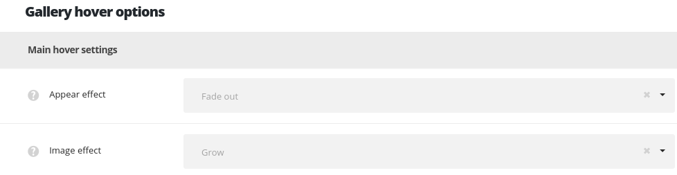
- Appear effect – allows you to choose one of the preset appear animations for the gallery items. If you choose inherit from theme options the displaying will correspond to the theme options.
- Image effect – set the behavior of the thumbnail image on hover.
Hover decoration settings
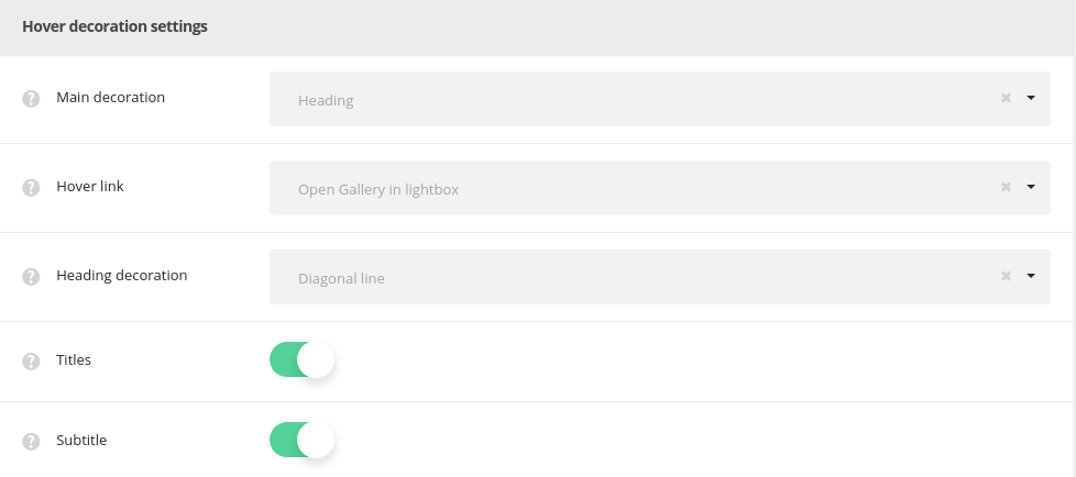
- Main decoration – set the decoration element which will be displayed on hover.
- Inherit – if you choose theme default the displaying will correspond to the
Theme optionsGallery options settingsGallery hover style optionsMain hover decorationsetting. - None – no decoration is set for mouse hover effect.
- Heading – allows showing the gallery item title/subtitle which is possible to link to the gallery page itself, to the external link or open the image in lightbox.
- Heading decoration – choose the style for the heading hover decoration. If you choose inherit from theme options the displaying will correspond to the theme options settings.
- Hover link – set the link for the plus icon. It can link to inside (inner page of single gallery item) and to lightbox.
- Title – set to Enable if you want the gallery item title to be displayed on hover.
- Subtitle – set to Enable if you want the gallery item subtitle to be displayed on hover.
- Plus – the plus icon will be displayed as hover decoration.
- Hover link – set the link for the plus icon. It can link to inside (inner page of single gallery item) and to lightbox.
- Plus position – set the Plus decoration position. If you choose inherit from theme options the displaying will correspond to the theme options settings.
- Plus background – set the Plus decoration’s background. This option is not available for ‘Middle of the project‘ plus position. If you choose inherit from theme options the displaying will correspond to the theme options settings.
- Lines – the lines will be displayed as hover decoration.
- Hover link – set the link for the plus icon. It can link to inside (inner page of single gallery item) and to lightbox.
- Dots – three dots will be displayed as hover decoration.
- Hover link – set the link for the plus icon. It can link to inside (inner page of single gallery item) and to lightbox.
- Inherit – if you choose theme default the displaying will correspond to the
Hover color settings
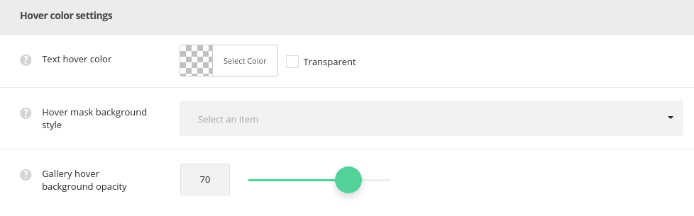
- Text hover color – select the text of the elements on hover.
- Hover mask background style – set the background style for the hover mask.
- Simple – select this style to have one color for the single gallery items hover.
- Mask background color – select the background color for the hover mask.
- Gradient – select this style to have the gradient style for gallery hover.
- Background gradient – choose the start and end color for the hover mask gradient color for single gallery items.
- Simple – select this style to have one color for the single gallery items hover.
- Gallery hover background opacity – set the opacity value for the hover mask background.
More details can be found in the Gallery Page Creation post.
