Portfolio section is the perfect way to present your projects and creative ideas to the whole world.
Check this post to learn more about Portfolio page creation.
Base portfolio options
Customize main settings for your portfolio section.
-
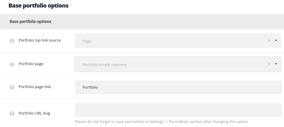
- Portfolio top link source – allows you to set the page or custom link which will be used for the button placed next to the categories and tags dropdown on pages on pages with Portfolio page template selected (check the example on this page) and on single portfolio pages with the Top pagination style selected, as shown on this page.
- Page – allows you to select the page from the existing on your site to be on Portfolio page template.
- Portfolio page – select the page which will be used as main portfolio page from the drop-down list.
- Custom URL – allows you to set the custom link for the portfolio page.
- Portfolio page URL – enter the link which will be used as the main portfolio page.
- Page – allows you to select the page from the existing on your site to be on Portfolio page template.
- Portfolio top link source – allows you to set the page or custom link which will be used for the button placed next to the categories and tags dropdown on pages on pages with Portfolio page template selected (check the example on this page) and on single portfolio pages with the Top pagination style selected, as shown on this page.
- Portfolio URL slug – allows you to change the portfolio slug. Set your custom slug which will be displayed instead of ‘my-product’ in portfolio URL. After changing this option, it is important to save the permalinks in
SettingsPermalinks. Check more in this post.
Content settings
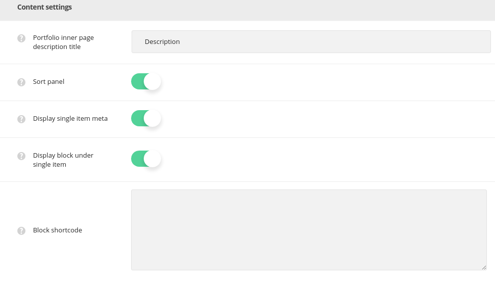
- Portfolio inner page description title – enter the title for your portfolio page.
- Sort panel – set it to Enable to show portfolio categories sorter above portfolio items on deprecated portfolio page templates.
- Display single item meta – set it to Enable to show the single portfolio item’s meta(publication date, author, and category) on the portfolio page.
- Display block under single item – set it to Enable to display the block that will be displayed under all single portfolios.
- Block shortcode – enter the shortcode of the needed module into this field that will be displayed under all single posts. More details can be found in this post.
Portfolio page options
Select the settings for the pages with Portfolio page template selected as default.
Layout settings
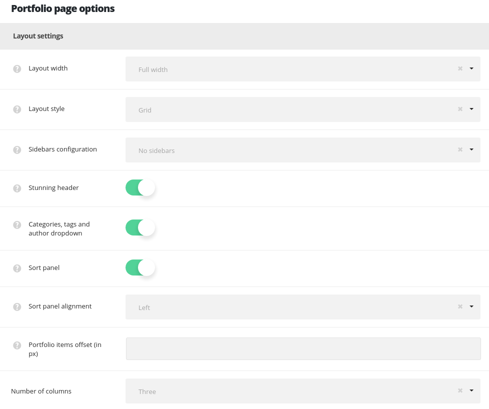
- Layout width – set the portfolio page content width. Boxed and full width variants are available.
- Portfolio layout style – select layout style for the single portfolio items on your portfolio page.
- Standard – the featured image of the single portfolio items is displayed in one column with the description below it. Find the example of the page here.
- Masonry – the portfolios are aligned into a masonry sections. The content takes as much space as needed and the thumbnails are not cropped and adjusted to it. Find the example of the page here.
- Grid – the portfolio items are aligned into a grid equal sections. The content is adjusted to take equal space and the thumbnails are cropped respectively. Grid page example can be found here.
- Sidebar configuration – set the sidebars to be shown on the portfolio page. No sidebars, sidebar on left, sidebar on right and both left and right sidebars are available.
- Stunning header – switch it to Enable to have the stunning header on portfolio page by default. It inherits the settings from
Theme optionsHeader optionsStunning header optionssection or you may overwrite them in single portfolio editorStunning Header optionsmeta box. - Categories and tags dropdown – adds categories, tags and author drop-down sorter before portfolio items. Check this link to view the example.
- Sort panel – allows you to enable or disable portfolio categories sorter above portfolio items (for Grid and Masonry styles only!). The example can be found here.
- Sort panel alignment – select the alignment for the sort panel horizontally. Left, right and center positions are available.
- Portfolio items offset (in px) – adds space between single portfolios on the portfolio page.
- Number of columns – select the number of columns for portfolio items on the portfolio page. Five columns are the maximum value (for Grid and Masonry styles only!).
Content settings
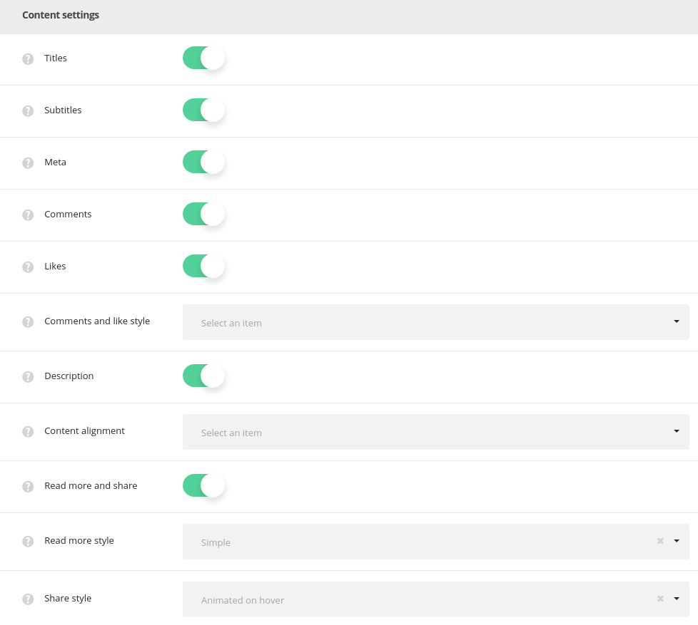
- Titles – set the titles of the portfolio item to be shown or hidden above the portfolio item, for Portfolio inside 2 variant Portfolio Template.
- Subtitle – set the subtitle of the portfolio item to be shown or hidden above the portfolio item, for Portfolio inside 2 variant Portfolio Template.
- Meta – allows you to show or hide the information about the portfolio item (date of creation, category, likes, count) under the featured image.
- Comments – select whether to show or hide the comments count of the single portfolio item.
- Likes – select if you’d like to show or hide the likes count of the single portfolio item.
- Comments and likes style – set the visibility of comments and likes counter. Always show or Show on hover variants are available.
- Description – allows you to show or hide short description from the Excerpt field under the featured image of the single portfolio item.
- Content alignment – set the horizontal alignment for the content of single portfolio item. Left, right and center positions are available.
- Read more and share – set it to Enable t to display the read more and share buttons for each single portfolio item on the portfolio page.
- Read more style – choose one of the preset styles for the Read more button.
- Share style – select one of the preset styes for the Share button.
Extra features
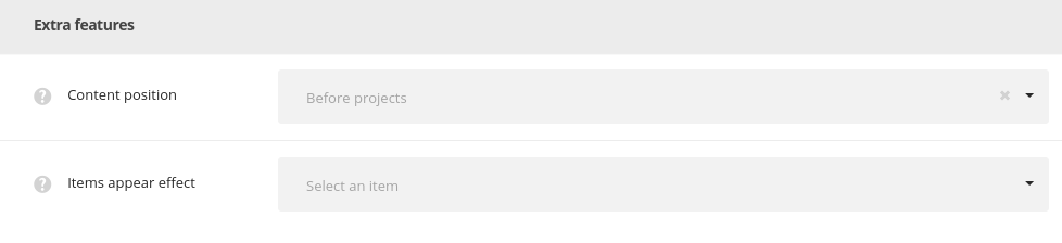
- Content position – select the position of the Visual Composer content: it may be displayed above or below the post item.
- Items appear effect – select the most suitable appear effect for the portfolio items.
Single portfolio item options
Adjust the settings for the single portfolio items on your site.
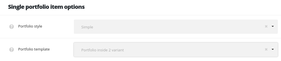
- Portfolio style – allows you to select the Simple or Advanced settings style. Advanced style allows you to control more options (like Enable meta, Enable read more and Share, Share style and Enable Fixed Share).
- Portfolio template – select what inner page type you’d like to use:
- Portfolio inside 1 variant – description sidebar has no paddings and decorations and stretches to cover full height, the gallery has no paddings and borders.
- Portfolio inside 2 variant – description sidebar has top and bottom paddings and the decoration zigzag dividers, the gallery has paddings and borders, new share and comments style.
Layout settings
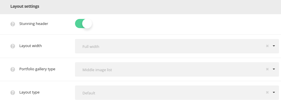
- Stunning header – switch it to Enable to have the stunning header on single posts by default. It inherits the settings from
Theme optionsHeader optionsStunning header optionssection or you may overwrite them in single post editorStunning Header optionsmeta box. - Layout width – set the single portfolio item content width. Boxed and full width variants are available.
- Portfolio gallery type – select the gallery appearance on the item inner page. You may add the gallery images to the Images gallery meta box.
- Default – displays gallery images carousel with small thumbnails at the bottom, the main image is set to 900x750px and the thumbnails are 250x250px. You may see the example following this link.
- Big images – displays images in one column full size, their size is set to 1280x900px. You may see the example following this link.
- Middle images list – displays images in two columns, their size is set to 650x650px. You may see the example following this link.
- Small image list – displays images in couple columns, their size is set to 400x400px. You may see the example following this link.
- Advanced gallery – displays one big image 800x800px and small images (400x400px) are around it. You may see the example following this link.
- Layout type – allows selecting whether the portfolios will be created with default structure or with Visual Composer elements.
- Default – select this layout type to create the portfolios with default structure (big, small, medium images list gallery type etc).
- For Page Builder – select this layout type to create portfolio item using the Visual Composer element.
Content settings
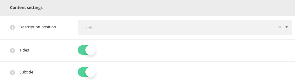
- Description position – select the description position in respect to the media content. Left, right and bottom position are available.
- Titles – set the titles of the portfolio item to be shown or hidden above the portfolio item, for Portfolio inside 2 variant Portfolio Template.
- Subtitle – set the subtitle of the portfolio item to be shown or hidden above the portfolio item, for Portfolio inside 2 variant Portfolio Template.
Pagination settings
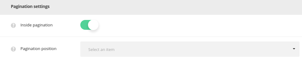
- Inside pagination – allows you to select the inner pagination style for portfolios. Switch it to Disable to remove inside pagination.
Portfolio archive page options
Easily customize the archive pages for portfolio section on your site.
Layout settings
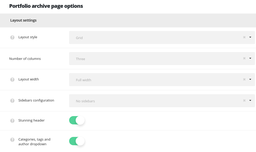
- Portfolio layout style – select layout style for the single portfolio items on your archive portfolio page.
- Standard – the featured image of the single portfolio items is displayed in one column with the description below it. Find the example of the page here.
- Masonry – the portfolios are aligned into a masonry sections. The content takes as much space as needed and the thumbnails are not cropped and adjusted to it. Find the example of the page here.
- Grid – the portfolio items are aligned into a grid equal sections. The content is adjusted to take equal space and the thumbnails are cropped respectively. Grid page example can be found here.
- Number of columns – select the number of columns for portfolio items on the portfolio page. Five columns are the maximum value (for Grid and Masonry styles only!).
- Layout width – set the archive portfolio page content width. Boxed and full width variants are available.
- Sidebar configuration – set the sidebars to be shown on the archive portfolio page. No sidebars, sidebar on left, sidebar on right and both left and right sidebars are available.
- Stunning header – switch it to Enable to have the stunning header on archive portfolio page by default. It inherits the settings from
Theme optionsHeader optionsStunning header optionssection or you may overwrite them in single portfolio editorStunning Header optionsmeta box. - Categories and tags dropdown – adds categories, tags and author drop-down sorter before portfolio items on the archive page. Check this link to view the example.
Content settings
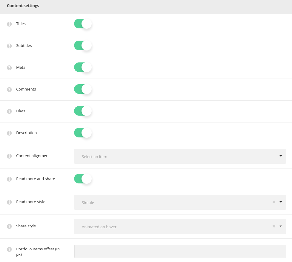
- Titles – set the titles of the portfolio item to be shown or hidden above the portfolio item, for Portfolio inside 2 variant Portfolio Template.
- Subtitle – set the subtitle of the portfolio item to be shown or hidden above the portfolio item, for Portfolio inside 2 variant Portfolio Template.
- Meta – allows you to show or hide the information about the portfolio item (date of creation, category, likes, count) under the featured image.
- Comments – select whether to show or hide the comments count of the single portfolio item.
- Likes – select if you’d like to show or hide the likes count of the single portfolio item.
- Description – allows you to show or hide short description from the Excerpt field under the featured image of the single portfolio item.
- Content alignment – set the horizontal alignment for the content of single portfolio item. Left, right and center positions are available.
- Read more and share – set it to Enable t to display the read more and share buttons for each single portfolio item on the portfolio page.
- Read more style – choose one of the preset styles for the Read more button.
- Share style – select one of the preset styes for the Share button.
- Portfolio items offset (in px) – adds space between single portfolios on the archive portfolio page.
Extra features
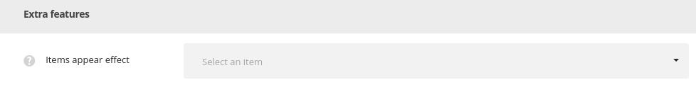
- Items appear effect – select the most suitable appear effect for the portfolio items.
Portfolio hover options
Create stylish and incomparable hover effect for the portfolio items on your site.
Main hover settings
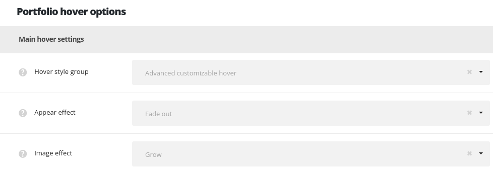
- Hover style group – select the portfolio type to use on the site:
- Pre-built hovers (old version) – allows you yo select the one from 24 pre built hover styles (available till Ronneby 1.1.0).
- Hover style – choose one of the preset hover styles from the list.
- Subtitle text – select the text to be shown as the portfolio subtitle on hover. Categories and Single item subtitle variants are available.
- Hover style – select the one from 24 pre built hover styles (available till Ronneby 1.1.0).
- Text hover color – select the text of the elements on hover.
- Advanced customizable hover – new elaborated hovers that can be customized (available in Ronneby 1.1.1).
- Appear effect – allows you to choose one of the preset appear animations for the portfolio items.
- Image effect – set the behavior of the thumbnail image on hover.
- Hover style – choose one of the preset hover styles from the list.
- Pre-built hovers (old version) – allows you yo select the one from 24 pre built hover styles (available till Ronneby 1.1.0).
Hover decoration settings
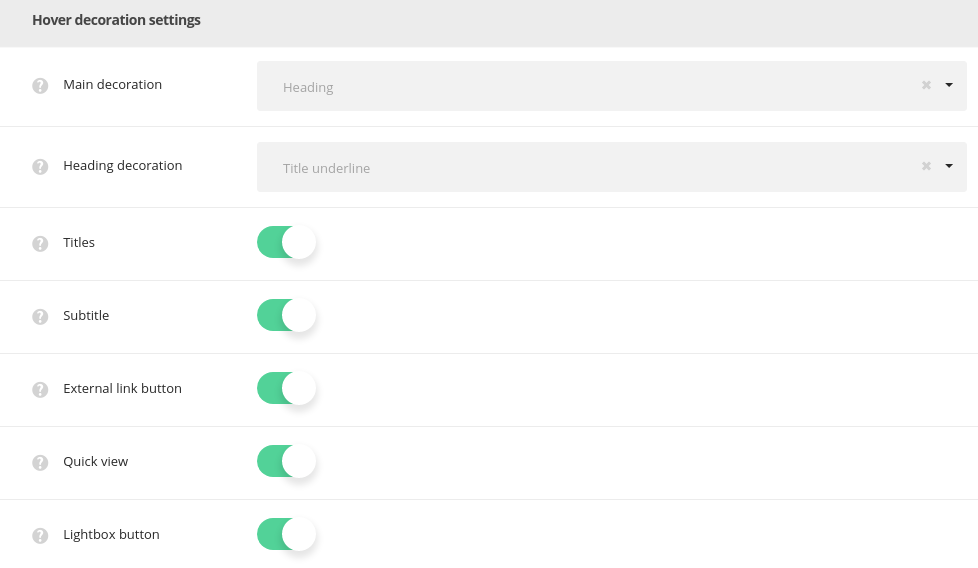
- Main decoration – set the decoration which will be displayed on hover.
- None – no decoration is set for mouse hover effect.
- Heading – allows showing the portfolio item title/subtitle which is possible to link to the portfolio page itself, to the external link or open the image in lightbox. The example can be found here.
- Heading decoration – choose the style for the heading hover decoration.
- Show subtitle – set to Enable if you want the gallery item subtitle to be displayed on hover.
- Enable external link – set on to display the link to custom project or external site.
- Enable Quick view – set on to display the button to preview portfolio work in the lightbox.
- Enable Lightbox – set on to display the icon to open the portfolio gallery in a lightbox.
- Plus – the plus icon will be displayed as hover decoration. Check the decoration example here.
- Hover link – set the link for the plus icon. It can link to inside (inner page of single portfolio item) and to lightbox.
- Plus position – set the Plus decoration position.
- Plus background – set the Plus decoration’s background. This option is not available for ‘Middle of the project‘ plus position. If you choose inherit from theme options the displaying will correspond to the theme options settings.
- Enable external link – set on to display the link to custom project or external site.
- Enable Quick view – set on to display the button to preview portfolio work in the lightbox .
- Enable Lightbox – set on to display the icon to open the portfolio gallery in a lightbox.
- Lines – the lines will be displayed as hover decoration. Check this link to view the example.
- Enable external link – set on to display the link to custom project or external site.
- Enable Quick view – set on to display the button to preview portfolio work in the lightbox .
- Enable Lightbox – set on to display the icon to open the portfolio gallery in a lightbox.
- Dots – three dots will be displayed as hover decoration. Here you may find the example.
- Enable external link – set on to display the link to custom project or external site.
- Enable Quick view – set on to display the button to preview portfolio work in the lightbox .
- Enable Lightbox – set on to display the icon to open the portfolio gallery in a lightbox.
Hover color settings
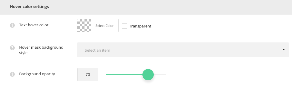
- Text hover color – select the text of the elements on hover.
- Hover mask background style – set the background style for the hover mask.
- Simple – select this style to have one color for the portfolio hover.
- Mask background color – select the background color for the hover mask.
- Gradient – select this style to have the gradient style for portfolio hover.
- Background gradient – choose the start and end color for the hover mask gradient color for portfolios.
- Simple – select this style to have one color for the portfolio hover.
- Background opacity – set the opacity value for the hover mask background.
