Add the reviews of your customers to promote your service using the Testimonial module.
You may see the example on the Testimonial page.
General settings
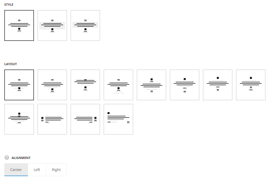
- Style – select the style of the testimonials – without decoration, with general background and content background.
- Layout – select the positioning of the module elements.
- Alignment – select the content alignment, for all Layout types, except for Left and Right Image. Left, right and center positions are available.
Extra features
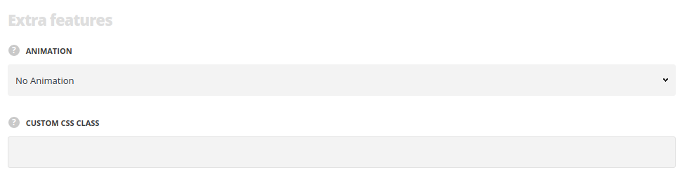
- Animation – choose between 14 preset animation effects.
- Custom CSS class – enter our own unique class name for the item – this is a useful option for those who want to create a specific style. E.g.: you can type custom-style class and then go to
Theme optionsGeneral optionsCustom CSS/JSCustom CSSfield and write your own CSS code with this class to get your own style.
Content settings
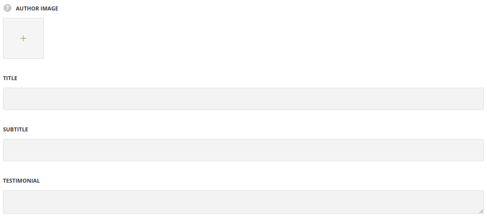
- Author image – select the image to be displayed as author image in the testimonial.
- Title – enter the title for the module.
- Subtitle – enter the subtitle for the module.
- Testimonial – enter the testimonial text.
Typography settings
Testimonial typography
- Font size – set the font size you need to use in the text in the testimonial.
- Letter spacing – set the needed distance between letters.
- Line-height – set the needed distance between lines.
- Text color – set the color of the font.
- Font style – select the font weight and style (bold, italic).
- Custom font family – set it to Enable to use custom Google font.
- Font Family – select the font family from the drop-down list.
- Font style – select the font weight and style (bold, italic) for the text in the testimonial.
Title typography
These settings are inherited from Theme options Custom typography Feature Title Typography.
- Element tag – select the tag for the title.
- Font size – set the font size you need to use in the title.
- Letter spacing – set the needed distance between letters.
- Line-height – set the needed distance between lines in the title text.
- Text color – set the color of the font.
- Font style – select the font weight and style (bold, italic) for the title.
- Custom font family – set it to Enable to use custom Google font.
- Font Family – select the font family from the drop-down list.
- Font style – select the font weight and style (bold, italic) for the title.
Subtitle typography
The typography settings are inherited from Theme options Custom typography Subtitle typography.
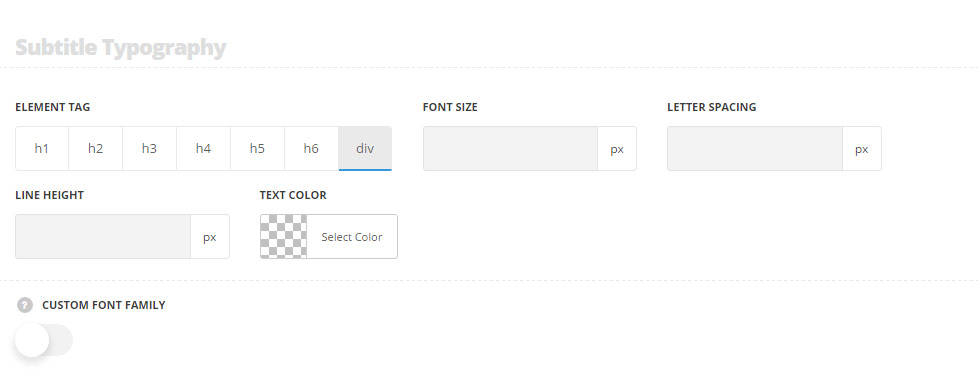
- Element tag – select the tag for the subtitle.
- Font size – set the font size you need to use in the subtitle.
- Letter spacing – set the needed distance between letters in the subtitle.
- Line-height – set the needed distance between lines in the subtitle text.
- Text color – set the color of the font.
- Font style – select the font weight and style (bold, italic) for the subtitle.
- Custom font family – set it to Enable to use custom Google font.
- Font Family – select the font family from the drop-down list.
- Font style – select the font weight and style (bold, italic) for the subtitle.
Style settings
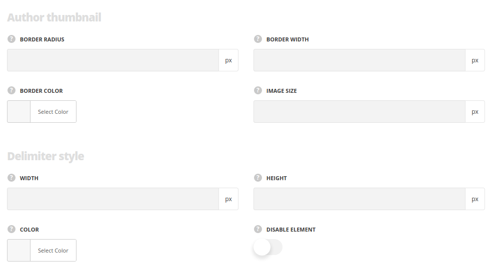
Author thumbnail
Style the author image.
- Border radius – specify the radius to get the rounded corners.
- Border width – type the border width to the thumbnail image, if needed.
- Border color – set the border color, if needed.
- Image size – specify the image width.
Delimiter style
Style the delimiter line of the module.
- Width – set the width.
- Height – set its height.
- Color – specify the color.
- Hide element – put the check mark in case you want to disable the delimiter.
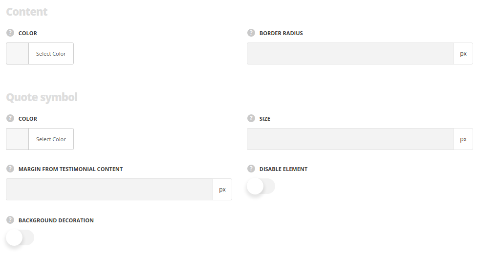
Content background
Style the background. For Decorated and Background styles only.
- Color – set the background color.
- Border radius – specify the radius to get the rounded corners.
Quote symbol
Style the quote icon decoration.
- Color – set its color.
- Size – specify the icon size.
- Margin from text block – set the spacing between the text and icon.
- Disable element – put the check mark in case you want to hide the quote icon.
- Background decoration – set it to Enable to add the background to quote symbol and add its decoration. Option is not available if the option ‘Disable element‘ is enabled.
- Border radius – set the the border radius for the quote symbol’s background. The default value is 50%.
- Background color – set the color for the quote symbol’s background. The default value is rgba(0,0,0,0.5).
