Use the customized contact form styles to display on the site.
General settings
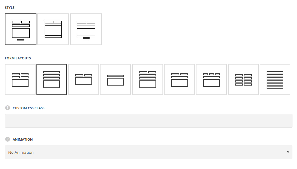
- Style – select the most suitable style of the contact form for your site.
- Bordered – each contact form fields are displayed separately with the border with shadow hover effect on click.
- Boxed – there is the border around the contact form displayed, and the contact form files are not separated from each other. On the field click, there is line animation effect.
- Simple – there is no border set around the contact form and its field, and the contact form files are separated from each other. On the field click, there is line animation effect.
- Form layout – select the layout style of the contact form which suits you more from the list of the available ones.
- Animation – choose between 14 preset animation effects.
- Custom CSS class – enter our own unique class name for the item – this is a useful option for those who want to create a specific style. E.g.: you can type custom-style class and then go to
Theme optionsGeneral optionsCustom CSS/JSCustom CSSfield and write your own CSS code with this class to get your own style.
Input style
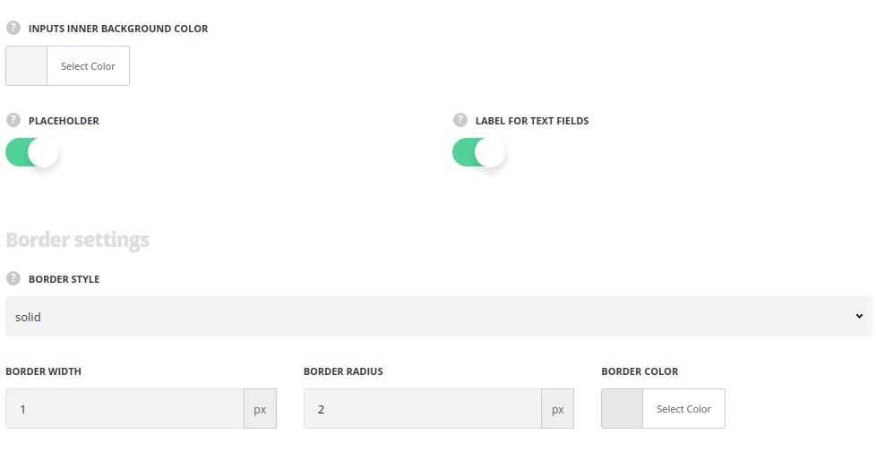
- Inputs inner background color – specify the background color for the inputs.
- Paceholder – set it to Enable to display the placeholder text (the text will be visible inside the input).
- Label for text field – set it to Enable to show the label text (the text will be visible above the input). For Bordered style only.
Border settings
- Border style – select the border style for the form from the drop-down list.
- Border width – set the width of the border.
- Border radius – set the border radius for the form filed to have rounded corners.
- Border color – select the color for the border. Default color is set to #e8e8e8.
Text settings
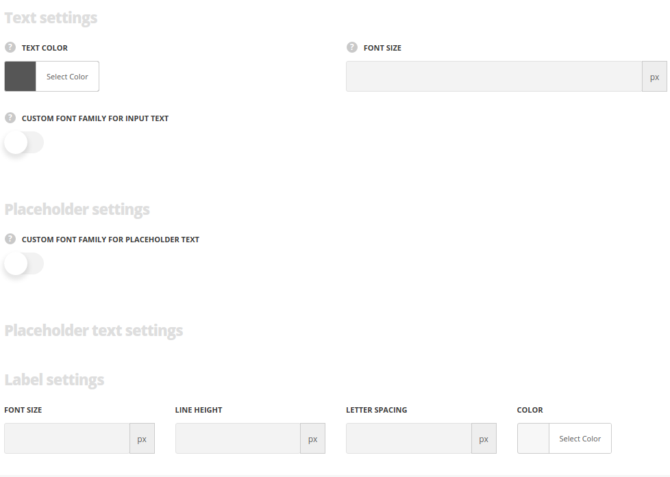
- Text color – choose the color for the content text. The default value is #565656.
- Font-size – set the font size for the content text.
- Custom font family for input text – set it to Enable to use custom Google font.
- Font Family – select the font family from the drop-down list.
- Font style – select the font weight and style (bold, italic) for the text.
Placeholder settings
- Custom font family for placeholder text – set it to Enable to use custom Google font.
- Font Family – select the font family from the drop-down list.
- Font style – select the font weight and style (bold, italic) for the text.
Placeholder text settings
- Font-size – set the font size for the placeholder text.
- Color – select the color of the placeholder text.
Label settings
- Font size – set the font size you need to use in the label text.
- Letter spacing – set the needed distance between letters.
- Color – set the color of the font.
Other settings
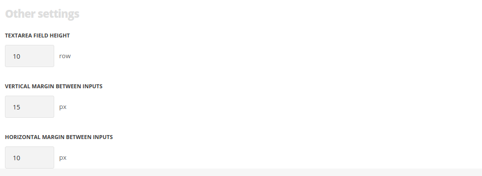
- Textarea height – define the height of the text area.
- Vertical margins between inputs – define the height of the margins between the inputs in vertical respective.
- Horizontal margins between inputs – define the height of the margins between the inputs in horizontal respective.
- Padding between columns – select the padding between the contact form field. For Bordered and Simple styles only.
Button style
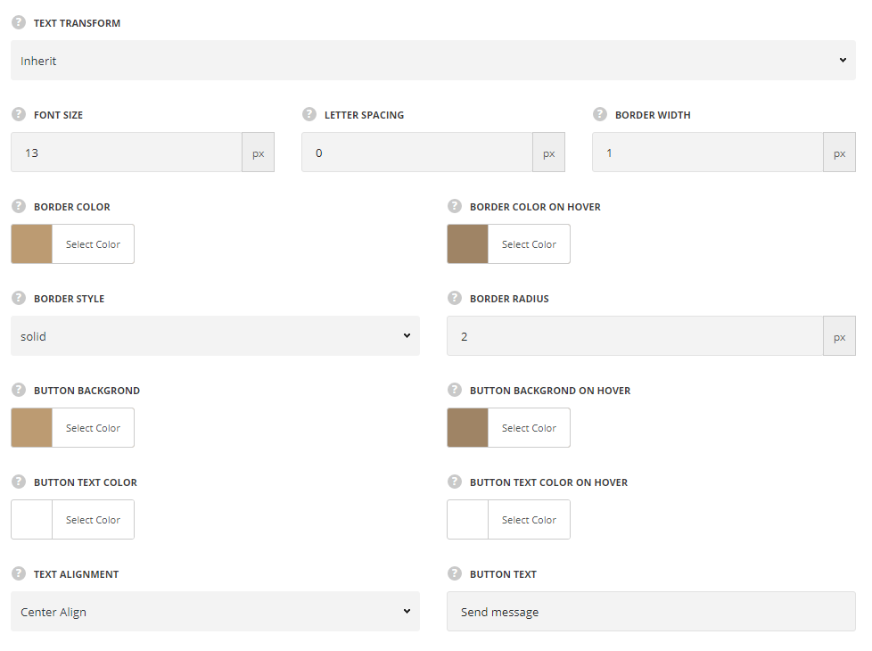
- Text transform – select the button text properties. You may select capitalize, uppercase, lowercase, initial and or inherit it from
Theme optionsGeneral optionsDefault button optionsDefault Button Typography. - Font size – set the font size you need to use in the contact dorm button. The defaut value is 45px.
- Letter spacing – set the needed distance between letters.
- Border width – set the border width for the button. The border is not set by default.
- Border color – select the border color for the button.
- Border color on hover – select the border color for the button on hover.
- Border style – allows you to choose the border style for the button from the list of available ones from the drop-down list.
- Border radius – set the border radius for the button to have rounded corners.
- Button background – choose the background color for the button. The default value is inherited from
Theme optionsGeneral optionsDefault button optionsDefault button background color. - Button background on hover– set the hover background color for the button. It is inherited from
Theme optionsGeneral optionsDefault button optionsDefault button hover background color. - Button text color – select the color of the text to be displayed in the button. The settings are inherited from inherited from
Theme optionsGeneral optionsDefault button optionsDefault Button Typographysection. - Button text color on hover – set the text color on hover for the button. It is inherited from
Theme optionsGeneral optionsDefault button optionsDefault button hover text color. - Text alignment – align the text horizontally inside the button. You may select Left Align, Center Align and Right Align.
- Button text – enter the text to be displayed inside the submit button of the contact form.
- Button width – set the width of the button according to the width of the form. You may select full width, half size, third size or inherit the settings from
Theme optionsGeneral optionsDefault button optionssection. - Button alignment – align the button horizontally. You may select Left Align, Center Align and Right Align.
- Custom font family – set it to Enable to use custom Google font.
- Font Family – select the font family from the drop-down list.
- Font style – select the font weight and style (bold, italic) from the list.
ReCaptcha setting
Enable and set the reCaptcha, if needed. You may check more information about it on Google reCaptcha page.
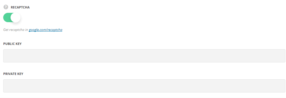
- Recaptcha – set it to Enable to use ReCaptcha for the contact form.
- Public key – type the generated key to make the reCaptcha function properly.
- Private key – type the generated key to make the reCaptcha function properly.
Field Editor
- Field type – select what kind of field you need to use in the form field.
- Nothing – select this type to disable the field of the contact form
- Radio – it will help you to create the radio bullets and to let your visitor select.
- Options – enter the options for the radio bullets and separate them with ‘enter’ button.
- Email – select this field to add the Email field to the contact form.
- Required field – set it to Enable to make this field required for the form.
- Label – type the label text with field title to be displayed in the form.
- Default value – type the default content of the form type.
- This field requires authors email address (Akismet validate) – switch it to Enable to make the email address checked by Akismet.
- Drop Down – select this field type to add the drop down list for the form.
- Label – type the label text with field title to be displayed in the form.
- Options – enter the options for the drop down list and separate them with ‘enter ‘button.
- Insert a blank item as the first option – set it to Enable to the have the empty item in the dropdown.
- Text – select this field to add the text field to the contact form.
- Required field – set it to Enable to make this field required for the form.
- Label – type the label text with field title to be displayed in the form.
- Default value – type the default content of the form type.
- This field requires authors email address (Akismet validate) – switch it to Enable to make the email address checked by Akismet.
- Textarea – select this field to add the text area field for the contact form messages to the contact form.
- Required field – set it to Enable to make this field required for the form.
- Label – type the label text with field title to be displayed in the form.
- Default value – type the default content of the form type.
- Telephone – select this field to add the telephone field for the contact form messages to the contact form.
- Required field – set it to Enable to make this field required for the form.
- Label – type the label text with field title to be displayed in the form.
- Default value – type the default content of the form type.
- Chexbox – choose this field to add the checkboxes to the contact form.
- Required field – set it to Enable to make this field required for the form.
- Options – enter the options for the checkboxes and separate them with ‘enter’ button.
- Date – select this field to add the calendar with dates to the contact form.
- Required field – set it to Enable to make this field required for the form.
- Min/Max – enter the begging date and the target finish date.
- Label – type the label text with field title to be displayed in the form.
- Default value – type the default content of the form type.
- This field requires authors email address (Akismet validate) – switch it to Enable to make the email address checked by Akismet.
- Acceptance – select this field to add the acceptance field for the contact form messages to the contact form.
- Make this checkbox checked by default – put the check mark to make the acceptance field always checked.
- Label – type the label text with field title to be displayed in the form.
Received email from
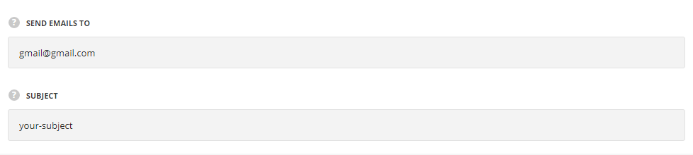
- To – enter the email address of the email recipient.
- Subject – enter the subject to transmit the message subject. Here you may add the page or contact form title to distinguish the emails in the inbox folder.
Message text
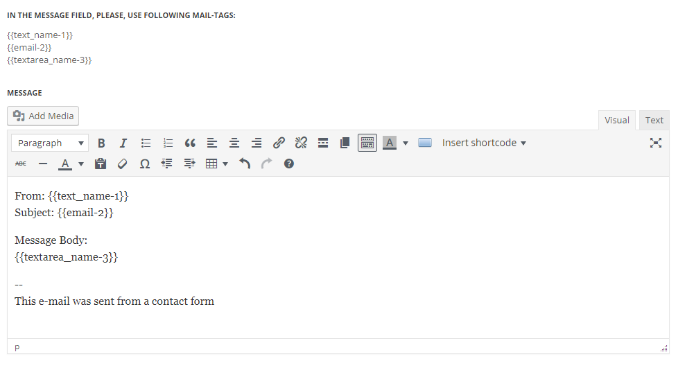
- Mail-tags you can use in the message field – check the mail-tags to be used in the certain contact form and add them to the Message container to transmit the information from the contact form. You need simply to copy the mail tags and enter them into the message field.
- Message – generate the message, that you’ll receive via the contact form by copying the correct mail-tags from the field above. Note, you have to type the mail-tags with figure braces.
More information about setting the correct mail tags for contact form can be found in this post.
