Here you can set all the logos that will be used on the site.
Logos options
Select the logotype and favicon images for your site.
Favicons
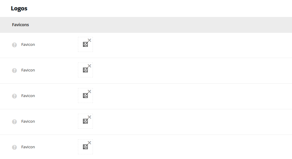
- Favicon – upload the small logo that will be displayed in the browser tab near the page title. You may add 5 different Favicons for different devices resolution (from 16x16px to 152x152px).
Header logotype images
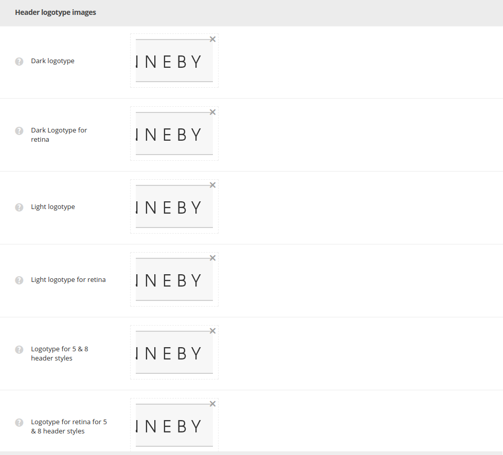
- Dark logotype – select an image from the file location on your computer or choose from the media library. The logo will be displayed for the header styles 1, 3, 9, 12.
- Dark Logotype for retina – select an image from the file location on your computer or choose from the media library. The logo will be displayed for the header styles 1, 3, 9, 12 on retina devices.
- Light logotype – select an image from the file location on your computer or choose from the media library. The logo will be displayed for the header styles 2, 4, 6, 7, 10, 13, 14.
- Light Logotype for retina – select an image from the file location on your computer or choose from the media library. The logo will be displayed for the header styles 2, 4, 6, 7, 10, 13, 14 on retina devices.
- Logotype for 5 & 8 header styles – select an image from the file location on your computer or choose from the media library. The logo will be displayed for the side navigation – header styles 5 and 8.
- Logotype for retina for 5 & 8 header styles – select an image from the file location on your computer or choose from the media library. The logo will be displayed for the side navigation – header styles 5 and 8 on retina devices.
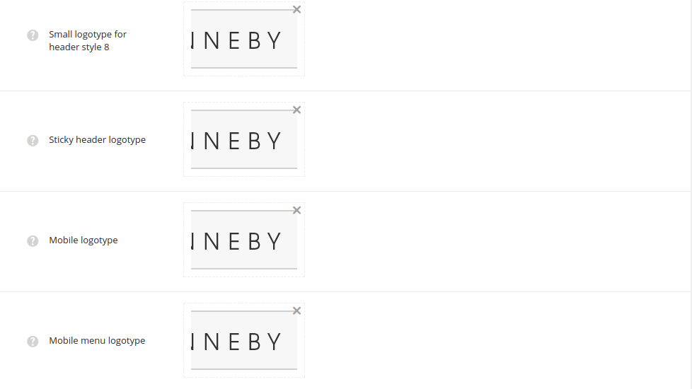
- Small logotype for header style 8 – select an image from the file location on your computer or choose from the media library. The logo will be displayed as small logotype in closed header style 8. The recommended logotype image size is 70×70.
- Sticky header logotype – select an image from the file location on your computer or choose from the media library for the sticky header that appears on scroll.
- Mobile logotype – select an image from the file location on your computer or choose from the media library for the mobile header.
- Mobile menu logotype – select an image from the file location on your computer or choose from the media library. The logo will be displayed as logotype in mobile menu.
Additional logotype images
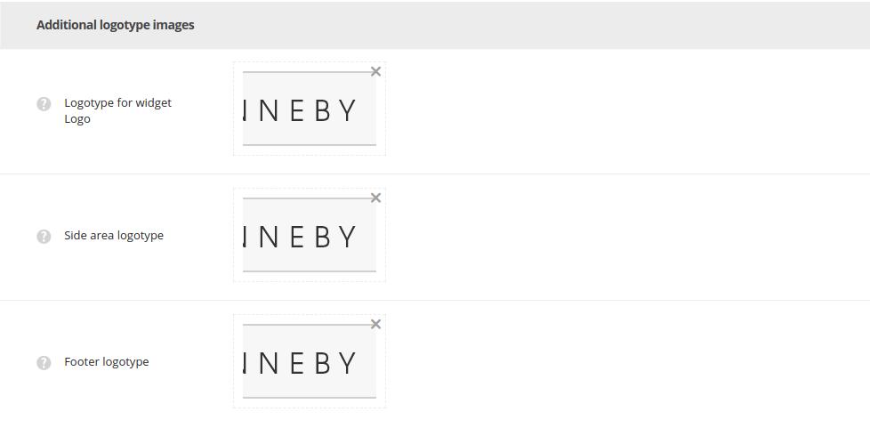
- Logotype for widget Logo – upload an image from the file location on your computer or choose from the media library. The logo will be displayed for Logo widget, which can be set in
AppearanceWidgets. - Side area logotype – select an image from the file location on your computer or choose from the media library. The logo will be displayed as Side area logotype. Check more in this post.
- Footer logotype – select an image from the file location on your computer or choose from the media library. The logo will be displayed in footer.
