Portfolio item post type is the perfect choice for demonstration the creative projects for your visitors. To create a new portfolio item, simply navigate to Portfolios section of the admin area and click on Add New.
It is important to set featured image for the portfolio item in Featured Image meta box in the right sidebar of the portfolio item editor since there will be no content to be displayed on the portfolio page.
The single portfolio item can be created either using the default structure (various Image gallery style and description for it in the different position), you can use the elements of Visual Composer plugin.
It is important! Select For Bage Builder layout type for single portfolio item in Single portfolio item options meta box to be able to create the portfolio items with Visual Composer elements.
Portfolio Categories
The most convenient way to group the portfolio projects.
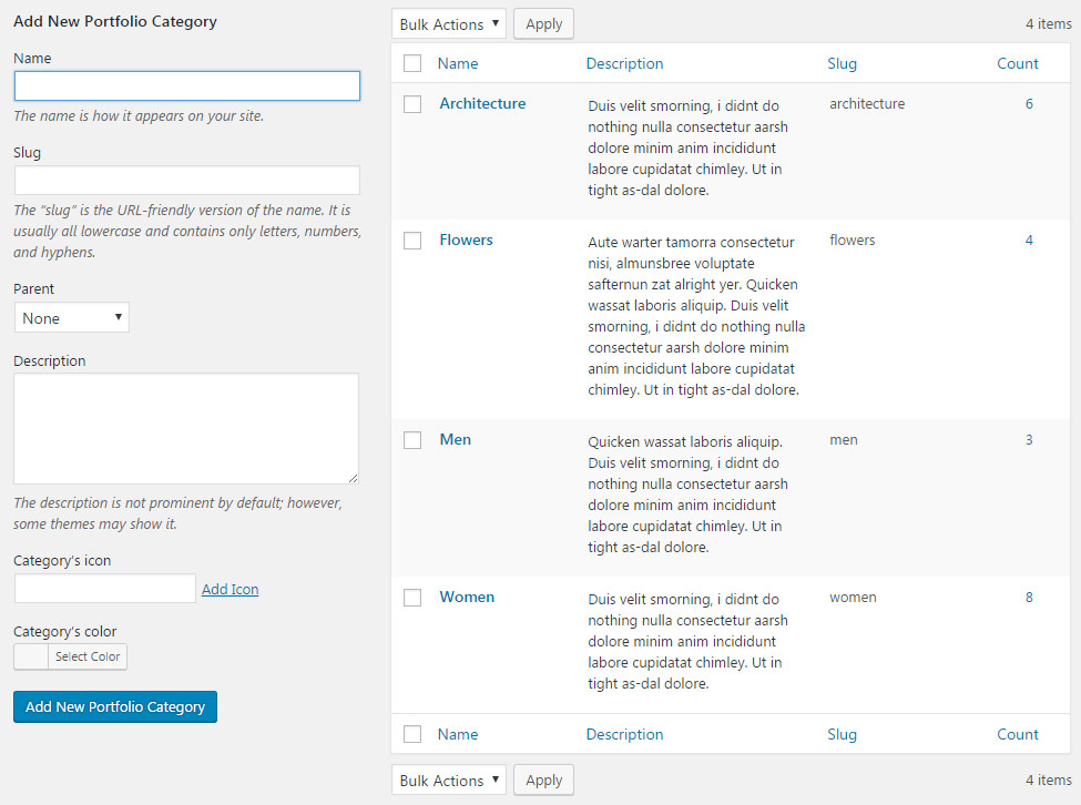
The Categories can be added in Portfolios Categories section of admin panel.
To create a new Category for portfolio items, check the short steps to be followed:
- Name – add the title of the category.
- Slug – enter the title of the category in the URL. Leave the field blank to make Slug the same as the Name.
- Parent – you may also select the Parent category to achieve the hierarchy on the site.
- Description – you may leave this field empty, the description will be visible in admin panel only.
- Category’s icon – category’s icon will be used in the Category, Tags and Author sort panel on the portfolio page.
- Category’s color – set the category’s color for category button to be displayed on single portfolio items.
Portfolio Tags
Tags allow to arrange the single portfolio items structurally and to facilitate the navigation among single portfolios.
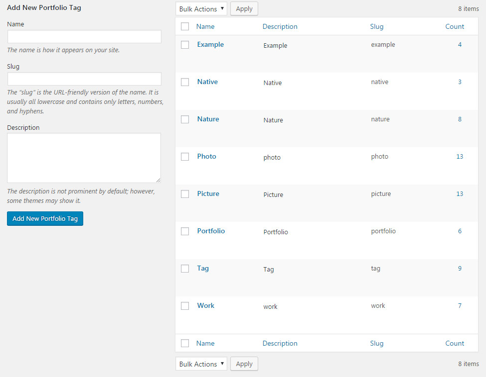
To add new Tag for portfolio item, go to Portfolios Tags section of admin area.
Check the step by step instruction on creating new tags for portfolio items below:
- Name – add the title of the tag.
- Slug – enter the title of the tag in the URL. Leave the field blank to make Slug the same as the Name.
- Description – you may leave this field empty, the description will be visible in admin panel only, it is added for your convenience.
Single Portfolio Item Options
Using this meta box you may overwrite the settings set for single portfolio and customize the variations of portfolio works for your visitors.
The settings are inherited from Theme options Portfolio options Single Portfolio item options section.
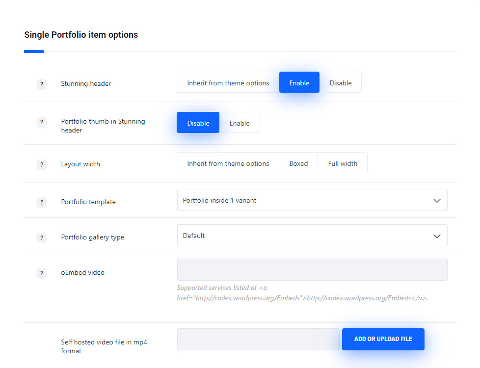
- Stunning header – set it to Enable to show the stunning header on gallery item page. If you choose inherit from theme options the displaying will correspond to the theme options settings.
- Portfolio thumb in Stunning header – set it to Enable to show the post’s featured image as Stunning header background image.
- Portfolio template – select the general appearance and customization possibilities of the portfolio inner page.
- Portfolio inside 1 variant – is default old style. Note, some styling options are not available for this template.
- Portfolio inside 2 variant – provides more customization options for the inner page. It has the decoration zigzag dividers, the gallery has paddings and borders, new share and comments style.
- Portfolio gallery type – select the gallery appearance on the item inner page. You may add the gallery images to the Images gallery meta box. If you choose theme default the displaying will correspond to the theme options settings.
- Default – displays gallery images carousel with small thumbnails at the bottom, the main image is set to 900x750px and the thumbnails are 250x250px. You may see the example following this link.
- Big images – displays images in one column full size, their size is set to 1280x900px. You may see the example following this link.
- Middle images list – displays images in two columns, their size is set to 650x650px. You may see the example following this link.
- Small image list – displays images in couple columns, their size is set to 400x400px. You may see the example following this link.
- Advanced gallery – displays one big image 800x800px and small images (400x400px) are around it. You may see the example following this link.
- oEmbed video – enter a Youtube, Vimeo, Twitter, or Instagram URL to display the video work in the portfolio item.
- Self hosted video file in mp4 format – enter the video URL or select the necessary video file from the media library.
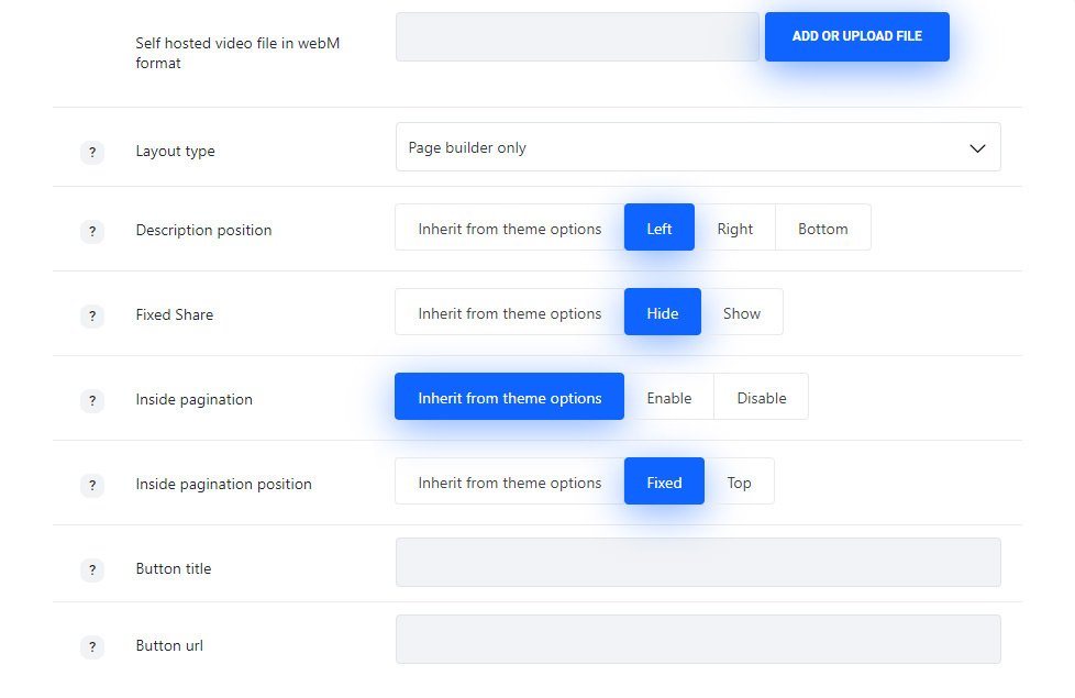
- Self hosted video file in WebM format – enter the video URL or select the video file from the media library.
- Layout type – allows selecting whether the portfolios will be created with default structure or with Visual Composer elements.
- Default – select this layout type to create the portfolios with default structure (big, small, medium images list gallery type etc).
- For Page Builder – select this layout type to create portfolio item using the Visual Composer element.
- Description position – select the description position in respect to the media content. Left, right and bottom position are available, if you choose theme default the displaying will correspond to the theme options settings.
- Title – set the title of the portfolio item to be shown or hidden above the portfolio item, for Portfolio inside 2 variant Portfolio Template.
- Subtitle – set the subtitle of the portfolio item to be shown or hidden above the portfolio item, for Portfolio inside 2 variant Portfolio Template.
- Share – allows you to show or hide the share in meta on the portfolio item, for Portfolio inside 2 variant Portfolio Template.
- Short description title – add extra field with portfolio work description, for Portfolio inside 2 variant Portfolio Template.
- Short description text – add more information about the portfolio work, for Portfolio inside 2 variant Portfolio Template.
- Additional link title – add an extra field with link on the portfolio work, for Portfolio inside 2 variant Portfolio Template.
- Fixed share – allows you to show or hide the side share on portfolio item.
- Pagination to previous and next posts style – allows you to select the inner pagination style for portfolios. Switch it to Disable to remove inside pagination. If you choose theme default the displaying will correspond to the theme options settings.
- Fixed – the pagination arrows for previous and next portfolio items will be displayed on scroll.
- Top – the pagination arrows are displayed on top of the portfolio items.
- Button title – add the title for the extra button with link.
- Button URL – type the URL of the button. Note, this link will be also displayed on the portfolio thumbnail – you may enable it in
Theme optionsPortfolio optionsPortfolio hover optionsHover decoration settingsEnable external link.
Description
Withing Ronneby theme the description fo the portfolio items is added using the Advanced Custom Fields bundled into theme pack.
Description is a wonderful choice for creating custom sections and adding extra information about the portfolio item project.
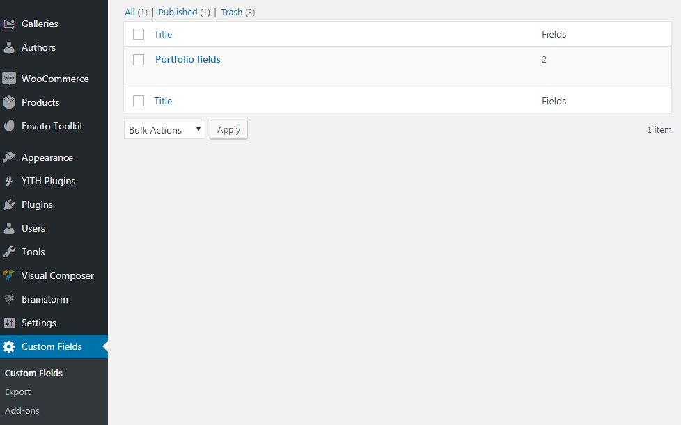
You can see that there are Clients and Tasks sections in portfolios. These extra fields are generated with the Advanced Custom Fields plugin recommended by the theme.
You may find them in Custom Fields Portfolio fields section to edit and customize. You can change the titles of the custom fields in this section.
There’s also a possibility to add new Custom field to a portfolio work if needed. You may check more information on the plugin in the official Advanced Custom Fields Documentation.
Below you may find more details about Portfolio fields meta box in the portfolio item editor.
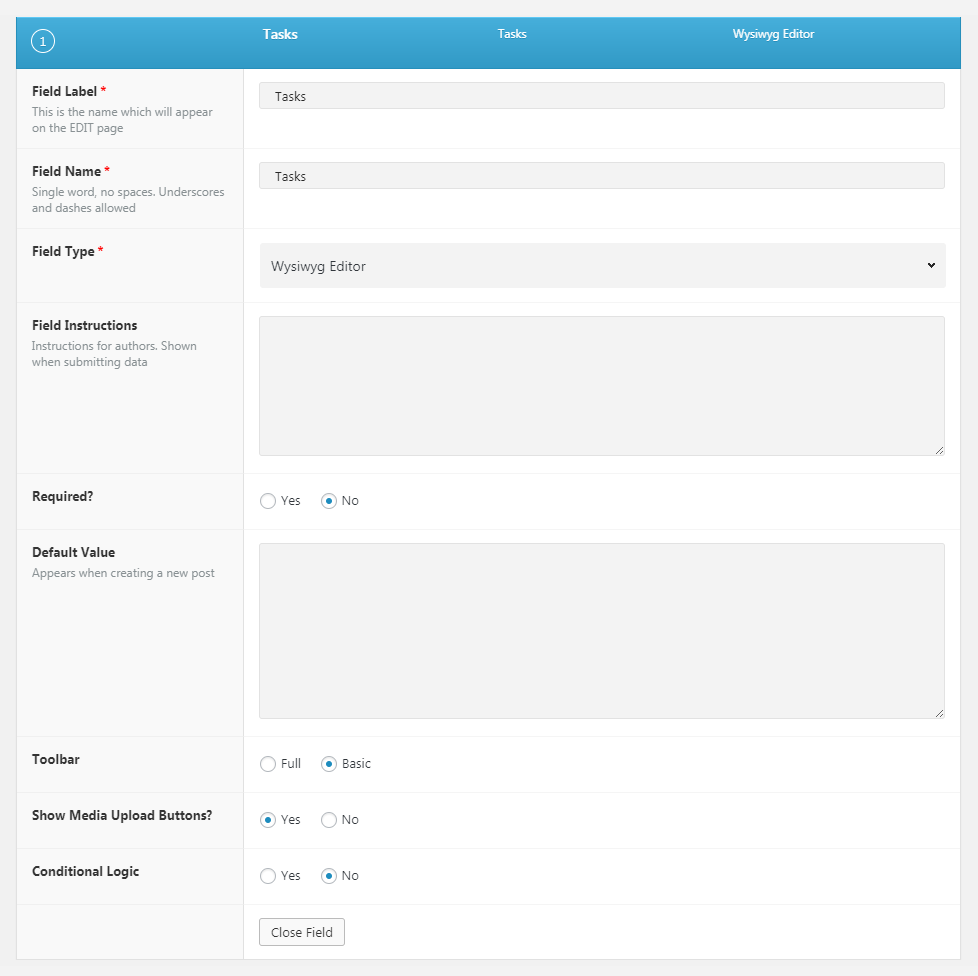
- Portfolio fields – within our theme, we have Clients and Tasks portfolio fields created by default. You may see the WYSIWYG editors in the custom fields. Add the needed information and style it to suit the design.
Note, Visual Composer shortcodes will also work in this section. Simply create the test page and add there the modules, you’d like to display on the portfolio work. Then switch to Classic mode and copy the needed shortcode. Paste that shortcode to the custom field and save portfolio work.
Stunning Header Options
Style the stunning header section for your portfolio item if you want to add something special on your page.
The stunning header options are inherited from Theme options Header options Stunning Header Options section.
The configurations set in this meta box section will be applied to the single portfolio item page only and will not affect other pages of your site.
Since the Stunning Header options meta box is the same for all posts and pages types, more details can be found in Single Page Creation Stunning Header Options section.
Follow this link to check the post.
Page options
Allows to select the style for the layout for your portfolio item.
The configurations set in this meta box section will be applied to the single portfolio item page only and will not affect other pages of your site.
Since the Page options meta box is the same for all posts and pages types, more details can be found in Single Page Creation Page Options section.
Follow this link to check the post.
Preloader options
Contains options for setting special preloader style for the single portfolio itemwhich will appear on the screen till the content is fully loaded.
The configurations set in this meta box section will be applied to the single portfolio item only and will not affect other pages of your site.
Since the Preloader options meta box is the same for all posts and pages types, more details can be found in Single Page Creation Preloader Options section.
Follow this link to check the post.
